Strategy ONE
Defining Microcharts widgets
The Microcharts widget consists of compact representations of data that allow analysts to quickly visualize trends in data. Microcharts convey information so that a user can, at a glance, determine the trend of a metric over time or how a metric is performing compared to forecasted figures. The Microcharts widget is useful for this purpose because individual microcharts can display attribute and metric data in a small graph that would otherwise be displayed as a single value in a grid report cell.
Use a Microcharts widget to quickly visualize the trend of a metric at a glance without having to know many additional details. The bar, sparkline, and bullet microcharts used in the Microcharts widget convey information that an analyst can understand just by looking at the graph once.
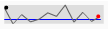
One, two, or three microcharts can be displayed in the Microcharts widget, depending on the number of metrics used on the report in the Grid/Graph. For example, bar and sparkline microcharts are included on the left side of the widget shown below. These microcharts convey the trend of a metric over time, from left to right. On the right side of the widget, bullet microcharts reveal the percentage of cases that were closed, in correlation with the goals for the regions, which are represented by the vertical lines within the bullet microcharts.

You can view these rows of microcharts in several ways:
-
All the microcharts
-
As a scrolling ticker that moves horizontally
-
As scrolling rows that move vertically
For details on how to implement one of these displays, see Viewing and interacting with Microcharts widgets: operation modes.
You can display the Microcharts widget as a widget in MicroStrategy Web, or on an iPad with MicroStrategy Mobile (Ticker mode, Vertical Scroll mode, and the tree display are not available on the iPad). Grid Mode and KPI List Mode let you format the Microcharts widget to display only one metric column at a time. When the widget is displayed on an iPad, users can tap the metric column to toggle between different metrics on the columns of the widget's Grid/Graph. For information about displaying only a single metric column on the iPad, see Formatting Microcharts widgets. For general information on widgets for mobile devices, see Widgets for mobile devices.
The number of rows in the widget represents the number of elements from the first attribute on the rows of the Grid/Graph that contains the widget. For example, the widget above has seven rows of regional data because the Region attribute on the Grid/Graph's rows has seven different elements, or regions.
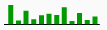
Some of the metrics on the Grid/Graph are used to create the microcharts in the widget, such as a sparkline or bar chart. Each of the following microcharts provides a unique way to visualize your data, as described below:
Each type of microchart needs different data requirements, as discussed below.
Data requirements for a Microcharts widget
To successfully create a useful Microcharts widget that can be used to analyze data, you must first correctly define the Grid/Graph. To do this, you must place report objects such as attributes and metrics on the Grid/Graph. The report objects and their placement on the Grid/Graph determine whether the Microcharts widget can be successfully generated and can display data.
A Microcharts widget does not need a separate selector to allow a user to interact with it. However, you can use a Microcharts widget as a selector. For an example and more information, see Using Microcharts widgets as selectors.
Each type of microchart needs different data requirements, as described in the following table:
Report Object Requirements on the Grid/Graph | |
Simultaneous bar, sparkline, and bullet microcharts | These requirements produce all three types of microcharts, although bar charts are hidden by default. For instructions on how to show them, see Showing and hiding microchart types. At least two attributes on the rows, unless KPI List mode is used. For requirements for KPI List mode, see Viewing a list of KPIs as rows of microcharts: KPI List mode. The last (right-most) attribute on the rows determines the X-axis values in the bar and sparkline microcharts in the widget. The remainder of the attributes on the rows (the first, second, third, fourth, and so on) determine the total number of rows displayed in the widget. The elements from those attributes become individual rows in the widget. At least seven metrics on the columns. The first (left-most) metric on the columns determines the height of the bars in the bar microcharts and the peak points in the sparkline microcharts. The second metric creates the horizontal reference lines that are displayed in the sparkline microcharts. The third metric determines the length of the performance measure bar in the bullet microcharts. The bar represents the actual metric value. The fourth metric determines the maximum possible values in the bullet microcharts. The fifth metric determines the right-most boundary of the first color band, Band 1, in the bullet microcharts. The sixth metric determines the right-most boundary of the second color band, Band 2, in the bullet microcharts. The seventh metric determines the value of the vertical reference line in the bullet microcharts, which is typically the target value for the metric. Any additional metrics are displayed in the columns of the widget, after the microcharts and their associated metrics. |
Bar and/or sparkline microcharts | Bar and sparkline microcharts are based on the same metrics and are therefore designed in a similar way. Bar microcharts are hidden by default; for instructions to display them, see Showing and hiding microchart types. At least two attributes on the rows, unless KPI List mode is used. For requirements for KPI List mode, see Viewing a list of KPIs as rows of microcharts: KPI List mode. The last (right-most) attribute on the rows determines the X-axis values in the bar and sparkline microcharts in the widget. The remainder of the attributes on the rows (the first, second, third, fourth, and so on) determine the total number of rows displayed in the widget. The elements from those attributes become individual rows in the widget. At least two metrics on the columns. The first (left-most) metric on the columns determines the height of the bars in the bar microcharts and the peak points in the line graphs in the sparkline microcharts. The second metric creates the horizontal reference lines that are displayed in the sparkline microcharts. If you place a third, fourth, fifth, and sixth metric on the columns, the metrics are displayed as individual columns in the widget. These columns are displayed after the microcharts and metrics associated with the microcharts. If you place a seventh metric on the columns, you can produce bullet microcharts. See Viewing and interacting with a Microcharts widget: operation modes for more information. |
Bullet microcharts | These requirements produce bullet microcharts, but sparkline and bar microcharts are automatically produced as well. By default, the bar microcharts are hidden, while the others are displayed. For instructions on how to hide the sparkline microcharts as well, see Showing and hiding microchart types. At least two attributes on the rows, unless KPI List mode is used. For requirements for KPI List mode, see Viewing a list of KPIs as rows of microcharts: KPI List mode. The last (right-most) attribute on the rows determines the X-axis values in the bar and sparkline microcharts in the widget. The remainder of the attributes on the rows (the first, second, third, fourth, and so on) determine the total number of rows displayed in the widget. The elements from those attributes become individual rows in the widget. At least seven metrics on the columns. The first (left-most) metric on the columns determines the height of the bars in the bar microcharts and the peak points in the sparkline microcharts. This applies even if you want to display only bullet microcharts. The second metric creates the horizontal reference lines that are displayed in the sparkline microcharts. This applies even if you want to display only bullet microcharts. The third metric determines the length of the performance measure bar in the bullet microcharts. The bar represents the actual metric value. The fourth metric determines the maximum possible values in the bullet microcharts. The fifth metric determines the right-most boundary of the first color band, Band 1, in the bullet microcharts. The sixth metric determines the right-most boundary of the second color band, Band 2, in the bullet microcharts. The seventh metric determines the value of the vertical reference line, which is typically the target value for the metric. Any additional metrics are displayed in the columns of the widget, after the microcharts and their associated metrics. |
KPI List mode | For KPI List mode, only one attribute can be included on the rows. This attribute should be time-based, since it controls the time series of the bar charts and sparklines in the widget. If only one attribute is placed on the rows, the widget can only be viewed in KPI List mode. For more information, see Viewing a list of KPIs as rows of microcharts: KPI List mode. |
For instructions to create a widget, see Creating widgets. For information on formatting a Microcharts widget, see Formatting Microcharts widgets.