MicroStrategy ONE
Viewing a list of KPIs as rows of microcharts: KPI List mode
Steps to view a list of KPIs as rows of microcharts
If you are viewing the widget in Grid mode or Vertical Scroll mode, you can view key performance indicators (KPIs) by enabling KPI List mode. A KPI is a measurement that tracks progress towards a goal. In KPI List mode, a list of KPIs such as Profit Margin and Revenue is displayed, with each KPI represented by its own row of microcharts. The trend of a specific KPI is now easier to understand because all data for the KPI is presented in one row of microcharts. When KPI List mode is disabled, sparklines represent only a single metric or KPI.
KPI List mode is available only if the following conditions are met:
-
The Microcharts widget is viewed in Grid mode or Vertical Scroll mode.
-
The Grid/Graph that contains the widget has only one attribute on the rows. The attribute should be a time-based attribute, such as Month, since it controls the time series of the bar charts and sparklines in the widget.
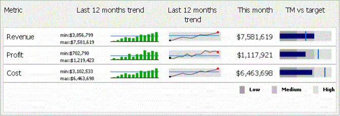
When an analyst views the Microcharts widget in KPI List mode, he can see KPIs such as Profit, Revenue, and Cost as separate rows of microcharts in a compact list, called the KPI list. Each row of microcharts tracks a specific KPI over time, as shown in the image below:

After enabling KPI List mode, you must determine how many of the metrics on the Grid/Graph are used to generate each row of KPI microcharts. For example, the following Grid/Graph, which was used to create the widget shown above, contains nine metrics in its columns:

If you specify three as the number of metrics to use per KPI in this widget:
-
The first three metrics are used to create a row of microcharts for the Revenue KPI. This set of metrics is indicated by the first circle in the image above. These three metrics produce the first row of the widget example above, labeled as Revenue.
-
The fourth, fifth, and sixth metrics are used to create a row of microcharts for the Profit KPI, as grouped by the second circle. They produce the second row of the widget example above, labeled as Profit.
-
The seventh, eighth, and ninth metrics are used to create a row of microcharts for the Cost KPI, as indicated by the third circle. They product the third row of the widget example above, labeled as Cost.
The number of metrics to use per KPI also determines the types of microcharts that are displayed in the widget, as explained below.
-
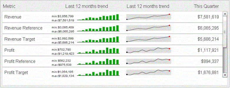
If only one metric is used per KPI, only sparkline and bar charts and their associated metrics can be displayed in the KPI list, as shown below. The horizontal reference line is not displayed in the sparklines. Notice that not all the metrics in the widget are displayed, as indicated by the scroll bar.

-
If two metrics are used per KPI, only sparkline and bar charts and their associated metrics can be displayed in the KPI list, as shown below. The horizontal reference line is also displayed in the microcharts, unlike if one metric is used. The entire widget is displayed below; notice that some metrics are no longer listed as individual rows.

-
If three to six metrics are used per KPI, any additional metrics are displayed to the right of the sparkline or bar charts and their associated metrics in the KPI list. The KPI list below uses three metrics per KPI. Notice that no additional metrics are displayed as individual rows in the widget.

-
If seven or more metrics are used per KPI, the KPI list can display sparkline, bar, and bullet microcharts. Any additional metrics are displayed to the right of the sparkline and bar microcharts. The KPI list below uses seven metrics per KPI.

This widget was not created from the Grid/Graph that was used in the previous examples. The Grid/Graph for this widget contains 21 metrics, so that seven metrics can be used for each of the three KPIs. For example, the first seven metrics are used to create the row of microcharts for the Revenue KPI.
The following procedure describes how to view a list of KPIs as individual microcharts in the Microcharts widget.
Prerequisites
This procedure assumes that the Grid/Graph as displayed in Design Mode or Editable Mode contains only one attribute on its rows. A widget can be viewed in KPI List mode when there is only one attribute on the rows of the Grid/Graph that contains the widget, as described above.
This procedure assumes you have already created a Microcharts widget; for instructions, see Creating widgets.
To view a list of KPIs as microcharts
-
Use Flash Mode in MicroStrategy Web to open a document containing a Microcharts widget.
-
Right-click the widget and select Properties. The Microcharts Widget Properties dialog box opens.
-
From the drop-down list at the top left of the dialog box, select Mode.
-
On the Mode tab, from the Operation Mode drop-down list, select Grid or Vertical Scroll. Since the Grid/Graph contains only one attribute on the rows, the KPI List Mode check box is selected by default.
-
In the Metrics per KPI field, specify the number of metrics on the Grid/Graph to use to generate the rows of microcharts for the KPIs. For details about how the number of metrics to use per KPI affects the display of the widget, see the examples in Viewing a list of KPIs as rows of microcharts: KPI List mode.
You can name the column that displays the metric associated with the sparklines or bullet charts. This metric is the same as the last data point within the sparklines and bullet charts.
-
From the drop-down list at the top left of the dialog box, select Labels.
-
You can add a label for the metric associated with the sparklines to name the column that contains the metric values associated with the sparklines. To do this, on the Sparkline tab, in the Associated Metric field, type a name for the column that contains the metric values associated with the sparklines.
-
You can add a label for the metric associated with the bullet charts, for example, to name the column that contains the metric values associated with the bullet charts. To do this, on the Bullet tab, in the Associated Metric field, type a name for the column that contains the metric values associated with the bullet charts.
-
Click OK to apply the changes to the widget.
