MicroStrategy ONE
Defining Interactive Bubble Graph widgets
An Interactive Bubble Graph widget is a conventional bubble plot that allows you to visualize the trends of three different metrics for a set of attribute elements. The data structure for an interactive bubble chart is very specific. At minimum, one attribute and three metrics are required. In the bubble chart:
-
One bubble is displayed for each attribute element.
-
Each bubble's position on the X-axis represents the value of the first metric.
-
Each bubble's position on the Y-axis represents the value of the second metric.
-
The size of each bubble represents the value of the third metric.
To ensure that different groups of attribute elements are displayed as different colored bubbles, you can add a fourth attribute above the first three metrics on the columns. This is described in detail in Data requirements for an Interactive Bubble Graph widget.
The Interactive Bubble Graph is interactive, unlike a standard bubble graph report. For example:
-
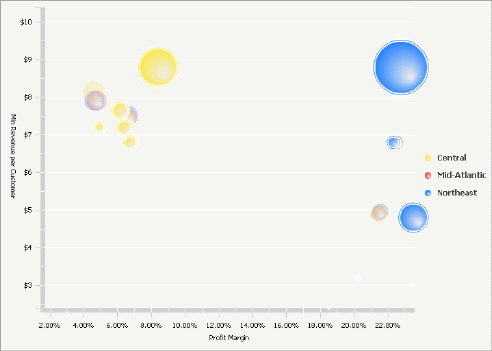
An analyst can change which metric is displayed on which axis. For example, in the widget shown above, the Profit Margin is displayed on the X-axis (the horizontal axis) and the Minimum Revenue per Customer on the Y-axis (the vertical axis). An analyst can switch the metrics, so that the Profit Margin is shown on the Y-axis, and the Minimum Revenue per Customer on the X-axis.
You can disable the ability to change which metric is displayed on which axis. For information, see Formatting Interactive Bubble Graph widgets.
-
An analyst can zoom into a section of the widget to enlarge it. For example, he can draw a selection box (or lasso) around the cluster of yellow bubbles, and enlarge that area of the widget, to focus on the information for those cities. He can then return to the original view of the widget.
You can disable the ability to zoom in on a section of the widget. For information, see Formatting Interactive Bubble Graph widgets.
-
An analyst can drill into the components of a bubble to see the underlying data within that bubble's data. For example, she can drill on a Region bubble (the parent attribute) down to bubbles that represent different cities (child attributes) within that region. To drill on a bubble in the bubble chart, the analyst clicks on any of the parent attribute bubbles. In the sample above, the green bubbles have been drilled to their child attribute element bubbles. To enable drilling in the bubble chart, the designer must add an additional attribute to the left of the other attribute on the rows. For specific requirements, refer to Data requirements for an Interactive Bubble Graph widget; for more information on enabling drilling, see Enabling drilling in an Interactive Bubble Graph widget.
-
Analysts can see a time-series animation that plots the bubble values through time. To see this kind of animation, an analyst can move a time slider or click a animation play button. To enable time series animation in the chart, a designer must place an additional attribute at the far left of the rows. For specific requirements, refer to Data requirements for an Interactive Bubble Graph widget.
Data requirements for an Interactive Bubble Graph widget
To successfully create a useful Interactive Bubble Graph widget that can be used to analyze data, you must first correctly define the Grid/Graph. To do this, you must place report objects such as attributes and metrics on the Grid/Graph. The report objects and their placement on the Grid/Graph determine whether the Interactive Bubble Graph widget can be successfully generated and can display data.
The data requirements for a Interactive Bubble Graph widget are described below:
-
One attribute on the rows.
-
To enable drilling on the bubble chart, add one additional attribute (a second attribute) to the right of the attribute in the rows. This attribute must be a child attribute of the parent attribute already on the rows. For detailed information on this requirement, with an example, see Enabling drilling in an Interactive Bubble Graph widget.
-
To enable time series animation, add one additional attribute (a second attribute) to the leftmost side of the rows. In Flash Mode or Interactive Mode in MicroStrategy Web, you must also enable the time-series analysis check box. For more information, see theDashboards and Widgets Creation Guide.
You can enable the time-series analysis check box in Flash View in MicroStrategy Developer and in Express Mode in MicroStrategy Web, but the change is not saved.
-
To enable both drilling and time series animation, the Grid/Graph must contain a total of three attributes.
-
-
At least three metrics on the columns. The first three metrics are displayed along the X-axis, Y-axis, and Z-axis, in order from left to right, by default. For example, the metric on the top of the columns is displayed on the X-axis. The Z-axis value determines the size of the bubble. However, when viewing the widget, an analyst can change which metric displays along each axis.
An Interactive Bubble Graph widget does not need a separate selector to allow a user to interact with it. However, you can use an Interactive Bubble Graph widget as a selector. For an example and more information, see Using an Interactive Bubble Graph widget as a selector.
For instructions to create a widget, see Creating widgets. For information on formatting an Interactive Bubble Graph widget, see Formatting Interactive Bubble Graph widgets.