Strategy ONE
Creating Date Selection widgets
Before You Begin
This topic discusses Date Selection widgets created to display in MicroStrategy Web. You can also create a Date Selection widget to display on a mobile device with MicroStrategy Mobile. On the mobile device, the widget displays as an interactive calendar. Flash Mode, Interactive Mode, and Express Mode in MicroStrategy Web displays it as the Date Selection widget shown in Creating Date Selection widgets. For a more detailed description of the Date Selection widget for the mobile devices, including an example, see Widgets for mobile devices. For instructions to create it, see the Strategy Mobile Analysis Help.
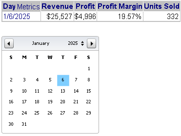
A Date Selection widget is a calendar selector that allows you to select which dates you want to see data about in a document. You are able to see all of the dates of each month in the widget, which allows you to be able to select dates more easily. For example, the Date Selection widget is useful if you are working with a dashboard -style document that displays data from Q4 2027 and you want to view data from a month before that. You can select the date you want to see and the data for that date displays on the document, as shown below:
You can specify whether or not a Date Selection widget displays as a widget in Interactive Mode and Express Mode in MicroStrategy Web. For instructions, see Determining how widgets are displayed. If a Date Selection widget does not display as a widget, and it was created as a:
-
Selector, it displays as a standard selector such as a listbox or button bar.
-
Widget, you can determine whether it displays as a Grid/Graph, blank space, or a placeholder. For instructions, see Determining how widgets are displayed.
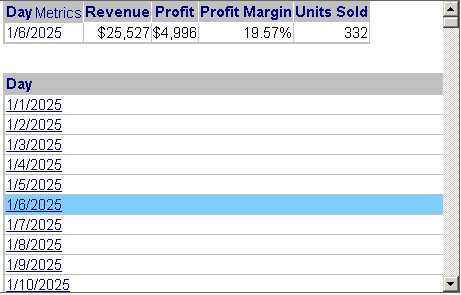
The same document is shown below in Interactive Mode in MicroStrategy Web. The Date Selection widget is defined to not display as a widget in DHTML. The Date Selection widget was created using a widget, so the selector is now displayed as a Grid/Graph. (Widgets are created with Grid/Graphs; for general information on widgets, see Providing Flash-based analysis and interactivity: Widgets.) Notice the scroll bar on the right: all the dates are not shown in this sample because the list is so long. Because the list is so long, dates that are further down the list do not appear in the same screen as the graph, which is why the Date Selection widget is so useful.
In non-Flash modes and views, the widget can instead be hidden or displayed as an empty Grid/Graph placeholder. For examples, see Determining how widgets are displayed.
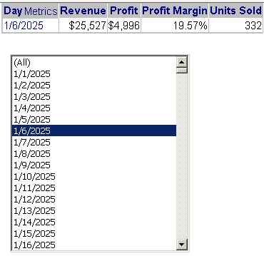
If the Date Selection widget was created as a selector rather than a widget, in Interactive Mode the document looks like the sample shown below. You can set the style of the selector, which in this example is left as the default, Listbox. Again, all the dates are not shown, because the list is so long. The scrollbar allows the user to view and select dates further down in the list.
These examples target a Grid/Graph, but a panel stack can also be the target of a Date Selection widget. However, a Date Selection widget created as a widget cannot switch panels on a panel stack.
The table below summarizes the differences between a Date Selection widget created as a widget and as a selector.
|
|
Widget |
Selector |
|
Display in Flash |
Can be either:
|
Date Selection widget |
|
Display in non-Flash modes/views |
Can be any of the following:
|
Can be either:
|
|
Target panel stacks and Grid/Graphs |
Yes |
Yes |
|
Multiple selections |
No |
Yes |
|
Target of another selector |
Yes |
Only if the selector is on a panel stack |
|
Method of creating |
Create a Grid/Graph and turn it into a widget |
Create a selector |
For instructions to create a Date Selection widget as a widget, see Creating a Date Selection widget as a widget. For instructions to create a Date Selection widget as a selector, see Creating a Date Selection widget as a selector.