Strategy ONE
Defining Heat Map widgets
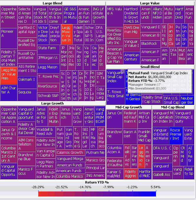
A Heat Map widget is a combination of colored rectangles, each representing an attribute element, that allow you to quickly grasp the state and impact of a large number of variables simultaneously. Heat Maps are often used in the financial services industry to review the status of a portfolio. The rectangles contain a wide variety and shadings of colors, which emphasize the status of the various components. In a Heat Map, the size of each rectangle represents its relative weight, while the color represents the relative change in value of that rectangle. You can hover over each individual rectangle to see which attribute element the rectangle represents and its metric values.
For information on what each object is represented by on the widget, review the following example.
Some of the rectangles in the Heat Map widget above are hidden from view.
-
The large areas (such as the Large Blend area in the image above) represent different categories of mutual funds. These areas are generated by the first attribute on the rows of the Grid/Graph that contains the widget. In this case, the first attribute is Mutual Fund Category. Notice that the name of each category is displayed in the headers of each of these areas.
-
The colored rectangles (colored shades of red and blue in the image above) represent different mutual funds. These rectangles, such as the Vanguard Small Cap Index and Legg Mason Value Prim rectangles above, are generated by any additional attributes on the rows. In this case, a second attribute, Mutual Fund, is on the rows of the Grid/Graph.
-
The size of each rectangle represents its relative weight. This is determined by the first metric on the columns of the Grid/Graph. This widget shows that Large Blend funds are weighted more heavily than Mid-Cap Blend funds in regard to net assets. In this case, the first metric on the columns of the Grid/Graph is Net Assets.
-
The colors displayed in the widget represent different ranges of return year-to-date percentages generated by the mutual funds. (In the image above, blue denotes higher percentages, while red and purple denote lower percentages.) The colors applied to each rectangle are generated by the second metric on the Grid/Graph. (In the image above, the second metric on the report is Return YTD %.) You can define the colors used to denote these values.
You can choose to create a dynamic heat map that an analyst can control using a selector. This type of heat map is considered dynamic because a user can use the selector to choose a different attribute element to view on the heat map. For steps to create a dynamic heat map, see Defining dynamic Heat Maps that use selectors.
You can create a Heat Map widget as a widget for display in MicroStrategy Web or on a mobile device with MicroStrategy Mobile.
Interacting with the Heat Map widget
In Flash Mode and Interactive Mode in MicroStrategy Web, you can change various aspects of the Heat Map widget. This is convenient because you make the changes and view the results immediately, without switching to Design Mode or Editable Mode, and then returning to Flash Mode or Interactive Mode. You can make these changes in Flash View in MicroStrategy Developer and in Express Mode in MicroStrategy Web to preview the results, but you cannot save the changes.
You can:
-
Refresh the widget, by returning to the widget as defined by the Grid/Graph or to the last saved version of the widget.
-
Provide additional room for some rectangles or eliminate outliers by removing rectangles from the Heat Map. You can display a list of deleted rectangles, and replace any rectangles that you removed.
-
Zoom in to a particular rectangle in the Heat Map for a closer view of the data within the rectangle. As you zoom in, the path that you are creating is displayed at the top of the widget. You can click a step to return to that view of the widget.
-
Change the size or color of the rectangles in the Heat Map, by changing the metric that determines the size or the color of the rectangles.
-
Remove attributes from the widget to focus on the data on a specific attribute. You can then replace any attributes that you removed.
-
Rearrange the grouping of categories on the Heat Map widget. The attribute at the top of the list creates the headers in the Heat Map and the attribute at the bottom creates the individual rectangles under each header.
-
Determine whether to display only the rectangles that are in a specified range, based on either the metric values that determine size or those that determine color.
-
Choose to blend or band the colors displayed in the Heat Map. Blending the colors means that colors are blended between points. Banding the colors means that a specific color is displayed for a specific range. You can add new points or bands, delete points or bands, move points or bands, and change the color of a point or band.
-
Search for an attribute in the Heat Map. You can choose to highlight the rectangles whose attributes match the text, or display only the rectangles whose attributes match the text.
-
Dock and undock the Interactive dialog box, which displays all the options described above. A docked dialog box is attached to the right side of the widget and cannot be moved. An undocked dialog box can be moved and resized.
For instructions, see the MicroStrategy Web Help.
Data requirements for a Heat Map widget
To successfully create a useful Heat Map widget that can be used to analyze data, you must first correctly define the Grid/Graph that contains the widget. To do this, you must place report objects such as attributes and metrics on the Grid/Graph. The report objects and their placement on the Grid/Graph determine whether the Heat Map widget can be successfully generated and can display data.
The data requirements for a Heat Map widget are described below:
-
One attribute on the rows. This attribute is used to create the large rectangles whose names are displayed in the widget.
-
If you add additional attributes to the Grid/Graph, all of the attributes will be displayed as separate rectangles within the larger rectangles.
The widget can actually use any number of attributes. Attributes with a parent-child relationship work best, because they are nested within one another in the heat map.
-
-
Two metrics on the columns. If more than two metrics are placed on the Grid/Graph, they are displayed as options in the drop-down list within the Heat Map.
-
The first metric on the columns determines the size of the small rectangles within the larger rectangles. Items with lower values are represented by smaller rectangles.
-
The second metric must be placed at the bottom of the columns. It determines the color of each rectangle. It must include values in the range of -1 to 1. This range is used to provide different shadings of color in the Heat Map widget.
-
You can choose to create a dynamic heat map that a user can control using a selector. This type of heat map is considered dynamic because a user can use the selector to choose a different attribute element to view on the heat map. For steps to create a dynamic heat map, see Defining dynamic Heat Maps that use selectors.
You can also use a Heat Map widget as a selector. For an example and more information, see Using Heat Map widgets as selectors.
For instructions to create a widget for display in MicroStrategy Web, see Creating widgets. For information on formatting a Heat Map widget, see Formatting Heat Map widgets.