MicroStrategy ONE
Defining Weighted List Viewer widgets
A Weighted List Viewer widget combines the data visualization techniques of thresholds and graphical weighting into a single visualization. This enables the analyst to assess the performance of a group of items.
Thresholds in the widget highlight rows based on the value of the first metric on the Grid/Graph that contains the widget. Specifically, rows are highlighted according to the range of values from the first metric on the columns. The rows are also ordered automatically so that metrics that are performing well are at the top and metrics that are performing poorly are at the bottom. A stacked bar chart is included next to the grid; it indicates the relative contribution, or weight, of each row.

In summary, the Weighted List Viewer widget has the following characteristics:
-
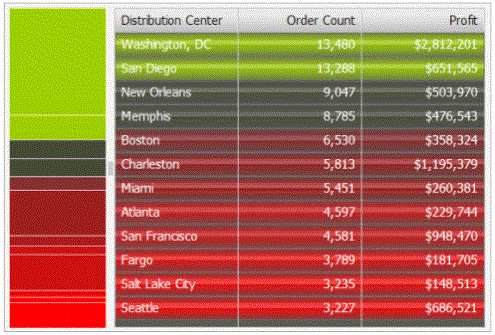
A grid that provides attribute and metric values with threshold colors applied to the values from top to bottom. The color bands on the grid reflect the range of values of the first metric on the Grid/Graph.
-
In the example above, the top rows are green and represent the maximum value of the Order Count metric. The next rows are black, denoting neutral metric values, and gradually change into the red of the bottom rows. Red represents the minimum range of values of the Order Count metric. The green-to-black-to-red color gradient is automatically generated by the widget.
-
You can specify whether to divide the metric values into two or three threshold color bands.
-
-
A stacked contribution bar graph on the left that depicts the relative contribution or percent-to-total calculation of a metric. This bar reflects the values of the second metric on the Grid/Graph.
-
Specific colors are used to depict good, neutral, and poor performance:
-
Green indicates good performance
-
Black indicates neutral performance
-
Red indicates poor performance
Data requirements for a Weighted List Viewer widget
To successfully create a useful Weighted List Viewer widget that can be used to analyze data, you must first correctly define the Grid/Graph. To do this, you must place report objects such as attributes and metrics on the Grid/Graph. The report objects and their placement on the Grid/Graph determine whether the Weighted List Viewer widget can be successfully generated and can display data.
The data requirements for a Weighted List Viewer widget are described below:
-
At least one attribute on the rows. The attribute's elements are displayed in the grid rows of the widget. For example, if you place the Region attribute on the rows, each region is listed in the grid in the widget, with corresponding metric values on the right and a contribution chart on the left.
-
At least two metrics on the columns. The metric data and corresponding colors displayed in the widget reflect the performance of different elements.
-
The first metric on the columns is the threshold metric. This metric is used to set the color of the rows. These colors are also displayed in the grid on the right side of the widget.
-
The second metric on the columns is the weighting metric that determines the percent-to-total value for each business attribute. It is used to set the relative size of each section of the contribution chart on the left side of the widget.
-
Additional metrics are displayed in the grid, but do not have any effect on the threshold colors or contribution chart on the left side of the widget.
A Weighted List Viewer widget does not need a separate selector to allow a user to interact with it. However, you can use a Weighted List Viewer widget as a selector. For an example and more information, see Using Weighted List Viewer widgets as selectors.
For instructions to create a widget, see Creating widgets. For information on formatting a Weighted List Viewer widget, see Formatting Weighted List Viewer widgets.
