Strategy One
Introduction to Analyzing Data in a Graph Matrix Widget
A Graph Matrix widget allows you to quickly analyze various trends across several metric values. You can use the widget to assess questions such as "How are sales comparing vs. forecast, by time and region?".
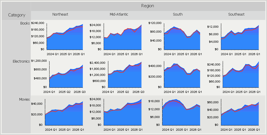
The Graph Matrix widget consists of several area graphs that display current values. Each area graph also has a line graph above it to show forecasted values. One graph is displayed for every combination of elements from the attributes on the rows and columns of the Grid/Graph report that contains the widget.
For example, in the widget below, the rows of the report contain the Category attribute elements and the columns contain the Region attribute elements. Twelve graphs are displayed because data exists for four regions and three categories of products.

A separate area graph is produced for each combination of region and product category. For example, one area graph focuses solely on electronics product figures in the Northeast region. Values in that graph are plotted across quarter (on the X-axis) and revenue (on the Y-axis). The line graph at the top of the area graph represents revenue forecast metric values, or the amount of revenue the company predicted that it would generate.
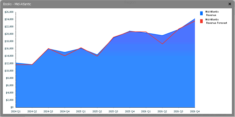
You can maximize a specific area graph by double-clicking it. The graph opens in a new window, as shown below:

Each area graph in a Graph Matrix widget has the following characteristics, as shown above.
- The X-axis provides the time scale. For example, the X-axis can represent weeks, quarters, or years. In the example above, the X-axis represents quarters.
- The Y-axis provides the metric values. For example, the Y-axis can represent revenue, profit, or units sold. In the example above, the Y-axis represents the Revenue metric.
- The area graph shows the current values, allowing you to see how values changed over time.
- The line graph at the top of the area graph shows the predicted, or forecasted, values.
- The black reference line in the area graph (not displayed above) shows the average for only the specific graph you are looking at.
- The red reference line in the area graph (not displayed above) shows the average metric value for all of the graphs in the same row of the Graph Matrix widget. This allows you to easily compare one graph in the widget to another.
