Strategy One
Introduction to Analyzing Data in a Microcharts Widget
The Microcharts widget consists of compact representations of data that allow you to quickly visualize trends in data. Microcharts convey information so that you can, at a glance, determine the trend of a metric over time or how a metric is performing compared to forecasted figures. The Microcharts widget is useful for this purpose because individual microcharts can display attribute and metric data in a small graph that would otherwise be displayed as a single value in a grid report cell.
Use a Microcharts widget to quickly visualize the trend of a metric at a glance without having to know many additional details. The bar, sparkline, and bullet microcharts used in the Microcharts widget convey information that you can understand just by looking at the graph once.
A designer can add up to three types of microcharts to a Microcharts widget. For example, bar and sparkline microcharts are included on the left side of the widget shown below. These microcharts convey the trend of a metric over time, from left to right. On the right side of the widget, bullet microcharts reveal the percentage of cases that were closed, in correlation with the goals for the regions, which are represented by the vertical lines within the bullet microcharts.

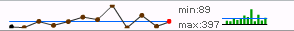
When you hover over a data point in a microchart, information about that data point is displayed in a tooltip. For example, if you hover over a bar in the bar chart microchart shown above (Trailing 12 Months, Min/Max), the tooltip displays the month and the number of open cases.
The data represented on Microcharts widgets are generally key performance indicators, or KPIs, for various attribute elements. KPIs are metrics used to evaluate how a company or business unit within a company reaches a goal. Examples of KPIs are Revenue, Profit, and Employee Headcount. In the example above, each Region attribute element is being evaluated based on two KPIs, Open Cases and Closed Cases.
A Microcharts widget may also list the KPIs in the rows of the widget. This type of display is called KPI List Mode and it provides a summary of how the company as a whole is performing, instead of individual attribute elements. The example widget above, displayed in KPI List Mode, would show Open Cases for all regions in one row and Closed Cases for all regions in the second row.
Types of Microcharts
The different types of microcharts are:
-
Bar charts, which plot a metric with respect to time using a single bar, displaying a metric's current value and historical value to visualize the shape of the trend.

-
Sparklines, which plot a metric with respect to time using a line graph, displaying a metric's current value and historical data to visualize the shape of the trend. Sparkline microcharts consist of the following:
- A line graph that depicts the metric's value over time.
-
A horizontal reference line, which provides a comparison point between the actual values and the reference values.

-
Bullet microcharts compare the value of one metric against other metrics, typically representing a target value. One common example is comparing the year-to-date value of a metric to the annual target or the forecast of the metric. Bullet charts consist of the following:
- A horizontal performance measure bar. This represents the actual metric value.
- A vertical reference line, which is typically the target value for the metric.
- Colored reference bands (Band 1, Band 2, and Band 3) that indicate a numeric range in which the metric's values exist.

How the Microcharts Widget is Displayed: Operation Modes
You can view and interact with a Microcharts widget in several ways, known as operation modes. Each of these modes provides you with a unique way of analyzing the microcharts and data within the widget. Which mode is used in a particular Microcharts widget is defined by the document designer. These modes include the following:
-
Grid: This is the default operation mode for a Microcharts widget. In this mode, all the rows of microcharts are displayed at the same time, from top to bottom, as shown below:
While in Grid mode, if the rows of the grid have at least three attributes, each attribute except the right-most attribute is combined and displayed as a row in the widget. For example, if Region is the first attribute and Call Center is the second attribute, rows are displayed for Northeast Boston and Northeast New York.
If the widget groups and indents these rows in a hierarchical tree display, you can collapse or expand the groups to show different levels of detail, with each level representing a different attribute. For example, in the image below, rows are grouped by the Region attribute. The Northeast group is expanded to display the elements of the Call Center attribute, with the rows Boston and New York.

You can sort a column of data in ascending or descending order by hovering the cursor over a column header and clicking the sort icons. You cannot sort any columns that contain microcharts. Any changes you make to the sort order of the widget are saved when you save the document.
-
Vertical Scroll: In this mode, you can view each row of microcharts as they automatically scroll from the top to the bottom. You can also manually navigate from one row to the next using the Previous and Next buttons on the right side of the widget, as shown below:

-
Ticker: In this mode, microcharts and supplemental text are displayed in a scrolling ticker that moves from right to left, as shown below. You can also manually scroll from one ticker to the next using the Previous and Next buttons on the right side of the widget. Text may have been added next to each microchart to provide background information or highlight a trend displayed in the microchart. This text is displayed alongside the microcharts as they scroll horizontally, as shown below:

Comparing Microcharts to a Target or Average: Reference Lines and Bands
Microcharts are designed to allow you to understand overall trends in data at a glance, but you can also analyze the individual data points that make up the trend. Comparing the values in a microchart to reference lines and bands allows you to understand how an attribute element or KPI is performing against a standard. You can evaluate the performance of an attribute element or KPI in a Microcharts widget in one of the following ways:
- To display a tooltip with detailed information on each data point, hover over individual nodes on the sparkline or bars in the bar graph. If the sparkline does not have any nodes, hovering over the line where the nodes would be also displays the tooltip. (Available if tooltips are enabled for the document.)
-
To compare data in a sparkline or bar graph microchart to an average, look at each data point's height relative to the horizontal blue line on the microchart. The horizontal blue line represents the average value of all data points in the microchart. (Available if reference lines are enabled.)
-
To compare data in a bullet microchart to a target value, look at the length of the bullet microchart in comparison to the vertical blue line. The vertical blue line represents the target value for the bullet microchart. If the bullet does not cross the blue line, this means that the target value was not attained. (Available if reference lines are enabled.)

- To categorize the KPI value of a bullet microchart as low, medium, or high, look at the bullet's length relative to the shaded bands behind it. The dark band represents low values, the lightly shaded band represents high values, and the band in-between represents medium values. If the bullet crosses into the lightly shaded band, this means that the bullet has a high value for that KPI. (Available if reference bands are enabled.)