MicroStrategy ONE
Introduction to Analyzing Data in a Weighted List Viewer Widget
The Weighted List Viewer widget combines the data visualization techniques of thresholds and graphical weighting into a single visualization. This enables you to assess the performance of a group of items.

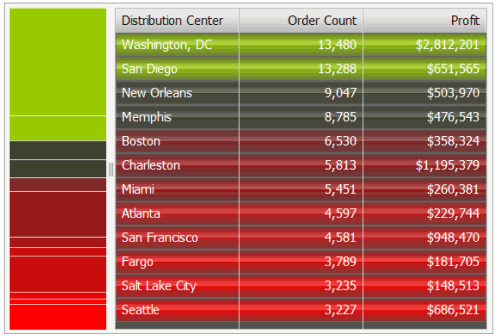
Thresholds in the widget highlight rows based on the value of the first metric in the widget. Specifically, rows are highlighted according to the range of values from the first metric in the widget's columns. The rows are also automatically ordered so that metrics that are performing well are placed at the top and metrics that are performing poorly are at the bottom. A stacked bar chart is included next to the grid; it indicates the relative contribution, or weight, of each row.
In summary, the Weighted List Viewer widget has the following characteristics:
-
A grid that provides attribute and metric values with threshold colors applied to the values from top to bottom. The color bands on the grid reflect the range of values of the first metric on the Grid/Graph report that contains the widget.
In the example above, the top rows are green and represent the maximum value of the Order Count metric. The next rows are black, denoting neutral metric values, and gradually change into the red of the bottom rows. Red represents the minimum range of values of the Order Count metric. The green-to-black-to-red color gradient is automatically generated by the widget.
- A stacked contribution bar graph on the left that depicts the relative contribution or percent-to-total calculation of a metric. This bar reflects the values of the second metric on the report that contains the widget.
-
Specific colors are used to depict good, neutral, and poor performance. By default:
- Green indicates good performance
- Black indicates neutral performance
- Red indicates poor performance
These color settings can be changed by the document designer.
