Strategy One
Introduction to Analyzing Data in a Map Widget
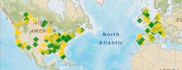
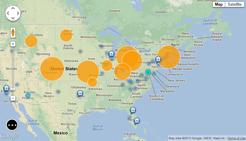
You can display your data as locations on a map using the Map widget. An example of a Map widget is shown in the image below, with data displayed using colored image markers in the widget.

Depending on how the widget was designed, a Map widget can display locations on the map as follows:
- Bubble markers, which are shown as orange bubbles in the example below this list. The size of the bubbles can be determined by a metric. In the example below, the bubbles are sized according to the Profit metric.
- Image markers, which are shown as blue and white markers in the example below this list. The document designer selects the type of image marker.
- A density map, which automatically colors the map based on metric values or the concentration of locations of interest on the map. In the example below this list, locations of interest are represented by blue areas.
- Map areas, representing countries, states, etc. The document designer can color-code areas based on the value of a metric.
-
A map path, which consists of locations on the map that are connected by a line. The line extending outward from each location on the map is displayed as thicker for larger metric values, and thinner for smaller metric values.

If the Map widget contains multiple sets of map markers (called layers), you can choose which map markers to analyze by displaying or hiding each layer. For example, in the image above, the map contains three different layers of data, each displayed using a different type of map marker. You can choose to display only the bubble markers, both bubble markers and the density map, bubble markers and image markers, etc.
You can analyze data in a Map widget as follows:
-
If the Select icon
 is displayed in
the widget, or if the map toolbar icons are displayed as shown in
the image below, you can analyze data in the widget by viewing different
sets of map markers, changing the display theme of the widget, and
so on.
- If
the map toolbar icons are displayed as in the image below, you
can analyze data in the widget by changing the metric used to display
data in the map, drill on data, and
so on.

Analyzing a Map Widget
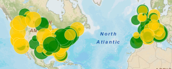
If the map toolbar icons are displayed as shown in the image below, you can analyze data in the Map widget by changing the metric used to display data in the map, drill on data, and so on. An example of a Map widget is shown in the image below, with data displayed using colored bubble markers in the widget.
![]()

See the following list of actions you can perform to analyze the data in a Map widget, and steps to perform them.
Zoom in or out of the map display
- Click the thumb on the slider located on the left side of the map.
- To zoom in on the map, drag the thumb towards the + side of the slider.
- To zoom out on the map, drag the thumb towards the - side of the slider.
Pan the map display to see a different region of the map
Click on the map, then drag it in the direction you want to pan the map display.
Change the metric used to display data in the map
From the drop-down
at the top of the map ![]() , select
the metric to use to display data.
, select
the metric to use to display data.
For example, the designer of the widget has chosen to format the color of map markers based on the value of the Profit metric. If you select the Profit metric, green map markers are displayed for larger profit values and red map markers are displayed for smaller profit values.
Select locations one at a time
If the widget has been designed to be used as a selector, you can automatically filter data displayed in grids, other widgets, panel stacks, and so on by selecting items in the map.
- From the widget's toolbar,
click the Mouse Click Selection
icon
 .
. - Click a location to select it.
Select locations within a rectangular region
If the widget has been designed to be used as a selector, you can automatically filter data displayed in grids, other widgets, panel stacks, and so on by selecting items in the map.
- From the widget's toolbar,
click the Rectangular Area
Selection icon
 .
. - Click and drag on the map to enclose a set of locations within a rectangle shape.
Drill on data in the map
This option is available if the Map widget has been designed to allow drilling.
- To select locations one at a time, from the widget's toolbar, click the Mouse Click Selectionicon
 .
. - To select the locations within a rectangular region, from the widget's toolbar, click the Rectangular Area Selection icon
 . Click and drag on the map to enclose a set of locations within a rectangle.
 - From the widget's toolbar, click the Drill icon.
Display additional information for a location in the widget
From the widget's toolbar,
click the View Information
Window icon ![]() . When you click a location
in the widget, an Information Window is displayed, containing
detailed information about the location.
. When you click a location
in the widget, an Information Window is displayed, containing
detailed information about the location.
If left and right arrows are displayed at the top of the Information Window, you can click the arrows to view information for nearby locations.
Display lines that show relationships between locations on the map
This option is available if the designer has added affinity lines.
From the widget's toolbar,
click the Affinity
icon ![]() , then click a map marker on the
map to display lines representing the relationships between
the selected marker and other locations on the map. Thicker
lines represent stronger relationships.
, then click a map marker on the
map to display lines representing the relationships between
the selected marker and other locations on the map. Thicker
lines represent stronger relationships.
Analyzing a Map Widget That Can Support Multiple Sets of Map Markers
See the following list of actions you can perform to analyze the data in the Map widget, and steps to perform them.
If
the map toolbar is not displayed as shown in the image below, click
the Select icon ![]() in the widget to display it.
in the widget to display it.
![]()
Zoom in or out of the map display
- Click the thumb on the slider located on the left side of the map.
- To zoom in on the map, drag the thumb towards the + side of the slider.
- To zoom out on the map, drag the thumb towards the - side of the slider.
Pan the map display to see a different region of the map
Click on the map, then drag it in the direction you want to pan the map display.
Switch between different display themes to view the map, such as Map and Satellite
From the drop-down at the top of the map, select the display theme, such as Terrain or Satellite.
View additional information about a specific map marker
Click the marker on the map. Additional information about the location is automatically displayed in a pop-up Information Window.
If left and right arrows are displayed at the top of the Information Window, you can click the arrows to view information for nearby map markers.
Display or hide layers of map markers
This option is available if the document designer has added multiple layers of markers to the map.
- From the widget's toolbar,
click the Multiple grids
icon
 .
. - To display a layer, select its checkbox.
- To hide a layer, clear its checkbox.
Determine the metric to use to display map markers in a layer
Depending on how the widget was designed, the value of this metric is used to size and color bubble markers, color image markers, color areas on a density map, or determine the thickness of map path lines.
- From the widget's toolbar,
click the Multiple grids
icon
 .
. - Under the name of the
layer, select the metric to use to display data. In the example
shown below, the markers in the Bubble Markers layer are displayed
based on the Count Carriers metric, but you can change it
to the Profit metric.

Select map markers one at a time
If the widget has been designed to be used as a selector, you can automatically filter data displayed in grids, other widgets, panel stacks, and so on by selecting items in the map.
- From the widget's toolbar,
click the Multiple Marker
Selection Tool icon
 .
. - Click each map marker that you want to select. When finished, click Done to select the map markers.
Select map markers within a rectangular region
If the widget has been designed to be used as a selector, you can automatically filter data displayed in grids, other widgets, panel stacks, and so on by selecting items in the map.
- From the widget's toolbar,
click the Rectangular Selection
Tool icon
 .
. - Click and drag on the map to enclose a set of map markers within a rectangle shape.
Clear all map marker selections
From the widget's toolbar,
click the Remove Selections
icon ![]() . Click OK.
. Click OK.
Display lines that show relationships between locations on the map
This option is available if the designer has added affinity lines.
From the widget's toolbar,
click the Filter Affinity
Lines/Arcs icon ![]() , then
click a map marker on the map to display lines representing
the relationships between the selected marker and other locations
on the map. Thicker lines represent stronger relationships.
, then
click a map marker on the map to display lines representing
the relationships between the selected marker and other locations
on the map. Thicker lines represent stronger relationships.
