MicroStrategy ONE
Defining the parts of a panel stack
The panel stack is the holder for a group of panels. You must add a panel stack before you can insert more panels (a new panel stack already contains one panel). The panels contain the controls (Grid/Graphs, text fields, and so on) that actually display the data, such as metrics and graphs, that a user sees.
The user sees only the border of the panel stack. The border properties include 3D effects, drop shadows, and rounded corners (displayed in Flash Mode only), as well as standard border options such as color and style. The background color comes from the individual panel; you can format each panel to have a different background color.
Most of the properties that control a group of panels are set in the panel stack. These properties include whether a title bar or pop-up text is displayed, as well as size and position information.
The title bar, when displayed, is an area across the top of the panels that shows the title. You can choose whether the title bar displays the name of the panel stack or of the panel currently being displayed. By default, the title bar also displays Next and Previous arrows to allow users to change panels in MicroStrategy Web and in Flash View in MicroStrategy Developer, although you can hide these arrows.
The current panel is the panel currently displayed in Design View. It is also the panel that is displayed on the panel stack when the document is viewed in PDF view or in MicroStrategy Web.
If a panel stack contains more than one panel, a user needs a way to change panels. By default, the title bar displays arrows that allow users to move through the panels. If you choose to hide the arrows or hide the title bar, you need to add a selector, such as a radio button or pull-down list, to allow users to display the different panels of a panel stack.
-
When a user switches to PDF View or to Express Mode in MicroStrategy Web, whichever panel was current becomes the only panel displayed, as well as the only panel that can be printed. The user cannot change to a different panel in PDF View or Express Mode.
-
In Interactive Mode, Editable Mode, and Flash Mode in MicroStrategy Web, a user can click the selector to switch panels.
A selector is not part of a panel stack, unlike the other items described in this section. A selector is a different type of control and is added to the document separately. The title bar, for instance, is an area of the panel stack, and each panel is contained in the panel stack. However, a selector can be an important addition to a panel stack because a selector allows the user to switch panels. The selector can also display the names of the different panels, so that a user can tell at a glance which panel he wants to view. The default arrow selectors on the title bar do not display the panel names. For more information, including examples and procedures, about selectors, see Providing interactivity to users: Selectors.
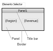
The following diagram shows a panel stack and the selector that targets it, in Design View. The panel is the light gray area containing the text fields Region and Revenue. The title bar is the darker gray area at the top, labeled Panel1. The panel stack border is displayed as a thick black line; note that it surrounds the entire panel, including the panel and the title bar. The selector (labeled Elements Selector) is a separate control placed above the panel stack. In MicroStrategy Web, the selector allows the user to choose the region to display.

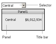
The following diagram shows the same panel stack and selector in Interactive Mode in MicroStrategy Web. The panel, panel stack, and border appear the same, except that the text fields have been replaced by data. The selector is rendered as a drop-down list of the regions. The Central region has been selected, so its data is displayed in the panel.

