Strategy ONE
Design ideas and examples
You can also find design ideas in Best practices for designing effective interactive documents.
-
Design an interactive document that monitors individual or group contributions to overall business goals. Provide a gauge widget or thermometer widget so users can measure their progress toward goals at a glance. For example, use a widget to showcase some key metrics, such as average number of transactions per customer, or average revenue per customer.
-
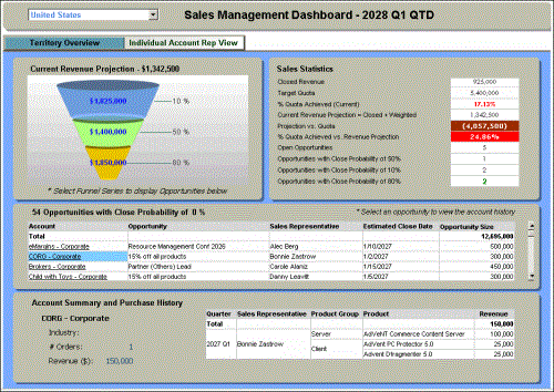
Design an interactive document for regional sales managers at two levels: One level shows an overview of sales in the region, and the other level contains grid reports displaying details on each account representative's individual accounts. The following two images show samples of each of these levels in a single document. The first image shows the regional (or Territory) overview level:
-

-
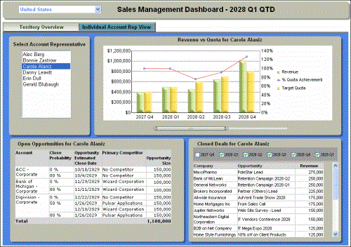
The next image shows the second layer, displaying details of the accounts for each account representative:
-

-
The layers in this document were created using panel stacks and selectors. For more information, see panel stacks and selectors.
-
-
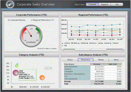
Design a key performance indicators document that lets users look at one or more gauges to instantly assess key performance data. Provide graphs that let users compare current performance against established targets so they can identify opportunities or issues. Include a report or two that provide supporting data so users can see what is behind the performance numbers. An example is shown below.
-
-
Design a financial document that monitors all key financial statements in one screen. For example, you might include an income statement as the main feature of the document, then add a smaller grid report and a graph report below it. Add a selector to the income statement and connect it to the two supporting reports. When a user selects a line item in the income statement, such as Total Operating Expenses, the supporting reports show detailed operating expenses in the grid, and actual and planned operating expenses by quarter in the graph.

