MicroStrategy ONE
Organizing interactivity features on a document
The result of a user's interactive selections can impact multiple objects simultaneously. To make this easier to design, you can use a panel stack, which is a collection of panels. Each panel can contain groups of objects. Panels help you display only those groups of data that should be seen at the same time.
Additional features let the user navigate between panels, and quickly change the display of data within a panel. Each is described below.
Panels and panel stacks
A control is any selectable item in the document's Layout area. This can be a text field, line, rectangle, image, panel, panel stack, selector, or Grid/Graph object. When designing a document, controls are organized together in small groups. These groups of controls are placed in a holder called a panel. Because the controls are grouped together on a panel, they can be presented to the documentuser one group at a time. This lets the designer create several different views (or panels) of data, each view (panel) containing a logical grouping of controls that display data that is related in some meaningful way.
A panel stack is a collection of individual panels, stacked on top of each other. Only one panel can be displayed at a time. An analyst can flip from panel to panel within a document's panel stack, displaying exactly the set of information he wants to see grouped together on the screen.
The sample interactive document shown in What is an interactive dashboard-style document? and Adding interactivity to Report Services (RS) documents uses a panel stack to provide the Corporate, Regional, and City "views". Each view is an individual panel in the panel stack.
For more information, examples, and procedures for panels and panel stacks, see Layering data in interactive documents: Panels and panel stacks.
Selectors
A selector is an element of a document that allows a user to change the data he is viewing. A selector can be displayed as a button bar, a drop-down list, radio buttons, and so on. A selector can change panels or the focus of a Grid/Graph. Examples of selectors are shown below:

Selectors allow a user, in Interactive Mode and Editable Mode in MicroStrategy Web, to:
-
Flip through the panels in a panel stack to display the different panels. The selector for the panel stack in the sample document is a button bar, which appears to the analyst as the "view" buttons.
-
Display different attribute elements or metrics in a Grid/Graph. For example, a user can slice or filter the data on a graph by selecting specific regions or metrics. In the sample document in Adding interactivity to Report Services (RS) documents, the slider is the selector for the Regional Performance graph, while the category buttons are the selector for the Subcategory Analysis grid.
For more information, examples, and procedures for selectors, see Providing interactivity to users: Selectors.
Title bars
A title bar is simply an area across the top of a panel stack or Grid/Graph. You can choose whether to display the title bar for each panel stack and Grid/Graph. When it is displayed, the title bar contains a title and several buttons.
-
The title identifies the panel, panel stack, or Grid/Graph.
-
The buttons allow users to minimize and maximize Grid/Graphs in MicroStrategy Web.
For examples and procedures to add a title bar to a Grid/Graph, see Adding title bars to Grid/Graphs. For examples and procedures to add a title bar to a panel stack, see Displaying title bars in panel stacks.
Quick switch
Quick switch is a button that allows an analyst to quickly change a Grid/Graph from Graph view to Grid view and back, with a single click. The quick switch button is available in MicroStrategy Web, in both Interactive Mode and Editable Mode; you cannot use it in MicroStrategy Developer. However, in MicroStrategy Developer you can determine whether quick switch is available in Web.
The button to perform the quick switch is located at the top of the Grid/Graph, as shown below.
![]()
For instructions to enable quick switch, see Enabling quick switch for Grid/Graphs.
Widgets
A widget is a type of Report Services control that presents data in a visual and interactive way. You can think of widgets as interactive Flash-only graphs that dynamically update when you select a new set of data to view. The document user can even interact with some types of widgets to manually select a set of data to analyze. A variety of widget types, such as Gauge, Heat Map, and Stacked Area widgets, are available for use in MicroStrategy documents. Although each type of widget looks different and is used in a unique way, the main purpose of all widgets remains the same: to provide analysts with a visual and interactive look into their data.
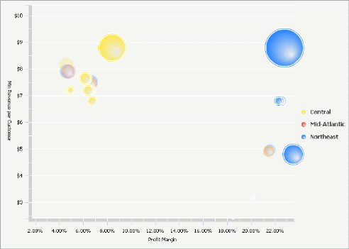
For example, the Interactive Bubble Graph widget below allows analysts to drill into each bubble in the graph by clicking it. Analysts can also use the time animation toolbar at the top of the widget to watch the bubbles appear on the graph in chronological order.

For more information, including examples and procedures, see Providing Flash-based analysis and interactivity: Widgets.
Graph styles for interactive documents
The following graph styles are particularly suitable to use in graph reports included in interactive documents:
-
Gauge
-
Funnel
-
Area
-
Vertical stacked bar
-
Combination: Line and horizontal bar
-
Bubble
-
Pie
For information about designing these types of graphs, see About designing and working with graph reports.
