Strategy ONE
Adding interactivity to Report Services (RS) documents
A key aspect of a dashboard-style document is the interactivity it allows. Interactivity lets analysts dynamically change the data displayed in Grid/Graphs or change other objects on the document.
You can add interactivity to your documents using a mix of the following features.
Analyzing specific attributes, elements, or metrics: Button bar
In the interactive document sample in What is an interactive dashboard-style document?, the buttons in the Subcategory Analysis grid can be used to change the product category displayed.
The document initially displays data for the Music category. Click the Books button to show data for that product category instead, as shown below.
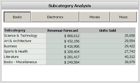
This example uses a Grid/Graph and a button bar selector. For a description of Grid/Graphs and procedures to create them, see Displaying reports in documents: Grid/Graphs. For a description of selectors and procedures to create them, see Providing interactivity to users: Selectors.
Analyzing across the company: Button bar
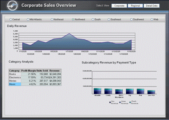
Another example of a button bar in this example is the buttons at the top right of the document. An analyst can use them to switch views, displaying a different set of grids and graphs which show a different set of data.
When you click the Regional button at the top of the document, a different set of grids and graphs is displayed, as shown below:
Analyzing ranges of time: Slider
In the interactive document sample in What is a Report Services (RS) dashboard?, an analyst can use the slider along the bottom of the Regional Performance graph to change the length of time displayed and specific range of time covered in the graph's data.
The document initially displays regional performance for August 2025 to February 2026. You can move the slider to change the range of time, for example, to display March to May 2028. You can extend the length of time displayed by dragging the right end of the slider to lengthen or shorten the slider. The graph now shows performance for March to September 2028, as shown below.
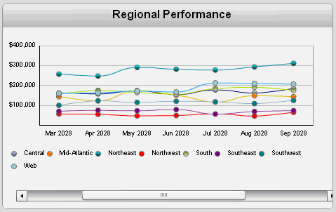
This example uses a Grid/Graph and a slider-style selector. For a description of Grid/Graphs and procedures to create them, see Displaying reports in documents: Grid/Graphs. For a description of selectors and procedures to create them, see Providing interactivity to users: Selectors.
Analysis at a glance: Gauges, thermometers, cylinders, funnels
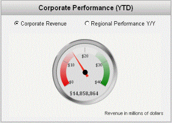
You can use objects such as gauge graphs, funnel graphs, gauge widgets, thermometer widgets, and cylinder widgets to provide analysts with a quick view of important KPIs. These graphs and widgets are good for analyzing data at a quick glance. They are most effective when placed near the top of a document.
The image below is an example of a gauge graph that is used at the top of a document to highlight corporate revenue and regional performance.
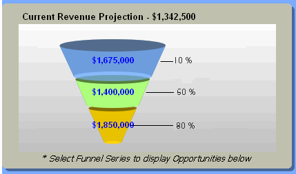
The image below is an example of a funnel graph that provides a quick look at current revenue projections.
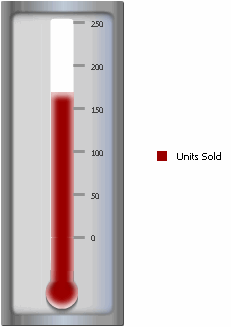
The image below is an example of a thermometer widget in a document in MicroStrategy Web. It allows an analyst to quickly glance at the number of units sold.
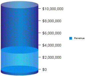
The image below is an example of a cylinder widget in a document in MicroStrategy Web. An analyst such as a regional manager can quickly glance at the cylinder to see how much revenue was produced.
For descriptions and examples of the widgets that you can add to a document, as well procedures to add them, see Providing Flash-based analysis and interactivity: Widgets.
