Strategy ONE
Panel stack examples
Before you begin
The panel stack is the holder for a group of panels. You must add a panel stack before you can insert more panels (a new panel stack already contains one panel). The panels contain the controls (Grid/Graphs, text fields, and so on) that actually display the data, such as metrics and graphs, that a user sees. For a more detailed description of panels and panel stacks, see Layering data in interactive documents: Panels and panel stacks.
Example: Layering Grid/Graphs on panels
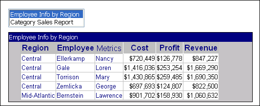
For example, you can stack two panels, each containing a different Grid/Graph. In Interactive Mode, Editable Mode, and Flash Mode in MicroStrategy Web, a user can flip between the panels, quickly replacing one Grid/Graph with the other. In the following image, a Grid/Graph is displayed on a panel. Notice the name of the panel, in the title bar at top of the panel: Employee Info by Region. Notice also that the Grid/Graph is the only control on the panel.

Above the Grid/Graph is a list box containing the names of the panels in the panel stack: Employee Info by Region and Category Sales Report. When you select the Category Sales Report, the other panel is displayed. Notice the name of the panel in the title bar: Category Sales Report. Also, notice that this panel includes a text field in addition to the Grid/Graph. The text field reads "Forecast based on 2022-2024 data."

Using panels in this fashion allows many independent layers of data within a single document page. You can also layer documents in a single document with the use of panels, as described in the next example.
The list box is a selector, a type of control which allows a user to interact with the panel stack. While selectors are discussed briefly throughout this section, more details on creating them and examples of their various options are provided in Providing interactivity to users: Selectors.
Example: Layering multiple documents in a single document
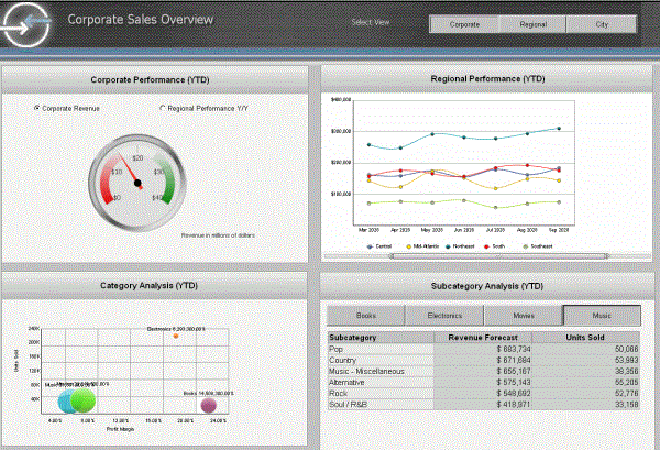
The example above placed only one or two controls (Grid/Graphs and a text field) on each panel. However, you can add multiple controls to each panel of a panel stack, creating layers of complex documents. For example, the following document contains a gauge for corporate revenue, a bubble graph for category analysis, a line graph for regional performance, and a grid report for subcategory analysis. A button bar labeled Select View is displayed at the top left of the document, and the Corporate button is currently selected. This document provides a company-wide view of revenue and performance.

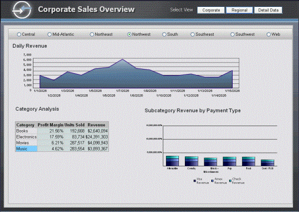
If you click Regional in the Select View button bar, another document displays. As shown below, this document contains an area graph for daily revenue, a grid report for category analysis, and a bar graph for subcategory revenue. This document provides a more detailed view of information, at the regional and daily level.

Each of these documents is on a panel, and the Select View button bar is a selector that allows you to switch between the panels. Using panels to layer multiple documents in the same document can organize related information and provide increasing levels of detail on different documents.
