Strategy One
Format Panel for Grid Visualizations
Starting in Strategy One (July 2025), the Merge repetitive cells setting in modern grid visualizations replaces Arrangement.
Once you add a grid visualization, modern grid visualization, or compound grid visualization to a dashboard and add objects to it, you can format the visualization.
Access
- Open an existing dashboard that contains a grid, modern grid, or compound grid visualization.
- Select the entire visualization or just the area you want to format.
-
The Editor, Filter, and Format panels are stacked together by default. Click Format
 to open it.
-
If the Format panel is not available, do one of the following:
-
Starting in Strategy One (November 2025), click the Format icon
in the left toolbar. -
Prior to Strategy One (November 2025), from the View menu, select Editor Panel to display all three panels. Click Format
to open it.
-
-
Starting in Strategy One (November 2025), you can place the Editor, Filter, and Format panels above and below each other as though in a column. To do this, drag one panel to the bottom of another. You can then adjust the relative height of the panels by hovering your cursor over the line dividing the panels and dragging the resizing icon up or down.
-
-
Select one of the following tabs on the Format panel:
-
Visualization Options
 to format the high-level layout and appearance
 -
Text and Form
 to customize the fonts and forms displayed in various areas on the visualization
 -
Title and Container
 to format the visualization’s title and container
-
Visualization Options
Template Select the template style and color.
Layout Select options for banding, outline, row headers, and column headers including:
-
Enable Banding: Select this check box to apply alternating colors to rows in the grid to increase readability.
Starting in Strategy One (April 2026), you can define the banding for modern grids. You can band by rows or columns, and select the colors.
Click here for detailed steps to band the grid.-
To create horizontal bands, click Row below Banding By. Then choose one of the following options in the Apply Color By drop-down list:
-
Number of Rows to switch colors every specified number of rows. Type the number of rows in Apply Color Every.
-
Row Header to switch colors every other row of the selected header. Choose the Header row.
For example, the grid contains Year and Month. If you band by Month, every other month is a different color. If you band by Year, every other year (including all the month rows in the year) is a different color.
-
To create horizontal bands in a modern grid with column sets, click Row below Banding By. You can band each column set individually or band all the columns at once. Select a column set to band from the Columns drop-down list, or select All. Then choose one of the following options in the Apply Color By drop-down list:
-
Number of Rows to switch colors every specified number of rows. Type the number of rows in Apply Color Every.
-
Row Header to switch colors every other row of the selected header. Choose the Header row.
For example, a grid's rows display Airlines, Departure Airport, and Destination Airport. Its column sets display different metrics for the Year, Month, and Weekday column sets. You can band the Year column set by Airline, the Month column set by Departure Airport, and the Weekday column set by Destination Airport, all in different columns.
-
-
To create vertical bands, click Column below Banding By. Then choose one of the following options in the Apply Color By drop-down list:
-
Number of Columns to switch colors every specified number of columns. Type the number of rows in Apply Color Every.
-
Column Header to switch colors every other column of the selected header. Choose the Header row.
For example, a grid's columns display the Year attribute above the Revenue, Profit, and Cost metrics. If you band by the Metrics, every other column is a different color (2025-Revenue, 2025-Profit, 2025-Cost, 2026-Revenue, and so on). If you band by Year, every other year (including all the metric columns in the year) is a different color.
-
-
To create vertical bands in a modern grid with column sets, click Column below Banding By. You can band each column set individually or band all the columns at once. Select a column set to band from the Columns drop-down list, or select All. Then choose one of the following options in the Apply Color By drop-down list:
-
Number of Columns to switch colors every specified number of columns. Type the number of rows in Apply Color Every.
-
Column Header to switch colors every other column of the selected header. Choose the Header row.
For example, one column set displays the Destination Airport attribute and the Delayed Flights metric. A second column set displays the Weekday attribute and the Total Flights metric. You can band the Airport column set with blue and gray every other column, and the Weekday column set with green and yellow every two columns. Alternatively, you can band all the columns with red and white every other column.
Banding by column is not available if the modern grid contains a microchart.
-
-
First Color: Click the drop-down arrow to access a palette of color options. Choose the color of the initial band.
-
Second Color: Click the drop-down arrow to access a palette of color options. Choose the color of the alternating band.
-
-
Enable Outline: Select this check box to enable outline mode.
-
Row Headers: Enable to display row headers on the grid. If they are enabled, you can:
-
Merge Repetitive Cells: Combine adjacent rows that contain the same value into a single, larger cell. This makes the grid more readable by removing redundant information and grouping related data.
-
Lock Headers: Locked headers do not move when you scroll the grid side to side. This makes it easy to identify the data in each row by keeping the context.
-
-
Column Headers: Enable to display column headers on the grid. If they are enabled, you can:
-
Merge Repetitive Cells: Combine adjacent columns that contain the same value into a single, larger cell. This makes the grid more readable by removing redundant information and grouping related data.
-
Lock Headers: Locked headers do not move when you scroll the grid up and down. This makes it easy to identify the data in each column by keeping the context.
-
Spacing Select options for cell padding, column size, and row size including:
-
Cell Padding: Display a Small, Medium, or Large amount of padding in the grid cells.
-
Column Size : Select one of the following options:
Fit to Container: Expand the columns to fit the available space in the grid container. This is the default option.
Fit to Content: Size the grid columns to fit the data within the column.
Fixed: Display columns using a fixed width. From the next drop-down list, select the column to adjust, or select All Columns to adjust all columns to the same width. Type the width of the column, noting the unit of measurement (which you can adjust in the user preferences).
Row Size: Select one of the following options:
Fit to Content: Size the height of the rows to fit the data. This is the default option.
Fixed: Display rows using a fixed height. In the All Row Height box, type the row height, noting the unit of measurement.
Microcharts Available for modern grids with microcharts. Select the chart height and vertical alignment for each microchart individually or for all microcharts at once.
-
If you select a sparkline microchart, you can display or hide the data point spots. If they are displayed, you can display all data points or only key data points. If you select key data points, you can define which are key: first value, last value, maximum value, minimum value, or any combination.
-
If you select a trend bar microchart, determine whether to display negative values above or below the axis.
Text and Form
You can define the font, text wrapping, cell fill, and borders of:
-
The entire grid
-
Column headers
-
For a grid or compound grid, you can hide or display the Headers.
-
For a modern grid with microcharts and/or column sets, you can define the options for each microchart or column set individually or for all microcharts and column sets at once.
-
Beginning in Strategy One (March 2025), select All Microcharts or the specific microchart to format rather than Column Headers. See New Text and Form Options for Modern Grids below.
-
-
Row headers
-
Values
-
For a grid or compound grid, you can hide or display the Headers.
-
For a modern grid with microcharts and/or column sets, you can define the options for each microchart or column set individually or for all microcharts and column sets at once.
-
If you select a sparkline microchart, you can choose the color of the line, the fill color below the line, whether to display or hide the data point spots. If they are displayed, you can select the color of the regular and the key spots. To select which key spots to display, see Visualization Options .
-
If you select a trend bar microchart, you can select bar colors for positive and negative values.
-
If you select a bullet microchart, you can select the color for the actual, target, and individual bands.
-
Beginning in Strategy One (March 2025), select All Microcharts or the specific microchart to format rather than Values. See New Text and Form Options for Modern Grids below.
-
New Text and Form Options for Modern Grids
Strategy One (March 2025) provides more granular formatting for modern grids, including the ability to format individual attributes and individual metrics. You can define the font, cell fill, and borders of:
-
All the attributes on the grid
-
Define the options for the Headers only, the attribute Elements only, or All to define both at once (attribute elements are the values of an attribute).
-
-
All the metrics on the grid
-
Define the options for the Headers only, the metric Values only, or All to define both at once.
-
-
All microcharts
-
Define the options for Headers only, Values only, or All to define both at once.
-
-
Each attribute on the rows individually
-
Define the options for Headers only, attribute Elements only, or All to define both at once.
-
-
Each microchart
-
Define the options for Headers only, Microcharts only, or All to define both at once.
-
When you select a specific microchart and then Microcharts, you can define the options specific to that microchart type.
-
-
Each column set
-
Define the options for Headers only, Values only, or All to define both at once.
-
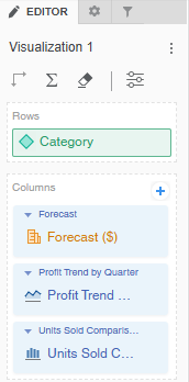
For example, the Editor panel below displays a modern grid that contains the Category attribute in the rows, a Forecast column set displaying the Forecast ($) metric, the Profit Trend by Quarter sparkline microchart, and the Units Sold Comparison by Industry trend bar microchart.
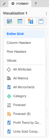
The modern grid's Format panel displayed below shows that you can individually format the attribute on the row (Category), the Forecast column set, the Forecast ($) metric in that column set, the Profit Trend by Quarter microchart, and the Units Sold Comparison by Industry microchart.
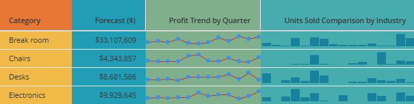
You can individually format different areas of the modern grid to produce the result displayed below. The Category attribute has an orange header and yellow values. The Forecast column set has a blue background. The Profit Trend microchart has a green background. The Units Sold Comparison microchart has a blue-green background.
Title and Container
Format the visualization’s title and container (think of the container as the object that holds the visualization).
Title Bar
You can enable or disable the Title Bar.
-
When it is enabled, you can Customize the Visualization's Title Bar by selecting the fill color, font options, whether to display one or two lines, and personalize action buttons.
Container
-
Fill: Select the background color of the visualization from the palette.
-
Border: Select the style and color of the visualization's borders from the drop-down lists.
-
Beginning in Strategy One (September 2025), you can adjust the Radius of rounded corners for the container.
-
Use a number between 0 and 40.
-
If the current Padding is less than 50% of the updated Radius, Padding automatically increases to match 50% of the new Radius.
-
-
Beginning in Strategy One (November 2025), you can apply a Shadow effect on the container. Select the fill color and opacity of the shadow. Define the shadow effects using the following options:
-
Blur: Controls the softness of the edge to diffuse or spread out the shadow. The range is from 0 to 40, where 0 is a sharply defined line and 40 is the most blurred.
-
Distance: Offsets the shadow from the container. Distance provides a 3D look, implying hierarchy or focus.
-
Angle: Sets the direction of the shadow around the container, measured in degrees. For example, to display the shadow:
-
Directly on the right, use 0.
-
On the bottom and right, use 45.
-
Below the container, use 90.
-
On the top, use 270.
-
-