MicroStrategy ONE
Gantt Chart
Gantt chart (also referred to as project time lines) are Bar graphs that help plan and monitor project development or resource allocation on a horizontal time scale.
A Gantt chart is essentially a horizontal bar chart. Attributes are displayed along the X-axis and metrics are displayed along the Y-axis. The Gantt chart provides a graphical illustration of a schedule that can help you plan, coordinate, and track specific tasks in a project. The data analyzed in a Gantt chart has a defined starting and ending value; for example, Project A begins 4/15/09 and lasts for a total of 40 days. The start time and duration are what allows you to display information as a Gantt chart.
Gantt Chart Example
Gantt charts are useful when analyzing human resources information. For example, the following Gantt chart depicts how long certain employees have been working for a company. The beginning of each horizontal bar represents a specific employee's hire date and the end of each bar represents the time at which an employee left the company. The overlap of the bars helps to visualize the workforce in the company during various periods of time. The report shown below displays the employee tenure for a subset of employees in a company.
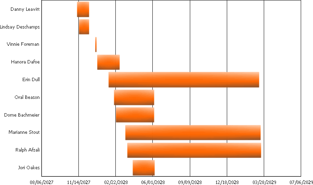
This information can potentially help a project manager in a number of ways. Given the information obtained in a Gantt chart such as this, he or she can better manage his or her resources to accommodate for the lack of personnel, as well as plan future hiring and project distribution.
Gantt charts require conceptual information from attributes, as well as two metrics:
- The first metric defines a starting point for the graph. This can be a particular date or a starting value. For the graph shown above, a Hire Date metric that provides the day an employee was hired serves as the starting point for the employee's employment with the company.
- The second metric defines the duration of the event that you are interested in, and it must match the time interval represented by the starting point. For the graph shown above, the duration of the Gantt chart is determined using a Tenure metric that provides the number of days an employee was hired with the company.
To create the Gantt charts displayed above, a report with the following information shown below was created.
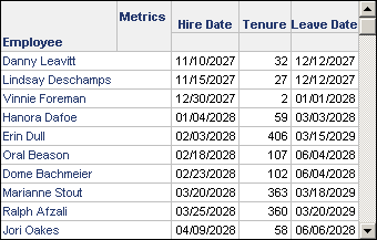
The Hire Date metric defines the starting point for each bar in the Gantt chart. The Tenure metric defines the end point for each bar in the Gantt chart. This metric is calculated by determining the number of days between the Hire Date and the Leave Date. While the Leave Date metric is not part of the display of the Gantt chart, it is shown here to help understand how the data for the Gantt chart was created.
Listed below is some additional information that you can use to re-create the Gantt chart shown above, or to create a similar Gantt chart using your data:
- This Gantt chart was created using the Human Resources Analysis Module, which is a part of the MicroStrategy Analytics Modules.
- The metrics Hire Date and Leave Date were created using the Hire Date and Leave Date facts, respectively. These facts use data that is provided in a date format, and displayed in mm/dd/yyyy format.
- The Tenure metric was created as a compound metric with the formula
([Leave Date] - [Hire Date]). This metric returns integer values for the number of days that an employee was with the company. - When date data is initially displayed on a graph, it may not be displayed in a date format by default. To display the time intervals correctly on the axis, you must modify the number formatting of the axis labels with a date format that matches your date data. For information on defining the number formatting for graphs, see Formatting Numeric Values on a Graph.
- The minimum value for the graph axis that displays time intervals was increased. The default minimum value for a graph axis is zero, but since dates are considered as numbers when creating the graph, this minimum must be increased to improve the display of the graph. To determine the numeric values associated with the time intervals on the axis, you can modify the number formatting of the axis labels to use the general number format. Once you determine the numeric value, you can define a relevant minimum value for the graph axis, and then switch the axis labels back to the proper date format for the date data. For information on defining the minimum or maximum value of a graph, see Adjusting the Layout, Size, and Scale of a Graph.
Using Gantt Charts Effectively
When you create a Gantt chart, consider the following:
- At least two metrics must be displayed in the columns:
- One metric serves as the starting data point.
- One metric serves as the length, or duration, from the starting point.
If you use two metrics that both return dates such as a start date and an end date, the Gantt chart is not displayed correctly.
- A pair of metrics defines start and length values which are translated as a horizontal bar in the graph. These metrics must use the same time interval to accurately display data on a Gantt chart. For example, if your starting point is a specific day such as 07/25/2020, the duration must be provided in terms of days. Therefore, a project that started on 07/25/2020 and ends on 07/31/2020 must have its duration provided as seven days. If, however, project start and end dates are based on a quarterly schedule (for example, starting in quarter one of 2019 and ending in quarter one of 2020) the duration must be provided as the number of quarters that the project was active for.
- Multiple metric pairs can be added to the columns to represent more start-length pairs. If you add an odd number of metrics to the report, the last metric on the report is not displayed on the graph.
- If you use dates to define the time period for the Gantt chart, you may need to change the minimum value of the graph's axis to better display data. For information on defining the minimum or maximum value of a graph, see Adjusting the Layout, Size, and Scale of a Graph.
- For information about the specific options for Gantt charts in MicroStrategy, see the MicroStrategy Developer help.