MicroStrategy ONE
Histogram
A Histogram is designed to group data frequencies in a Bar graph format. Histograms capture how certain data falls within specific intervals, and are often represented as bell curves. The intervals (for example, profit ranges of $200,000-$300,000) appear on one axis. The number of attribute elements (for example, the number of call centers) that fall within each interval are displayed on the other axis. Therefore, a Histogram graph can allow you to answer questions such as:
- How many call centers generated profits within the $200,000 to $300,000 range?
- In which profit range did the majority of the call centers' profits exist?
A Histogram can also display the variation in a performance and helps you make decisions about a process, product, or procedure that could be improved after examining the variation.
The data in a Histogram can be skewed to the left or right. If the Histogram shows a long line of short columns on the left side of the Histogram and the high value on the graph appears on the far right, the data is defined as "left-skewed" or "negatively skewed." If a long line of short columns appears on the right side and the high value on the graph appears on the far left, the data is defined as "right-skewed" or "positively skewed." Data that is skewed either to the left or right can indicate inconsistent procedures or processes. The decisions you make based on a Histogram can include determining the appropriateness of the direction of the skew.
Histogram Graph Types
You can create the following types of Histogram graphs in MicroStrategy:
- Vertical Histogram graph
- Horizontal Histogram graph
Vertical Histogram Graph Example
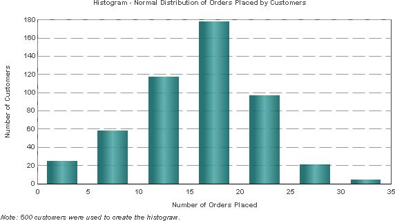
A vertical Histogram graph is shown below. The height of the columns represents the number of customers who placed an order, while the X-axis highlights different ranges of the number of orders placed. For example, the tallest column shows that about 180 customers placed between 15 to 20 orders each.

This graph report, named Histogram - Normal Distribution of Orders Placed by Customers, is available in the MicroStrategy Tutorial project.
Using Histogram Graphs Effectively
- As shown in the example above, Histogram graphs are best suited for large sets of statistical data. In this case, a sample of 500 customers is used, as indicated by the note below the graph.
- Your Histogram graph may not display all of its data on one page when you first build it. If this occurs, from Graph or Grid Graph View, select the Graph menu and then Preferences. Within the General category, adjust the Maximum number of categories setting to reflect the number of report-level elements on which the Histogram is based. For example, the graph above contains order data for 500 different customers, and Customer is the report-level attribute. In this case, you can adjust the Maximum number of categories setting to 500 to reflect the 500 different customers represented in the graph.
In MicroStrategy Web, you can set the maximum number of categories by selecting Graph from the Format menu and adjusting the Maximum: Categories setting within the General tab.
- For information about the specific options for Histograms in MicroStrategy, see the MicroStrategy Developer help.
