MicroStrategy ONE
Adjusting the Layout, Size, and Scale of a Graph
You can determine how your graph is scaled, the overall layout of the graph, and how graph elements such as legends and titles are positioned on the graph.
Before you begin formatting different elements of your graph, you must first consider whether to use manual or automatic graph layout, as explained in the following section.
Pros and Cons of Manual and Automatic Graph Layout
You can control the positioning of graph elements such as legends and titles manually or you can have the system automatically reposition these elements, which helps you avoid overlapping elements on your graph.
For example, suppose you add an attribute to your graph report. When the graph is re-executed, you may notice that your graph's overall layout has changed to accommodate the additional data. You have the option to enable or disable this automatic adjustment.
If you choose the automatic layout setting, any modifications that impact the layout, such as data changes, invoke the automatic positioning of elements such as legends and labels. For example, suppose you select a different page-by attribute on your grid, which results in a larger set of data with longer category names. With automatic layout the graph frame height may need to be adjusted so the axes labels fit. This adjustment is required because when the number of series increases, the height and width of the legend area may need to increase. This reduces the width of the graph's frame.
For automatic layout, if the recalculated legend size is larger than the current background frame, the size of the background frame can automatically expand. Since this option overrides other sizing options, it can lead to a frame size that is unexpected.
The automatic and manual layout options are in the Preferences dialog box, accessible from the Graph menu. By default, automatic layout is selected.
The following table provides a quick overview of the features of automatic and manual graph layout.
|
Layout Type |
Pros |
Cons |
|
Automatic |
Graph elements are repositioned automatically as needed. For example, if you add report objects to the grid report, the graph report automatically resizes to accommodate the additional data. Some objects such as graph legends can still be moved using other methods than manually moving the object on the graph. For information on displaying graph legends, see Displaying and Formatting a Graph Legend. |
You cannot manually move any objects within the graph. Note: If you try to move an element manually, a dialog box opens. If you choose to stay in automatic layout mode, the element does not move. If you switch to manual layout, the element moves. |
|
Manual |
You can position graph elements yourself. For example, you can drag and drop a graph, legend, title, data label, and so on to a new location. Provides the most design flexibility. Provides some automatic layout options such as automatically recalculating the size of the graph legend and repositioning the graph frame and legend. |
You cannot benefit from the automatic resizing features offered by automatic layout. |
Follow the procedure below to learn how to enable either automatic or manual graph layout mode.
To Choose Automatic or Manual Layout for Graph Reports
- View a report in Graph View.
- Choose Graph > Preferences.
- Within the Layout category, select from the following options:
- Automatic layout: Allows graph components to be repositioned automatically.
- Manual layout: Allows you to position graph components yourself. If you select Manual layout, the following option becomes available:
- Re-calculate legend size automatically when data changes: Automatically re-calculates the legend size when data changes. If this option is selected, you can also set the following option.
- Reposition chart frame and legend: Re-positions the legends to a default location such as right or left when data changes. For example, in a graph report, initially you placed the legend frame in the center of the graph report. If you select this check box, change the data, and re-execute the report, the legend frame is moved to one of the default locations on the graph. For more information about this setting, see Example: Manually Positioning a Graph Legend.
- Expand background frame to accommodate recalculated legend sizes: Automatically expands the size of the background frame if the recalculated legend size is larger than the current background frame. This setting is available only if the Automatic layout option or Manual layout: Re-calculate legend size automatically when data changes option is selected.
This option overrides other sizing options and can lead to an unexpected frame size.
- Click Apply.
- Click OK.
Manually Positioning Graph Elements
Sometimes you need to reposition graph objects such as the graph itself, the legend, or titles and subtitles. The extent to which you can manually control the position of graph elements is determined by the following:
- If automatic layout mode is enabled, graph elements are automatically repositioned when anything is resized or readjusted on the graph. Even if automatic layout mode is enabled, you can still choose to place graph elements in certain places on the graph. However, these locations are default locations and are not customizable. For information about automatic layout, see Pros and Cons of Manual and Automatic Graph Layout.
With automatic layout mode enabled, you can place a graph's legend to the left, right, or below a graph by configuring options in the Graph Preferences dialog box (see Displaying and Formatting a Graph Legend). You cannot, however, drag and drop the legend onto another location.
- With manual layout mode enabled, you can manually drag and drop graph elements on your graph, as demonstrated in the following example. For information about manual layout, see Pros and Cons of Manual and Automatic Graph Layout.
Example: Manually Positioning a Graph Legend
If you set your graph layout preference to manual layout mode (as described in Pros and Cons of Manual and Automatic Graph Layout), you can select options to help you position the legend. The size of the legend can change automatically when the data changes. If you select manual layout mode, the legend can be repositioned to a default location, such as right or left, when the data changes.
Place the legend frame in the center of a graph report. Then, choose Graph > Preferences. In the Layout category in the Preferences dialog box, select the Re-calculate legend size automatically when data changes check box, and then the Reposition chart frame and legend check box. Change the data of the report and re-execute it. The legend frame is moved to one of the default locations on the graph report.
To Manually Position a Graph Legend
- View the report in Graph View.
- Choose Graph > Preferences.
- Within the Layout category, if manual layout is not already selected, select Manual layout.
- To have the size of the legend change when the data changes, click Re-calculate legend size automatically when data changes.
- If you selected the legend size recalculation option, you can also have the legend repositioned to a default location, such as right or left, when the data changes. To do this, select Reposition chart frame and legend. Click OK to return to the graph.
- On the graph, click the background of the graph legend, outside of the legend text. A selection box with handles appears.
If boxes appear around the legend text, try clicking further outside of the legend text area until a selection box with handles appears.
- Drag and drop the legend to the desired location.
- Save the graph.
Resizing a Graph
You can manually resize the elements on your graph, including the graph chart itself, if manual layout is enabled, as explained in Pros and Cons of Manual and Automatic Graph Layout.
The following procedure guides you in resizing the actual graph chart within your graph report.
To Manually Resize a Graph
- View a report in Graph View.
- Ensure manual layout mode is enabled. See Pros and Cons of Manual and Automatic Graph Layout for the necessary steps.
-
Click a section of the graph that is blank.
Do not click the actual bars or lines of your graph; instead, click the graph's background. Handles appear around the graph frame.
- Use the handles on each side and corner of the graph to manually resize the graph.
Resizing a 3D Graph Using Auto Arrange
When you set the font size for an axis label to a very large value in a non-3D graph, the graph shrinks to accommodate the new font size. However, in 3D graphs, after you resize the font to the original value, the graph does not expand to its original size. You can resize the 3D graph to its original size by using the Auto Arrange option. This option can be accessed from the Graph menu of the Report Editor.
A graph with a 3D graph style has been created.
To Resize a 3D Graph Using Auto Arrange
- View a report in Graph View, using one of the available 3D graph styles.
- Choose Graph > Auto Arrange.
Scaling a Graph
Configuring the scaling of your graph is one of the most important steps in creating a clear and useful graph report. A graph's scale determines the range of values that appears on your graph's axes, which directly affects how data is presented on your graph. Scaling differs from resizing in that scaling determines how data is measured along each axis. Resizing does not affect actual measurements of data or how that data is presented as a graph.
When you switch a report from Grid View to Graph View for the first time, the graph scaling is automatically set for you. For example, if revenue data does not exceed $5,000 in your grid report, then $5,000 may be set as the highest label on the Y-axis.
To scale your graph efficiently, analyze the data on your grid report and then base your scaling decisions on that data. For example, if profit data on your grid report does not exceed $500,000, consider setting $500,000 as the maximum value on the appropriate axis. This allows elements on your graph such as bars in a Bar graph to be rendered at a considerable size, making it easier for you to view and analyze the data on your graph.
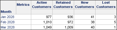
In the report grid in the following image, notice there are no more than 1,049 active customers for any given month. Therefore, the labels on the Y-axis on the graph report do not exceed 1,200. When you switch a grid report to a graph, the scaling of the graph is automatically determined for you. In this case, MicroStrategy Developer produces a graph whose Y-axis does not exceed 1,200. This scaling allows the bars on the graph to appear at a considerable size, which makes the graph more attractive and usable. The grid report and resulting graph report are shown below.
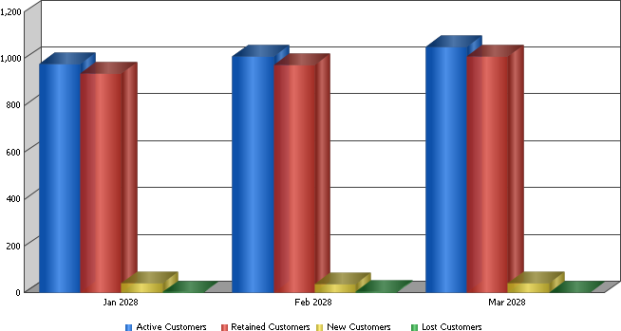
While the automatic scaling displays the active and retained customer data effectively, notice that the new and lost customer data is difficult to interpret from this graph. Another option to improve the scaling of a graph is to use a dual Y-axis. These two axes can then be used to display metrics with similar values when the relative scale of some metric data is far different than the scale of other metric data on the graph. For example, the same graph is displayed below with a dual Y-axis that displays Active Customers and Retained Customers on one Y-axis, and New Customers and Lost Customers on another Y-axis.
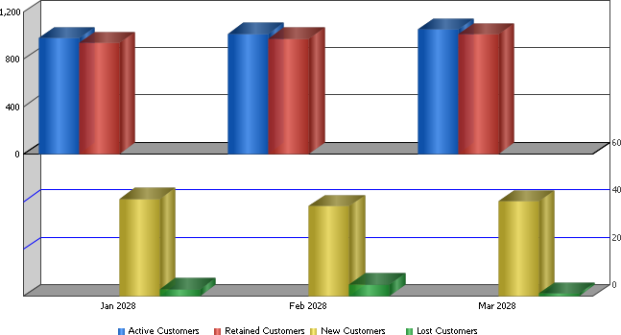
Notice in the graph above that by putting the metrics on separate Y-axes, the scale is improved for the data and all data is easier to interpret and analyze. To further adjust the scale of the graph, you can change the top Y-axis to have a maximum of 1,100 and a minimum of 900. Additionally, you can change the bottom Y-axis to have a maximum of 50. This modified graph is shown below.
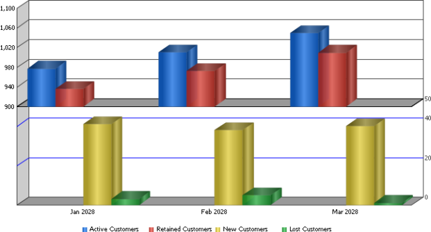
Notice how defining a minimum of 900 for the top graph provides more clarity to the Active Customers and Retained Customers metric values. It is now much easier to see the differences in active and retained customers for each month. This shows that it is just as important to define a good minimum value for a graph as it is to define a good maximum value.
Also, defining a slightly smaller maximum of 50 for the bottom graph has provided a small improvement to the display of data.
The procedure below show you how to manually define the scale of your graph. Steps are provided to adjust scaling in both MicroStrategy Developer and MicroStrategy Web.
Scaling a Graph in MicroStrategy Developer
A graph report has been created.
You are logged in to a project using MicroStrategy Developer.
To Manually Scale a Graph
- In MicroStrategy Developer, view a report in Graph View.
- Select one of the data labels along any of the axes on your graph.
- Choose Graph > Grids and Scales.
- Underneath the Axes category, select one of the available Y-axis categories.
- If the graph uses a dual Y-axis, you can define the minimum and maximum values for the two Y-axes. To define a graph to use a dual Y-axis, see Defining a Graph to Use a Dual Y-Axis in MicroStrategy Developer.
- If the graph uses three-dimensional formatting, you can define the minimum and maximum values for the X-axis and the Y-axis.
- In the Use Manual Setting area, select the Maximum Value and Minimum Value check boxes. You can then enter the maximum and minimum values to define for the Y-axis of the graph.
If you define a manual maximum and minimum value for a graph axis, the axis is not recalculated when modifying the objects or filtering for a graph. This can cause the axis to not adequately represent the graph data when the data displayed for the graph changes. If the data on a graph changes, you can clear the Maximum Value and Minimum Value check boxes and click Apply to allow the graph to automatically recalculate the size of the axis.
You should avoid defining manual maximum and minimum values for graphs that are frequently modified such as graphs that use prompts.
- If the graph uses a dual Y-axis you can also define the minimum and maximum values for the second Y-axis. If the graph uses three-dimensional formatting, you can also define the minimum and maximum values for the X-axis.
- Click Apply.
- Click OK.
Defining a Graph to Use a Dual Y-Axis in MicroStrategy Developer
The procedure below show you how to define a graph to use a dual Y-axis, which can improve the scale of the graph to match the available data.
A graph report has been created. It must be displayed as one of the following graph types which can support a dual Y-axis:
- Area
- Bar
- Line
- Scatter
- Polar
- Radar
- Bubble
Two or more objects (commonly metrics) are included in the series of the graph report.
You are logged in to a project using MicroStrategy Developer.
To Use a Dual Y-Axis in MicroStrategy Developer
- In MicroStrategy Developer, view a report in Graph View.
- Choose Graph > Graph Options.
- Select the Layout category.
- Select the Dual Axis check box. This displays each Y-axis overlaid on top of the other, with each axis using a different color.
- Select the Split Dual Axis check box to display each Y-axis to separately. Displaying a dual Y-axis in this manner can make the graph easier to analyze and interpret.
- Select the Dual Y Options category to define which Y-axis each series object (commonly metrics) is displayed on.
- Select series objects in the Primary Axis or Secondary Axis panes and use the arrow button to change the axis the series object is displayed on. You should include series objects on the same axis if they have similar data ranges.
Review the reports described in Scaling a Graph, which use one Y-axis for metrics that have values between 900-1,000 and use a second Y-axis for metrics that have values between 0-50.
Graphs created in MicroStrategy 9 and later versions distribute series objects evenly between the Primary Axis and Secondary Axis by default. Graphs updated from MicroStrategy releases before version 9 may use a different default dual Y-axis order for the series objects. These default orders can be changed using the arrow buttons available.
- If you selected to split each Y-axis, you can also define the following options:
- Split Position: Defines what percentage of the displayed graph is taken up by each axis. Use the slider to see a sample of how the display changes on the left.
- Show Axis Split: Displays or hides the dual axes split line. This provides additional visual separation between each axis.
- Click Apply.
- Click OK.
Scaling a Graph in MicroStrategy Web
You can set whether Y-axis values display on the graph and, if so, what minimum and maximum values to use on the scale. You can also specify the interval or steps to use.
To Scale a Graph Report in MicroStrategy Web
- Click the name of a report to execute it. Display the report in either Graph View or Grid and Graph View.
- Choose Format > Graph.
- On the Axes tab, select from the following options.
- To specify the scaling for the Y1-axis, type a maximum, minimum, and grid interval in the Y1 Axis Values, Use Manual Setting area.
- To specify the scaling for the Y2-axis, type a maximum, minimum, and grid interval in the Y2 Axis Values. Use Manual Setting area.
- To adjust the position of the Y1 and Y2 axes, change the settings in the Dual Y Options area.
- Click OK.
Displaying Off-Scale Values in a Graph
MicroStrategy Developer allows you to specify a range of values for which to display items in a graph. However, some graph items may fall outside a given range. When this occurs, you can use the Off-scale Value Display drop-down list to change how they are displayed. There is a separate setting for each axis in a graph.
The display options are:
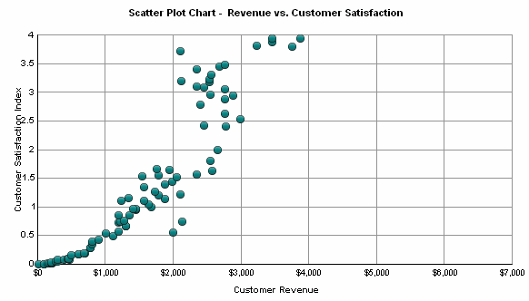
- Hide Values: This option hides all elements which fall outside the specified minimum or maximum range for a graph. In the graph below, all data points representing a Customer Satisfaction Index of more than four have been removed from view.
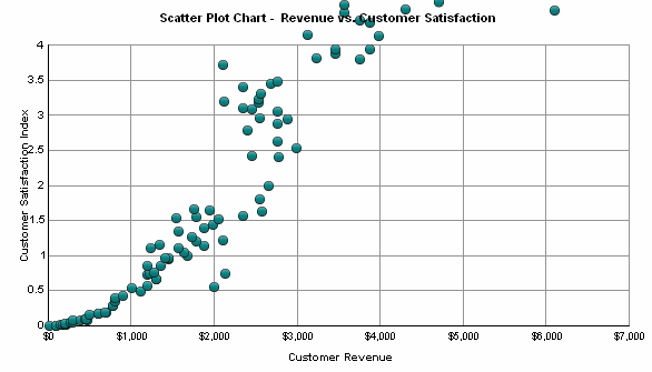
- Show Values: This option displays all elements which fall outside of the specified range. These elements continue off the specified axes and are only constrained by the size of the graph area. In the graph below, data points with a Customer Satisfaction Index of more than four are shown continuing off the top of the graph.
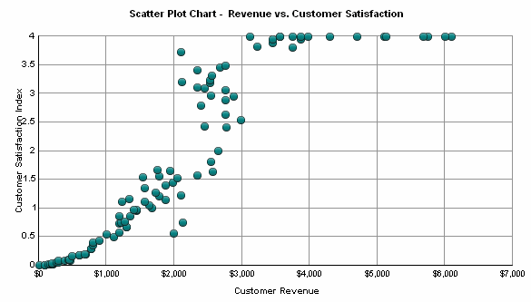
- Clip Values: This option shows elements that fall outside the specified range, but forces them to fit into the graph by clipping them to the side. In the graph below, data points with a Customer Satisfaction Index of more than four can be seen clipped to the top of the graph.
You are logged in to a project using MicroStrategy Developer.
A graph report has been created.
A range of values has been specified for at least one axis. For more information on defining ranges for graphs, see Scaling a Graph.
The graph includes graph elements which fall outside of the specified range. These steps can be completed without elements outside of the graph range, but the changes will not be visible.
To Change the Display of Off-Scale Values
- In MicroStrategy Developer, view a report in Graph View.
- Choose Graph > Grids and Scales.
- Expand the Axes category, and then expand the axis for which to modify the display of off-scale values.
- Select the Grids and Scales category.
- From the Off-scale Value Display drop-down list, select one of the following options:
- Hide Values
- Show Values
- Clip Values
- Click Apply.
- Click OK.
- Choose File > Save.