MicroStrategy ONE
Gauge
A Gauge graph is designed to display a specific data set using a semicircular dial with indicators. The graph's indicators are situated within the dial's range to depict whether the monitored data is within defined limits.
There is only one type of Gauge graph available in MicroStrategy.
Gauge Graph Example
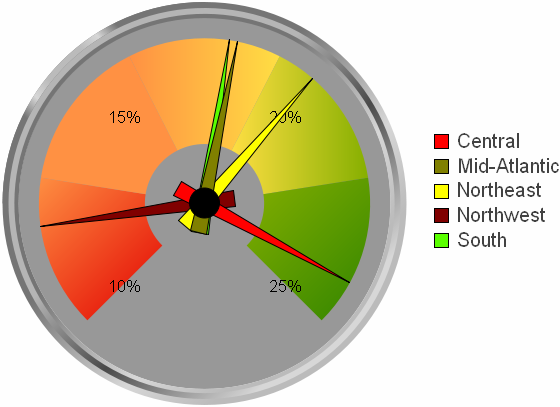
In this example, annual revenue data for specific regions is displayed in the following Gauge graph. The Gauge graph reveals the percentage by which certain regions grew their revenue from last year to the current year. Notice that the Central region achieved the largest revenue growth, as indicated by the needle closest to the maximum of the gauge (25%).
You can display the same information in a different way by showing each region's revenue data in side-by-side Gauge graphs, as shown below. To do this in MicroStrategy Developer, move the Region attribute from the series of the graph report to the categories. The Gauge graph has also been defined to display three gauges on each row.
This graphing approach allows you to quickly determine which region was most successful when compared to the previous year. The Gauge graph below depicts this alternative way of using gauges to analyze revenue data.
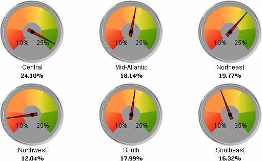
This graph report is a modified version of the graph report named Regional % Revenue Growth (Gauge), which is available in the MicroStrategy Tutorial project.
Using Gauge Graphs Effectively
- To display one gauge that displays data for every item, place both the metric and attribute in the columns. For example, on the report template for the first graph in this section, the Region attribute is placed on the report's columns so all data for the regions is displayed in one gauge.
- To display multiple gauges, place the attribute on the rows and the metric on the column. For example, on the report template for the second graph in this section, the Region attribute is placed on the report's rows so multiple gauges are displayed at the same time in the graph.
To adjust the number of gauges that are shown on one page, right-click the graph's background and select Graph Options. Within the General category, adjust the Gauges Per Row setting to specify the number of gauges to appear on one row of the page. For example, for the graph above, specifying three as the number of gauges per row results in three gauges displaying on each row.
To specify how many gauges appear on one row in MicroStrategy Web, from the Format menu select Graph. Then, modify the Maximum Categories setting to match the desired number of graphs.
- You can determine the range of numbers that is displayed for each quality band in the gauge. To do this, from the Graph menu select Graph Options. Within the Display category, adjust the minimum and maximum values for each band.
- You can adjust the thickness of the gauge dial. To do this, from the Graph menu select Graph Options. Within the General category adjust the Range Thickness setting.
- For information about the specific options for Gauge graphs in MicroStrategy, see the MicroStrategy Developer help.