MicroStrategy ONE
Boxplot
A Boxplot (sometimes called a box and whisker plot) is a graph type designed to compare similar distributions at a glance. The goal of Boxplot graphs is to make the center, spread, and overall range of values immediately apparent. The Boxplot is useful for isolating the extreme values and identifying the range of middle values in your data. The box shows the median values of a variable, while the whiskers stretch to the greatest and lowest values of that variable. Boxplots can also help you identify symmetrical or skewed distributions among values.
This type of graph is most beneficial when you are comparing one variable for several different groups, for comparing similar distributions (because the center, spread, and overall range are immediately apparent), and for detecting symmetrical or skewed distributions.
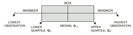
The image above provides an overview of the values and statistics depicted in Boxplot graphs, and is not an actual representation of a MicroStrategy Boxplot graph. A Boxplot consists of five summary statistics, each of which is described below. As shown in the image, a box is drawn around the quartile values, and the whiskers extend from each quartile to the extreme data points.
The summary statistics within box and whisker plots include the following:
- Median: The middle of the data when it is arranged in order from least to greatest.
- Lower quartile or 25th percentile: The median of the lower half of the data.
- Upper quartile or 75th percentile: The median of the upper half of the data.
- Minimum value: The smallest observed value. In MicroStrategy graphs, this is depicted as a whisker on the bottom of a column.
- Maximum value: The largest observed value. In MicroStrategy graphs, this is depicted as a whisker on the top of a column.
Boxplot graphs only work well when there is enough data to provide the statistics described above. For example, you use a Boxplot graph for data that covers certain years or quarters to see the different time periods plotted. If you only have one or two years or quarters in your data, the Boxplot graph does not display all the expected statistics because it cannot define quartiles and medians from only one or two values.
Boxplot Graph Example
The following Boxplot graph and its corresponding grid report provide data about the amount of revenue generated each day during a given quarter. Each column is split into two sections. The top section represents the upper quartile or the 75th percentile, and the bottom section represents the lower quartile or the 25th percentile. The whiskers extending from the top and bottom of each column indicate the highest and lowest daily revenue values respectively.
For example, during Q4 of 2027, daily revenue reached a low of about $12, as shown by the whisker below the column. Daily revenue that quarter did, however, reach a high of over $14,000, as evidenced by the whisker at the top of the column. The median revenue value for the quarter, $1,758, is shown as a horizontal line that splits the column. The upper and lower quartiles are shown above and below the median line respectively.
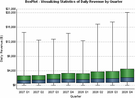
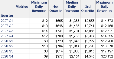
This graph report is a modified version of the graph report named BoxPlot - Visualizing Statistics of Daily Revenue by Quarter, which is available in the MicroStrategy Tutorial project.
Using Boxplot Graphs Effectively
- When you create a Boxplot graph you must include the correct number of metrics for the graph to resemble the example above. To view the quartile sections and median line within the graph columns, as well as the high-low whiskers, five metrics must appear on your report template in the following order:
- Minimum value metric (for example, the Minimum Daily Revenue metric in the graph above).
- Low value metric (for example, the 1st Quartile metric).
- Base or median value metric (for example, the Median Daily Revenue metric).
- High value metric (for example, the 3rd Quartile metric).
- Maximum value metric (for example, the Maximum Daily Revenue metric).
- For details about building the types of metrics used in the graph above, open the Boxplot graph in the Graph Styles folder in MicroStrategy Tutorial and view each metric's definition.
- For information about the specific options for Boxplot graphs in MicroStrategy, see the MicroStrategy Developer help.