MicroStrategy ONE
Pareto Chart
A Pareto chart is designed to help identify the cause of a quality problem or loss. It includes a Histogram that often shows how often a specific problem is occurring or the different types of problems that are occurring. In general, Pareto charts allow you to display the specific areas in which improvement or investigation is necessary.
Pareto Chart Graph Types
You can create the following types of Pareto charts in MicroStrategy:
- Pareto graph
- Pareto Percent graph
Pareto Chart Example
The following Pareto chart and its associated grid report reveal data about how long it took each region to ship its orders and the number of orders each region shipped. The Y-axis represents the number of orders shipped and the X-axis displays the number of days it took for an order to ship. The column bands each represent a different region. It is beneficial to view this information in a Pareto chart because it allows you to easily analyze and compare the shipping trends of different regions.
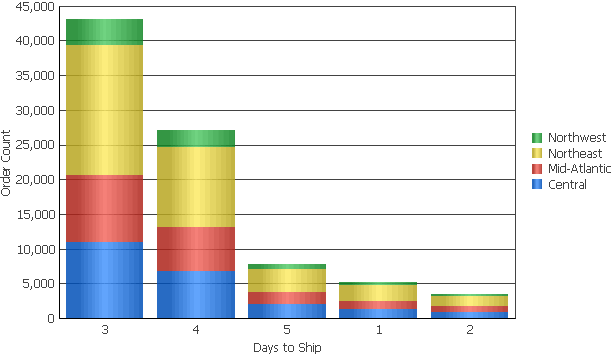
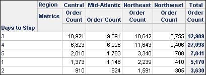
Notice that the majority of orders were shipped in three days, as indicated by the first and tallest column in the graph. Within the same column you can also see that the Northeast region shipped the most orders. Meanwhile, the smallest column on the right reveals that fewer than 5,000 orders were shipped in two days for any region displayed on the graph.
While this graph looks similar to a stacked graph (see Bar) it should be noted that the values are represented differently. In a stacked graph, each item is displayed with a height equal to that item's value, with the item displayed at the top having the highest value. This gives a representation that the items are stacked, with the item with the smallest value at the front and the item with the largest value at the back. Therefore, a stacked graph is a good option for viewing the totals of each item in relation to the other items.
In a Pareto chart such as the one shown above, all the items are displayed on top of each other so that the height of the column represents the total of all items. Each item's relative size within a column represents how much of that total comes from that particular item. Therefore, a Pareto chart is a good option for viewing the total value of a group of items, along with each item's relative contribution to that total.
Pareto Percent Example
The Pareto chart below is an example of a Pareto Percent graph, another type of Pareto chart you can create in MicroStrategy. The graph reveals the amount and percentage of revenue generated from households of different sizes. In this Pareto Percent graph, the X-axis represents the number occupants in the household. The Y-axis represents the total revenue generated for each household.
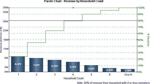
The Line graph above the columns represents the cumulative contribution to revenue, which is tracked on the Y2-axis on the right side of the graph. For example, $8.4 million in revenue was generated by households with a single occupant, which represents about 24% of the total revenue.
The difference between the other increments on the line shows the percent contribution of each household count to the total revenue. For example, $7.6 million in revenue was generated by households with two occupants, which represents about 21% of the total revenue. You can also obtain this 21% value by subtracting the 24% above the household count of one, from the 45% above the household count of two. In this way, the Line graph provides another way of viewing the graph information displayed in the Pareto Percent graph's columns.
This graph also includes a line at the 80% of revenue mark. This line provides the immediate recognition that 80 percent of the total revenue was received from households with four or fewer occupants.
This graph report, named Pareto Chart - Revenue by Household Count, is available in the MicroStrategy Tutorial project.
Using Pareto Charts Effectively
- To add data labels to the columns of your Pareto chart, right-click the graph background and select Graph Options. Expand the Series category, select the Labels and Values category, and then select the Show Data Labels check box. You can use the drop-down lists that become enabled to customize the data labels.
In MicroStrategy Web, you can make data labels visible using the Format: Graph dialog box. To open the Format: Graph dialog box, from the Format menu select Graph. In the Format category, from the left-most drop-down list, select Series Values. To display data labels on the graph, select the Show check box.
- For information about the specific options for Pareto charts in MicroStrategy, see the MicroStrategy Developer help.