Strategy ONE
Formatting Grid/Graphs
Formatting a Grid/Graph changes the formatting of the Grid/Graph, not the data displayed in it. For example, you can format the border around the Grid/Graph to change its color or make it appear three-dimensional. To change the formatting of the data displayed in the Grid/Graph, such as bolding attribute names or changing the color of bar graph risers, you must edit the Grid/Graph. For instructions to edit a Grid/Graph, seeEditing Grid/Graphs in documents. For details on the available data formatting options, seeEditing Grid/Graphs in Grid viewandEditing Grid/Graphs in Graph view(the options vary depending on how the Grid/Graph is displayed).
When you add a new Grid/Graph, the initial formatting of the Grid/Graph is determined by the control default, but you can then change any of the formatting options. A control default specifies the default formatting for a particular type of control.
You can format the borders and background of a Grid/Graph. Border options include 3D borders and drop shadows; background options include transparent backgrounds and gradient colors. You can also modify other properties that define the Grid/Graph, such as tooltips and grid overflow, and quick switching between grid view and graph view. Most of these properties are is included in Useful formatting suggestions for Grid/Graphs.
The background of a Grid/Graph shows only when the Grid/Graph is larger than the report displayed inside it. This occurs when all of the following conditions are met:
-
The Grid/Graph is displayed as a grid report.
-
The Height mode and Width mode are set to Fixed, not Fit to contents. This allows the specified Height and Width figures to be used. See Resizing Grid/Graphs in documents for instructions.
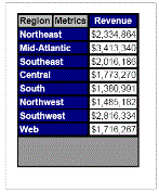
For example, the background of the Grid/Graph in the following sample is a dark gray. Because the Grid/Graph is longer than the actual grid report, the bottom of the Grid/Graph is dark gray.
Title bars in Grid/Graphs
You can add a title bar to a Grid/Graph, as explained in Adding title bars to Grid/Graphs. A title bar allows Web users to minimize and maximize the Grid/Graph, and it identifies the Grid/Graph in all views. You can format the title bar independently of the Grid/Graph itself. You can format the font and background, including transparent backgrounds and gradient colors, of the title bar.
If the background of the title bar is transparent, the background color of the Grid/Graph shows through.
Formatting Grid/Graphs
You can change the formatting and other properties of the Grid/Graph object as described below:
-
To change all options for a Grid/Graph (formatting, size, and so on), use the Property List. However, you cannot format the title bar using the Property List. Formatting options include borders (including 3D borders and drop shadows) and colors, including gradient colors (two-color combinations). The other properties include those that define the Grid/Graph, such as name, view mode (Grid, Graph, or Grid and Graph), data, position, size, and title bar settings. A procedure is included below; see To format a Grid/Graph.
-
To quickly set basic borders, use either the Formatting toolbar or the right-click menu. For procedures, see Applying basic borders to Grid/Graphs.
-
To quickly choose a single color for the background of the Grid/Graph, use either the Formatting toolbar or the right-click menu. For procedures, see Formatting single-color backgrounds of Grid/Graphs.
-
To use more complex backgrounds, such as gradient (two-color) and transparent backgrounds, use the Format Objects dialog box. You can also define the background color for cells selected in Grid/Graphs used as selectors. For procedures, see Formatting the backgrounds of Grid/Graphs.
-
To change general and layout properties, such as position, size, and title bar setup, that define the Grid/Graph, you can use the Property List or the Properties dialog box. You can also set properties specific to Grid/Graphs, such as the data source, view mode, grid overflow, and quick switch. The main difference between the interfaces is that formatting options are available in the Property List but not in the Properties dialog box. A procedure for using the Property List is included below; see To format a Grid/Graph. For a procedure using the Properties dialog box, see Specifying Grid/Graph properties using the Properties dialog box.
-
To change the background and borders of the Grid/Graph, use the Format Objects dialog box. You can select 3D borders and drop shadows, as well as gradient colors for the background, with this interface. For a procedure, see Formatting Grid/Graphs using the Format Objects dialog box.
-
To change the font and background of the Grid/Graph title bar, use the Format Objects dialog box. You can define a gradient color for the background. For a procedure, see Formatting Grid/Graph title bars.
The Property List is the easiest to use, as it contains most of the options of the other interfaces on the same screen as the Layout area. However, you cannot use it to format the title bar.
See Useful formatting suggestions for Grid/Graphs for descriptions of formatting options and ways they can enhance your Grid/Graphs. For examples of Grid/Graph formatting, see the Document Creation Help.
Prerequisite
This procedure assumes that you have added a Grid/Graph to the document. For instructions on adding Grid/Graphs, see Displaying reports in documents: Grid/Graphs.
To format a Grid/Graph
This procedure uses the Property List to format a Grid/Graph, because it contains most of the options of the other interfaces, and it is displayed on the same screen as the Layout area. The Property List allows you to define properties such as the view mode for the Grid/Graph as a whole. You can also use it to format the Grid/Graph container, which is the object that holds the actual Grid/Graph. However, you cannot use it to format the title bar, or the data (that is, the metrics or rows, for example) that is displayed in the Grid/Graph. For instructions on formatting the title bar, see Formatting Grid/Graph title bars. To format the data on the Grid/Graph, you must first edit the Grid/Graph; for instructions and more information, see Editing Grid/Graphs in documents.
-
Open a document in the Document Editor. (How?)
-
If the Property List is not displayed, select Property List from the View menu.
-
Click the Grid/Graph to select it. Resizing handles display around it.
If red hashed lines appear around it, you are in edit mode. Press ESC and click the Grid/Graph once.
-
To make the Grid/Graph appear three-dimensional, like a button, apply a 3D effect:
-
Change 3D effect to either Sunken (to inset the Grid/Graph, like a pushed button) or Raised (to outset the Grid/Graph, like a button).
-
Enter the thickness of the 3D line, measured in points, in 3D weight.
The 3D effect border takes precedence over any existing border. If you later disable the 3D effect, the original border settings are automatically restored.
-
-
To change the background color, select a new Backcolor using the Color dialog box.
-
Change the Backstyle property to specify whether the background is:
-
Transparent, which allows you to see what is behind the Grid/Graph.
-
Opaque, which covers what is behind the Grid/Graph. It also allows the fill color of the Grid/Graph to be seen.
-
Gradient, which blends two colors together. For more information, see Steps to apply gradient colors.
-
-
To define the style and color of the borders:
-
Click the ... button in the Border field. The Border tab of the Format Objects dialog box opens.
-
See Steps to format borders for further instructions.
-
-
To "float" the Grid/Graph on top of the background, apply a drop shadow:
-
Set Drop shadow to True.
-
Enter the offset of the drop shadow, in points, in Drop shadow depth.
-
-
To apply gradient colors, which blend two colors to create a gradual color change in the background, see Steps to apply gradient colors.
-
To determine how to display the Grid/Graph in MicroStrategy Web when it is larger than its container, specify the Grid overflow (HTML) property. This property is applied when the View mode is set to Grid or to Grid and graph. Select one of the following options:
-
Clip, to display only what can fit within the size dimensions.
-
Scroll, to display scroll bars to allow a user to view all of the data on the Grid/Graph.
-
-
To determine how to display the Grid/Graph when the document is exported to PDF or Excel, specify the Grid overflow (PDF and Excel) property. This property is applied only if the Height mode or Widthmode is defined as Fixed. Select one of the following options:
-
Clip, to display only what can fit within the size dimensions.
-
Fit to grid contents, to display all of the data on the Grid/Graph.
-
-
To display a pop-up tooltip, enter the text in Tooltip.
-
To select how the Grid/Graph is displayed, use the View mode property. Select one of the following options:
-
Grid, to display the control as a standard MicroStrategy grid report with rows and columns of attributes and metrics.
-
Graph, to display the data visually as in a standard MicroStrategy graph report.
-
Grid and graph, to display both a grid and a graph in the same control. The Grid position and Grid area percent properties are now displayed; for more information see Configuring Grid/Graphs in Grid and graph mode.
-
-
To hide the Grid/Graph in PDF view, set Visible to False.
The Grid/Graph is still displayed in Design View.
-
To change the dataset used to populate the Grid/Graph, select a different dataset report in the Data source property. The drop-down list shows all the dataset reports in the document.
-
To enable quick switch, select True in the Quick switch property, found in the Property List: Data section. Quick switch allows users to switch between viewing the grid or the graph by clicking a button in Interactive mode and Editable mode in MicroStrategy Web. For more information, see Enabling quick switch for Grid/Graphs.
The Quick switch property is displayed only when View mode is set to Grid or to Graph.
-
A widget is an interactive Flash-only graph that dynamically updates when you select a new set of data to view. In Flash Mode in MicroStrategy Web, the Grid/Graph is displayed as a widget, and users can interact with it.
To create a widget, you first create a Grid/Graph and then define various Flash properties. In addition, each type of widget requires a specific number, type, and arrangement of report objects on the Grid/Graph. Details are provided in the help topic for each type of widget. For instructions to create a widget, see Creating widgets; for an overview of the types of widgets available for documents, see Understanding and working with widgets.
-
You can enable a transition animation for Flash Mode in MicroStrategy Web. A transition animation is a visual transition that occurs when a Grid/Graph is first displayed in Flash Mode. Examples are Blur, Fade, and Iris. For more information, see Enabling transition animations for Grid/Graphs and panel stacks in Flash Mode (Web). To enable an animation:
-
Select a type of transition animation from the Selected transition drop-down list. This is the animation that is applied when users switch to Flash Mode in MicroStrategy Web.
-
Select a Speed from the drop-down list. This determines how quickly the transition animation takes. If you select Automatic, the speed is determined by the type of transition.
-
-
The left margin is the distance between the left edge of the Grid/Graph and the left border of the section. Enter a new number in the Left property.
-
The top margin is the distance between the top edge of the Grid/Graph and the top of the section. Enter a new number in the Top property.
-
To change the height of the Grid/Graph, enter the new number in the Height property.
-
To determine whether the height is dynamic or static, set the Height mode. The options are described below:
-
Fixed: The height does not change from the size set in the Height property.
-
Fit to contents: The height expands to the height of the control. This is used only for Grid/Graphs displayed as grids, and it only affects View mode.
-
-
To change the width of the Grid/Graph, enter the new number in the Width property.
-
To determine whether the width is dynamic or static, set the Width mode. The options are described below:
-
Fixed: The width does not change from the size set in the Width property.
-
Fit to contents: The width expands to the height of the control. This is used only for Grid/Graphs displayed as grids, and it only affects View mode.
-
-
By default, the Grid/Graph is displayed at the height and width set for it; the Display state property is set to Normal. To change it, select one of the following from the Display state property drop-down list:
-
Minimized: Only the title bar is shown until the user expands the Grid/Graph. A user can move the grid but cannot resize it.
-
Maximized: The Grid/Graph is displayed at the same size as the section in which it is located.
-
-
You can display a title bar for the Grid/Graph. A title bar allows MicroStrategy Web users to minimize and maximize the Grid/Graph, and it provides an identifier for the Grid/Graph in all views. To display a title bar, do the following:
-
Set Show title bar to True.
-
By default, the name of the dataset report is displayed in the title bar. To display a different title, type the new text into the Title property.
-
To change the height of the title bar, enter a new number in Title height.
-
For information on formatting the title bar, see Formatting Grid/Graph title bars.
-
-
When you are done, click anywhere in the Layout area outside the Grid/Graph object.