Strategy One
Create Cards
Starting in Strategy One (April 2026), you can create cards in Library.
Starting in Strategy One (December 2025), you can use an unlinked and in-memory Mosaic model as the data source when you create a card. A Mosaic model is a data model created with the AI-enabled Mosaic Studio to provide a flexible data infrastructure.
Starting in Strategy One (October 2025), optionally enter a description of your change when saving a card.
Cards are objects that hold the data about a keyword attribute. When creating a new card, you can select from a variety of card templates, add widgets, and customize your cards format.
You must be connected to an environment to create cards.
You must have the Use Workstation and Certify Content privileges to create and use cards in Workstation.
You must have the Create application objects privilege to create cards in Library.
To create cards on HyperIntelligence Card Authoring, the following two privileges under Server – Intelligence license are required:
Server – Intelligence
- Create application objects
- Use Workstation
A Mosaic model used as a data source must be unlinked (not linked to other Mosaic models).
- To create cards in Workstation:
- Open the Workstation window.
- In the Navigation pane, click Create a New Card
 next to Cards.
- To create cards in Library, on the Library home page, click Create New
 then select Card. Beginning in Strategy One (April 2025), you can create, edit, and certify cards in Library.
- If Library is not open, type the following in your browser window:
https://HOST_NAME:PORT/MicroStrategy Library/app
- If Library is not open, type the following in your browser window:
- Select the data source by doing one of the following:
- To select an in-memory cube, click Datasets on the left.
- Starting in Strategy One (December 2025), to select a model, click Mosaic Models on the left.
- To navigate to another folder that contains your data source, click Projects on the left.
- Select the data source and click OK. The Card Editor displays.
-
On the Template tab, click Change Template to use one of the five card templates.
Basic Card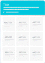 Ring Card
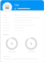 Matrix Card
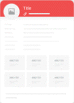 Section Card
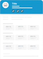 Compact Card
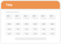 Which template should I use?
Template Description Use Case Basic The default, most standard and basic template for HyperIntelligence.
Provides a header, various cells for attributes and metrics, and the option of a footer for more space—allowing users to make decisions at a fast pace.
- Financial information
- Basic employee information
Ring Utilize a list view rather than boxed cells and ring widgets for easy-to-view metrics and percentages.
Provides a header, list view, ring widgets, and an optional footer.
- Employee card showcasing % to overall sales goal
- Sales KPIs amongst different product categories
Matrix Input text-heavy attributes, as well as a number of metrics within different sections—increasing the style points and overall card readability.
Capitalizes on a combination of boxed cells and the list view, as well as an optional footer section.
- Employee or individual profile
- Quick patient history information (attributes) and vitals (metrics)
- Student information across school systems
Section Organize your card by splitting up sections of texts or attributes and matrices—perfect for adding titles and links to your sections of data.
Capitalizes on a combination of text boxes and matrices, as well as an optional footer section.
- Business and financial information
- Sales and store performance
- Organization-wide information
Compact Ideal for landscape 16:9 viewing and sharing via Twitter.
Provides efficient use of the card real estate by showing only numbers stacked in a grid-like manner—making it easier for users to find and navigate through information quickly.
- Cryptocurrency statistics (market cap, price, volatility, etc.)
- Data or facts around some key business strategic initiatives
- On the Format tab, click the Header drop-down to customize your card's header. Depending on the template you selected, other drop-down options are available to customize.
-
On the Widgets panel, drag and drop List, Matrix, Ring, or Text Box widgets on your card. To remove widgets, drag the widget off of the card.
- Drag the attribute you want to serve as the keyword attribute from the left pane to the header of the card template. A star appears next to the chosen keyword attribute. The header displays sample data using one data point from your attribute.
- Use the icons in the header to add a link or a contextual link
 , clear content
  , set keyword matching
 , or specify the display of attribute forms for titles and subtitles. See Alternate Keyword Matching for more information.
- Add information to the card by dragging objects from the dataset to the card template. You can change the order of information on the card by dragging a specific widget or list item to a different location.
- Click Save.
-
Starting in Strategy One (October 2025), optionally type a description in User Comments and click OK.
When you save the card, it is only visible to you. To allow users to view your card, see Manage Card Properties


