Strategy One
Create a Selector Panel or Window
Starting in Strategy One (April 2026), you can add an optional Reset button, which immediately unsets or resets all selections in the panel or window. You can also disable the Apply and Cancel buttons. For details on how these buttons work, see Enable and Disable Buttons.
Starting in Strategy One (September 2025), you can add a panel or window of filters and selectors to your dashboard to enhance the filtering experience. They can display multiple filters and selectors, so end users can easily view all their choices in one place. End users can also modify multiple filters in bulk and apply all the selections at once.
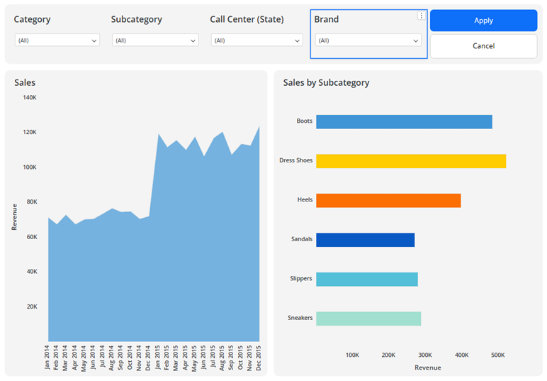
In the example below, a selector panel contains filters for Category, Subcategory, Call Center, and Brand. Make your selections in any or all of the filters, and click Apply to update the targeted visualizations, in this case the Sales line graph and Sales by Subcategory bar graph.
A selector panel acts as a mini dashboard canvas. You can add the following objects to them:
-
Filters
-
Selectors
-
Text
-
Images
-
HTML containers
-
Shapes
A selector window functions as a selector panel within an information window. Like an information window, the user clicks a text box or image to open the selector window. This helps save space on the dashboard page, while still providing one place to adjust and apply multiple filters at the same time.
Create a Selector Panel or Selector Window
-
Edit an existing dashboard or create a new one.
-
You must enable the new Dashboard Editor for Workstation to create selector panels and selector windows.
-
- Ensure the dashboard page is selected, not a panel or information window. Do one of the following:
- To create a selector panel, in the top toolbar, click Panel Stack
 and choose Selector Panel. The new panel is added to the page and displays in the Layers panel, as shown below.
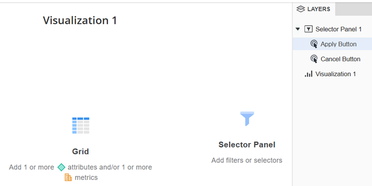
- To create a selector window, in the top toolbar, click Information Window
 and choose Selector Window. The new window is added to page. In the Layers panel, a new section has been added for information windows. The rest of the dashboard objects are shown in the Canvas section. You can return to the dashboard canvas by selecting an element under Canvas in the Layers panel.
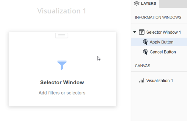
- To create a selector panel, in the top toolbar, click Panel Stack
- Create objects within the panel or window. Ensure that the panel or window is selected when you add the object.
-
Starting in Strategy One (April 2026), you can move an existing filter onto the selector panel, by dragging and dropping the filter from the Layers panel.
-
Starting in Strategy One (April 2026), you can move an existing selector onto the selector panel, by dragging and dropping the selector from the Layers panel.
-
From the dashboard canvas, select a text box or image that should trigger the selector window. This is also referred to as the source of the selector window.
-
In the upper right corner of the source object, click More
 , point to Select Information Window, and choose the selector window to open.
When you click on the source text box or image, the selector window displays.
Starting in Strategy One (April 2026), you can add an optional Reset button. You can also disable the Apply and Cancel buttons.
- In the Layers panel, right-click the selector panel or selector window and choose Format.
- In the Format panel, click Selector Panel Options
 or Selector Window Options
  .
. -
Enable and disable the Apply, Cancel, and Reset buttons to create the scenario that you need for the selectors.
- Enable Apply to allow users to make multiple selections in multiple filters/selectors and then choose to apply them all at once.
- Disable Apply to automatically apply each individual selection that a user makes.
- Enable Cancel (used when Apply is enabled) to allow users to cancel selections before manually applying them. Selections made since the last Apply action are removed from the filters.
- Disable Cancel to remove the option to cancel multiple selections.
- Enable Reset to allow users to immediately reset or unset all selectors and filters.
- A dynamic filter is reset to the First N / Last N items, as defined in the filter.
- A required filter is reset to the default selection saved with the dashboard.
- For all other filters, if the All option is enabled, all elements are selected. If the All option is disabled, no selection is made so all data is displayed.
- Disable Reset to remove the option to immediately reset or unset.
-
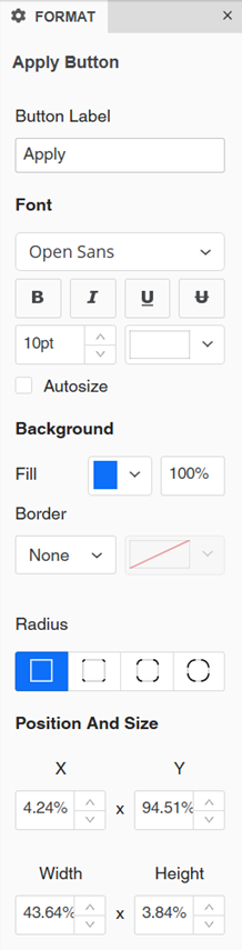
Resize and reposition the buttons as you would with text boxes.
-
Right-click the button to format and select Format, or select the button in the Layers panel.
-
In the Format panel, you can type replacement text in the Button Label box.
-
Alternatively, double-click the button and type new text.
-
-
Format the font of the label text, including whether to Autosize it to fit the button size.
-
Select the background fill for the button.
-
Select the button's border style and color.
-
Select the Radius to modify the button's shape.
-
You can manually define the position and size of the button using the boxes instead of dragging and resizing the button itself.
Format the Selector Panel or Selector Window
- In the Layers panel, right-click the selector panel or selector window and choose Format.
- In the Format panel, click Selector Panel Options or Selector Window Options .
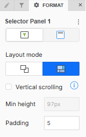
- By default, the panel or window uses free-form layout. To change it to auto layout, click Convert to Auto Layout
 .
.Use free-form layout to organize and overlap the filters, selectors, images, HTML, and shapes. You can independently position, size, and layer containers on the panel or window.
Use auto layout to automatically fill the panel or window with the objects. The objects can be repositioned around each other.
-
If you selected free-form layout, choose whether to Stretch the Elements
 to fill the panel/window or Expand the Canvas
  to add more content to the panel/window without resizing it.
 -
If you selected auto layout, adjust the Padding around the objects. Type a number between 1 and 50.
-
By default, vertical scrolling is disabled. To enable it, select the Vertical Scrolling check box. You can then set the Minimum Height.
-
If you are formatting a selector window, you can display a Close button to control how your users dismiss the selector window. To do this, enable Close Button.
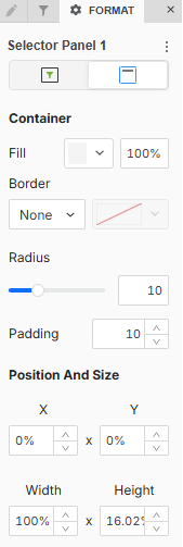
Format the Container
The container is the object that contains the window or panel.
- In the Format panel, click Title and Container
 .
.
-
Select the Fill color and its transparency.
-
Select a Border style and color.
-
Beginning in Strategy One (September 2025), you can adjust the Radius of rounded corners for the panel stack container.
-
Use a number between 0 and 40.
-
If the current Padding is less than 50% of the updated Radius, Padding automatically increases to match 50% of the new Radius.
-
-
Adjust the Padding around the panel stack container. Use a number between 1 and 100.
-
For a selector window, you can define the position and size.
-
Control the Position of the selector window when it is triggered.
The Left, Right, Top, and Bottom positions are in relation to the selected data point. If there is not enough space in the specified position based on the selected point, the window automatically displays in a position where there is enough space.
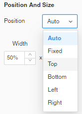
- If you select Fixed Position, define the position of the window by setting a percentage in the X and Y boxes.
For example, if you type 25 in the X box, the top left corner of the window displays 25% from the left edge of the dashboard page. If you type 15 in the Y box, the top left corner displays 15% down from the top of the dashboard page.
- Define the size of the window by setting percentages in the Width and Height boxes.
-
- Save the dashboard.
Filters and selectors on the panel/window can target visualizations and filters on the dashboard page (that is, the canvas) or on a panel, not on an information window.
Select the Trigger for the Selector Window
To display the selector window, a user clicks a text box or image.
Format the Buttons
The Apply, Cancel, and Reset buttons are disabled in editing mode. When you make selections in filters or selectors on the panel or window, the targets automatically update.
To view and test the buttons in the panel or window, view the dashboard.