Strategy ONE
Example: Use the Default Transform and a Custom Layout Definition File in iOS
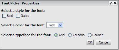
The code sample in this topic illustrates how to create a custom widget properties editor that uses the default transform and a custom layout definition file. The code produces a properties editor like the one shown below—with two check boxes, one drop-down menu, and three radio buttons.

Layout definition files are discussed in detail in the Web SDK section of the MSDL under Customizing MicroStrategy Web -> Part I: Fundamentals of Customization -> Data Presentation -> Layout Definitions.
In this example, the default transform is used for the widget properties editor because the editor contains simple controls that do not need to be dynamically generated. The code for the custom layout definition file that is responsible for displaying this properties editor is shown below. This is followed by an explanation of relevant sections of the code.
<!DOCTYPE mstrlayout:layout SYSTEM "mstrlayout.dtd">
<mstrlayout:layout>
<div>
<span style="font-weight:bold;">Select a style for the font:</span>
<br/>
<mstrlayout:render name="checkbox">
<mstrlayout:argument type="String" value="bld"/>
</mstrlayout:render>
<span>Bold</span>  
 <mstrlayout:render name="checkbox">
    <mstrlayout:argument type="String" value="itl"/>
 </mstrlayout:render>
 <span>
    <mstrlayout:render name="descriptor">
    <mstrlayout:argument type="string" value="scenario1.1"/>
    <!-- Descriptor for text "Italics" -->
 </mstrlayout:render>
<br/>
<br/>
</span>
<span style="font-weight:bold;">Select a color for the font:</span>   
<mstrlayout:render name="SelectBox">
<mstrlayout:argument type="string" value="color" />
<mstrlayout:argument type="string" value="0^Black|1^Red|2^Blue|3^Green"/>
</mstrlayout:render>
<br/>
<br/>
<span style="font-weight:bold;">
<mstrlayout:render name="descriptor">
<mstrlayout:argument type="string" value="scenario2.1" />
<!-- Descriptor for text "Select a typeface for the font:" -->
</mstrlayout:render>
</span>
<mstrlayout:render name="Radio">
<mstrlayout:argument type="string" value="typeface"/>
<mstrlayout:argument type="string" value="0^Arial|1^Verdana|2^Courier"/>
</mstrlayout:render>
</div>
</mstrlayout:layout>Code explanation for the custom layout definition file
The custom layout definition file invokes "render" methods from the default transform, VisualizationPropertiesTransform. This transform has supporting methods such as renderCheckbox(), renderTextbox(), and renderRadio() that can be called from the layout definition file.
-
Rendering a check box
TherenderCheckbox()method is called twice. It is called firstto render the check box for “Bold” as shown below.
Copy<mstrlayout:render name="checkbox">
<mstrlayout:argument type="String" value="bld"/>
</mstrlayout:render>
<span>Bold</span>   The property named “bld” holds the value of the check box based on the user selection. This property-value combination is saved in the metadata and retrieved for the user when the widget properties editor is opened. The text “Bold” for the check box is rendered using HTML.
The renderCheckbox() method is called again to render the check box for “Italics”.
Copy<mstrlayout:render name="checkbox">
<mstrlayout:argument type="String" value="itl"/>
</mstrlayout:render>
<span>
<mstrlayout:render name="descriptor">
<mstrlayout:argument type="string" value="scenario1.1"/>
<!-- Descriptor for text "Italics" -->
</mstrlayout:render>The property named “itl” holds the value of the check box based on the user selection. This property-value combination is saved in the metadata and retrieved for the user when the widget properties editor is opened. The text “Italics” for the check box is rendered using localization descriptor files.
-
Rendering a drop-down menu
The renderSelectBox() method is called to render the drop-down menu. The list of elements to be displayed in the drop-down menu is supplied in the format value^String, with multiple values separated by a vertical bar symbol (also called the pipe symbol), |. The list of elements in the code snippet below is " 0^Black|1^Red|2^Blue|3^Green".
Copy<span style="font-weight:bold;">Select a color for thefont:</span>   
<mstrlayout:render name="SelectBox">
<mstrlayout:argument type="string" value="color"/>
<mstrlayout:argument type="string"value="0^Black|1^Red|2^Blue|3^Green"/>
</mstrlayout:render>
...
</span>The property named “color” holds the value of the user selection from the drop-down menu. This property-value combination is saved in the metadata and retrieved for the user when the widget properties editor is opened. The text “Select a color for the font:” for the check box is rendered using HTML.
-
Rendering radio buttons
The renderRadio() method is called to render the radio buttons. The list of options to be displayed for the radio buttons is supplied in the format value^String, with multiple values separated by a vertical bar symbol (also called the pipe symbol), |. The list of options in the code snippet below is "0^Arial|1^Verdana|2^Courier".
Copy<mstrlayout:render name="Radio">
<mstrlayout:argument type="string" value="typeface"/>
<mstrlayout:argument type="string"value="0^Arial|1^Verdana|2^Courier"/>
</mstrlayout:render>The property named “typeface” holds the value of the user selection for the radio buttons. This property-value combination is saved in the metadata and retrieved for the user when the widget properties editor is opened. The text “Select a typeface for the font:” is rendered using localization descriptor files, as shown below.
Copy<span style="font-weight:bold;">
<mstrlayout:render name="descriptor">
<mstrlayout:argument type="string" value="scenario2.1"/>
<!-- Descriptor for text "Select a typeface for the font:" -->
</mstrlayout:render>
</span>
