Strategy ONE
Create a Custom Layout Definition File in iOS
Before you create the plug-in for a custom widget properties editor, you need to create a layout definition file for the properties editor. This file works together with the transform to display the controls in the editor for each property, set default values for each property, populate the controls with values (the previously selected values if they exist or the default values if no values have already been selected) for each property, capture the user's selections, and save the resulting property-value pairs to the metadata for the relevant report or document.These saved property values can then be read and used by a widget in a mobile application. The custom layout definition file contains HTML code for displaying the widget properties editor and invokes methods in the transform.
Layout definition files are discussed in detail in the Web SDK section of the MSDL under Customizing MicroStrategy Web -> Part I: Fundamentals of Customization -> Data Presentation -> Layout Definitions.
The custom layout definition file contains the HTML code for displaying the widget properties editor and invokes methods in the transform. The custom layout definition file should be saved in the plugins\pluginName\WEB-INF\xml\layoutssubfolder inside the MicroStrategy Web installation folder—for example,
In addition to invoking methods from the transform, you can also use CSS in the custom layout definition file to customize the appearance of the editor and use tabs to organize properties. Code snippets for both of these are provided below.
-
You can define CSS rules for the widget properties editor in the custom layout definition file, as shown in bold in the code sample below. However, you must define your CSS rules so that they do not conflict with the rules used by MicroStrategy Web.
<!DOCTYPE
<mstrlayout:layout
<
<div class="iphonegridcontainer"
<style type="text/css">
.iphonegridcontainer div {
border-style:solid;
border-width:1px;
border-spacing:0;
}
.iphonegridcontainer h1 {
text-align:center;
font-size:0.875em;
font-family:Verdana,Georgia;
}
.iphonegridcontainer p {
color:#120A8F;
}
</style>
<h1>Font Picker<h1>
<br
<p>Select a style for the font:</p>
<br
]]>
<mstrlayout:render name="check box"
<mstrlayout:argument type="String" value="
</mstrlayout:render
<
<span>Bold</span>
]]>
</div>
</mstrlayout:layout
-
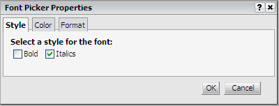
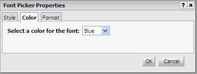
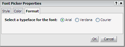
Tabs provide a convenient way to organize widget properties in a properties editor by allowing you to group similar properties together on one tab. For example, the properties for font style can be grouped on a Style tab, the property for font color can be grouped on a Color tab, and the property for font typeface can be grouped on a Format tab, as shown below.


The code required to display these three tabs is shown in bold in the code sample below.
<!DOCTYPE
<mstrlayout:layout
<div>
<mstrlayout:render name="Tabs">
<mstrlayout:argument type="String" value="Style,Color,Format"/>
</mstrlayout:render>
<
<div class="mstrTabContainer"
]]>
<span style="font-weight:bold;">Select a style for the
font:</span>
<br /
<mstrlayout:render name="check box">
="Code" style="background-color: #c0c0c0;"> <mstrlayout:argument type="String" value="bld" />
</mstrlayout:render>
<span>Bold</span>   
<mstrlayout:render name="check box">
<mstrlayout:argument type="String" value="itl" />
</mstrlayout:render>
<span>
<span>Italics</span>   
<br />
<br />
</span>
<
</div>
<div class="mstrTabContainer"
]]>
<span style="font-weight:bold;">Select a color for the
font:</span>   
<mstrlayout:render name="SelectBox"
<mstrlayout:argument type="string" value="color" />
<mstrlayout:argument type="string"
value="0^Black|1^Red|2^Blue|3^Green" />
</mstrlayout:render>
<br />
<br />
<br />
<
</div>
<div class="mstrTabContainer"
]]>
<span style="font-weight:bold;">Select a typeface for the font:</span>   
<mstrlayout:render name="Radio"
<mstrlayout:argument type="string" value="typeface" />
<mstrlayout:argument type="string"
value="0^Arial|1^Verdana|2^Courier" />
</mstrlayout:render>
<br />
<br />
<br />
<
</div>
]]>
</div>
</mstrlayout:layout>
The code for actually rendering the tabs in the properties editor is provided by the default transform, VisualizationPropertiesTransform. This transform has a renderTabs() method that renders a collection of tabs for the editor. The code snippet below calls the renderTabs() method and specifies the names for the tabs (Style, Color, and Format) as a comma separated list. The names for the tabs are displayed in the order specified in the list.
<mstrlayout:render name="Tabs">
<mstrlayout:argument type="String" value="Style,Color,Format"/>
</mstrlayout:render>
The content for each tab is contained within its own <div> element as follows.
<!DOCTYPE mstrlayout:layout SYSTEM "mstrlayout.dtd">
<mstrlayout:layout>
<div>
<div class="mstrTabContainer
...> </div>
<div class="mstrTabContainer"
... ...
</div>
<div class="mstrTabContainer"
... ...
</div>
</div>
</mstrlayout:layout>
