Strategy One
Lock Page Size
Starting in Strategy One (January 2026), dashboard authors can define the default consumption view for users.
Starting in Strategy One (December 2025), you can enable a preview feature to display a
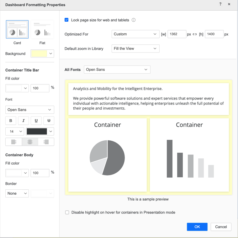
MicroStrategy ONE (June 2024) introduces a new dashboard formatting setting to lock a dashboard's page size. You can set predefined or custom ratios so the dashboard size updates responsively as you change your browser size. The length vs width ratio does not change for each component on the canvas.
Starting in Strategy One (May 2025), this feature is supported in the Library iOS app.
Dashboard Level Lock Page Size Setting
- Open a dashboard you want to modify.
- From the Format menu, select Dashboard Formatting. The Dashboard Formatting Properties dialog opens.
-
Select the check box next to Lock page size for web and tablets.
-
In Optimized for, choose a predefined size in the drop-down or edit the width and height for custom sizing.
-
Starting in Strategy One (January 2026), in Consumption view, choose a default behavior when the dashboard opens in consumption mode. If you are using a version prior to Strategy One (January 2026), this field is named Default zoom in Library.
Dashboard users in consumption mode can update the view setting to their preference.
-
Optionally, click the link icon between [w] and [h] so when a width or height is updated, the other is updated proportionally.
Recommended Canvas Size for Tablets
In addition to the default canvas size in the Optimized For drop-down, view the following dashboard for the latest iPad and Andriod tablet models.
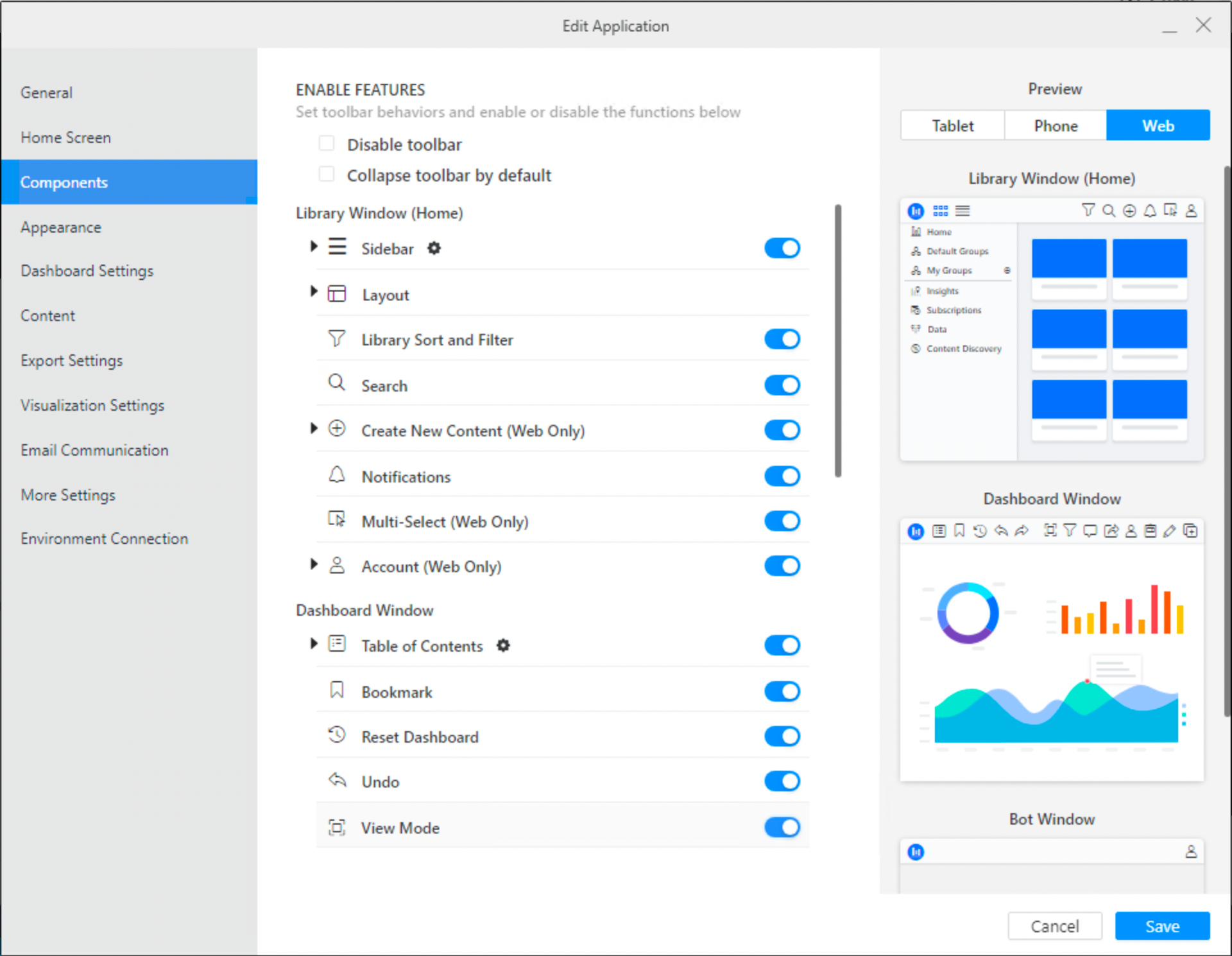
Application Level Lock Page Setting
If you are upgrading to MicroStrategy ONE (June 2024) from an earlier version, if an administrator toggles on the application component, users won't see the view mode option unless the dashboard level setting is selected.
-
Open the Workstation window.
-
Connect to an environment.
-
In the Navigation pane, click Applications.
-
Right-click an application and choose Edit.
-
In the left pane, click Components.
-
Toggle on View Mode.
-
Click Save.
Limitations
-
For some SVG and custom visualizations, lasso selection and tool tips will not work on Library or with Android touch.
-
Drop-down list selectors may adjust depending on zoom in or out.
-
When the canvas scales up on mobile devices, it may appear blurry. To prevent this, set the page size based on a larger iPad model, which allows the design to scale down cleanly and maintain visual clarity on smaller screens.