Strategy One
Create a Pie or Ring Chart
You can view the contribution of attribute elements or metrics to a total by displaying your data in a pie or ring chart. Beginning in Strategy One (December 2025), you can also create a modern donut chart, a circular chart with a hole in the middle, like a donut, that displays KPI information.
You can use a variety of display styles to produce pie and ring charts. You can display pie charts in a grid layout or display ring charts in scatter layout. Click here to see examples of pie and ring charts, including the data requirements for each style.
To Create a Pie or Ring Chart
- Open a dashboard.
-
In the top toolbar, click .
- Choose Pie > Pie Chart
 or Ring Chart
  .
. - In the Datasets panel, double-click attributes and metrics to add them to the visualization. A pie or ring chart requires at least one attribute and one metric.
Example Pie and Ring Charts
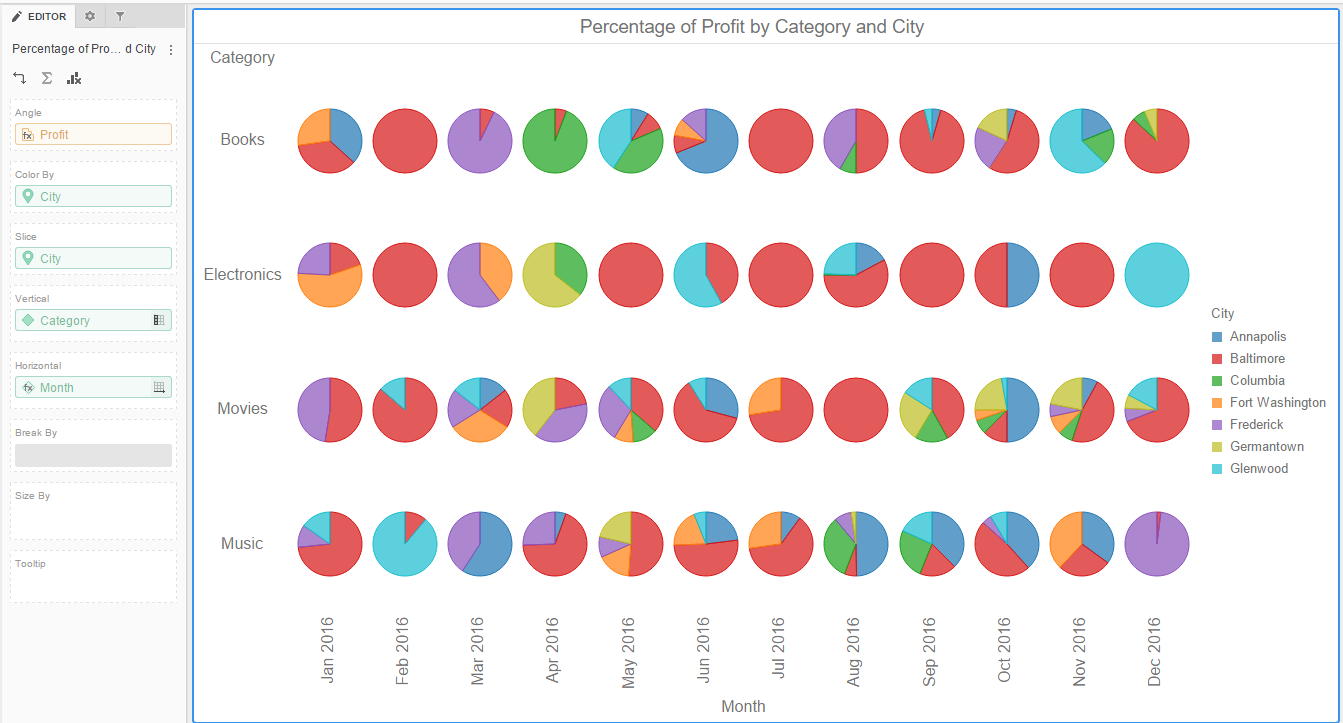
Display pie or ring charts in a grid layout. The pies or rings do not overlap.
This style requires:
- One metric in each of the following areas: Angle
- One attribute in each of the following areas: Color By, Slice, Vertical, and Horizontal
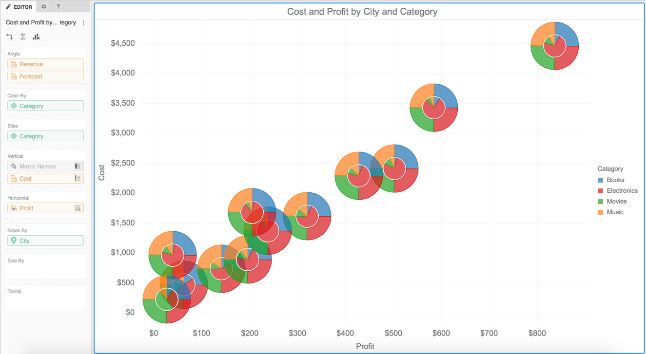
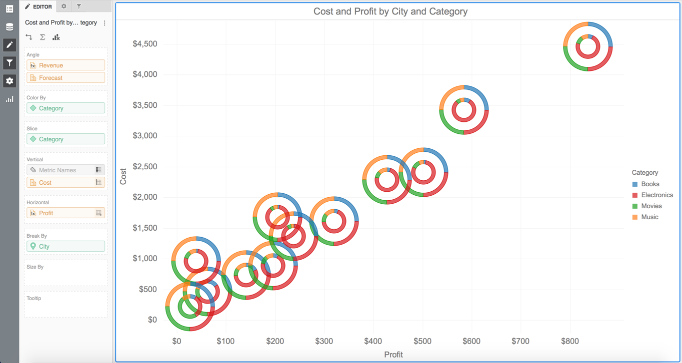
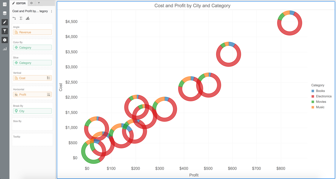
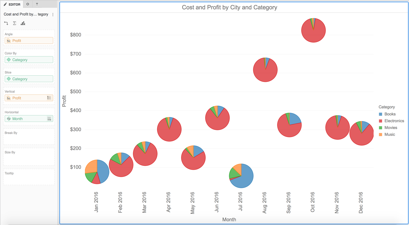
Display pie or ring charts in a scatter chart layout. The pies or rings can overlap and may or not be sized.
This style requires:
- One metric in each of the following areas: Angle, Vertical, and Horizontal
- One attribute in each of the following areas: Color By, Slice, and Break By
Display pie or ring charts in a vertical or horizontal layout. This type is also known as a bubble layout. The pies or rings do not overlap.
The vertical layout style requires:
- One metric in each of the following areas: Angle and Vertical
- One attribute in each of the following areas: Color By, Slice, and Horizontal
The horizontal layout style requires:
- One metric in each of the following areas: Angle and Horizontal
- One attribute in each of the following areas: Color By, Slice, and Vertical
If your visualization contains pies or rings displayed in the same position, the pies or rings are overlaid on top of each other. Add a second metric to the Angle area to view two separate pie or ring charts in the same location. A white circle appears around pie charts that have been overlaid on top of other to distinguish them as separate charts.