Strategy One
Introduction to Heat Maps
You can quickly grasp the state and impact of a large number of variables at one time by displaying your data with a heat map visualization. A heat map visualization is a combination of nested, colored rectangles, each representing an attribute element. Heat Maps are often used in the financial services industry to review the status of a portfolio.
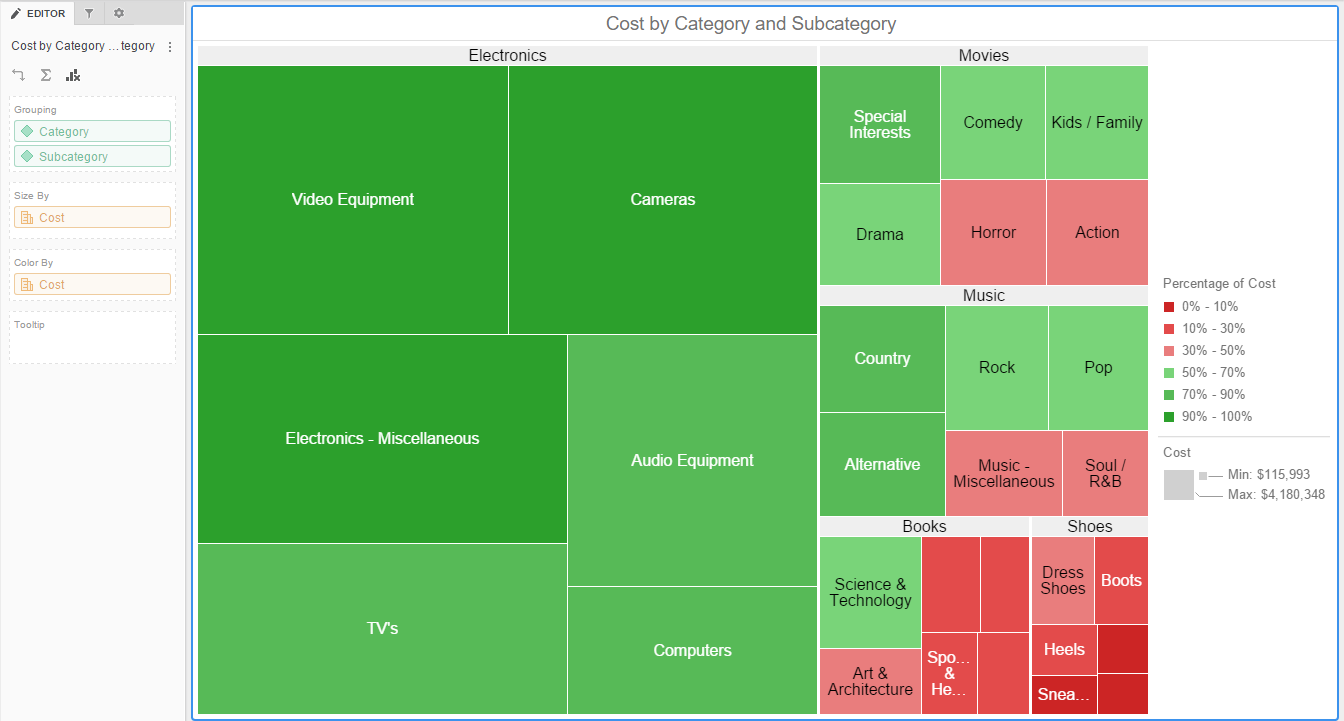
The rectangles contain a wide variety and many shadings of colors, which emphasize the weight of the various components. In a heat map visualization:
- The size of each rectangle represents its relative weight. The legend provides information about the minimum and maximum values.
- The color of each rectangle represents its relative value. The legend provides the range of values for each color.
- Data is grouped based on the order of the attributes in the Grouping area of the Editor panel.