Strategy One
Introduction to Box Plot Visualizations
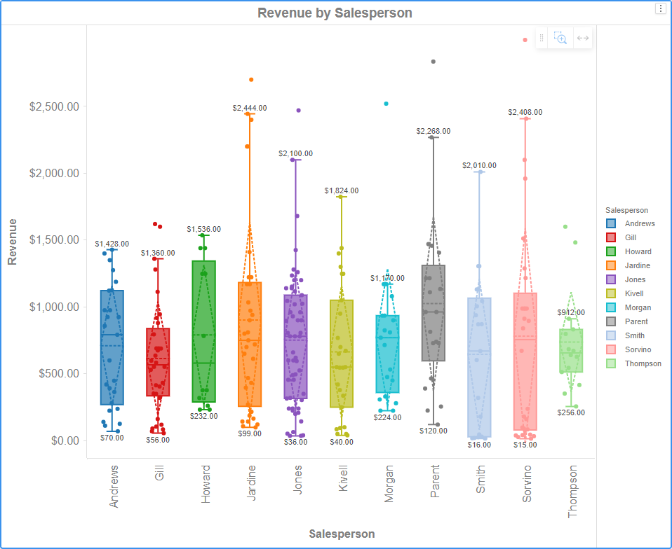
A box plot visualization allows you to examine the distribution of data. One box plot appears for each attribute element. Each box plot displays the minimum, first quartile, median, third quartile, and maximum values. In addition, you can choose to display the mean and standard deviation as dashed lines. Outliers appear as points in the visualization. You can adjust the spacing between points (that is, jitter) to avoid overlap. A box plot must include at least one metric and at least one attribute.
Related Topics
How to Show or Hide Attributes in a Box Plot Using the Legend
Zoom and Pan on a Histogram, Waterfall Chart, or Box Plot
How to Drill In and Out of a Box Plot
View Information About Visualization Elements