MicroStrategy ONE
Radar Chart
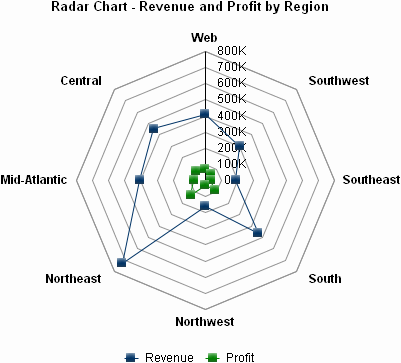
A Radar chart resembles a Polar chart, but works differently. Instead of allowing you to see distinct data markers, Radar charts connect these markers to form a shape. Each corner of the shape represents a different data point, as shown in the example below.
Radar Chart Graph Types
You can create the following types of Radar charts:
- Line
- Stacked Line
- Dual-axis Line
- Dual-axis Stacked Line
- Area
- Stacked Area
- Dual-axis Area
- Dual-axis Stacked Area
Radar: Line Graph Example
The following graph is a Radar: Line graph. It is called a Radar: Line graph because of the line formed between the data points in the graph. The graph reveals information about the resumes received for each position in a company.
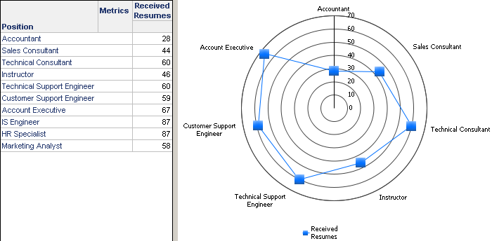
In the graph, notice that the Y-axis is represented as a vertical line that runs down the upper portion of the circular X-axis. The Y-axis lists various received resume amounts in ascending order from bottom to top. Each label on the circular X-axis represents a different position in the company, for example, Sales Consultant or Customer Support Engineer.
You can read this graph by displaying markers for each position on the graph. In the example above, each marker is displayed as a rectangle. These markers are placed based on the metric values for the attributes. For example, the marker for Customer Support Engineer is displayed between the 50 and 60 lines since there were a total of 59 resumes received for this position.
This graph sample serves as an example of the flexibility of Radar charts, as well as Polar charts. In this example, this graph gives quick insight into how many resumes are received for each position and how this relates to the amount received for other positions. This can highlight positions that a Human Resources department may need to recruit more heavily for to find additional candidates. For example, more recruiting may be necessary for the Accountant position, as only 28 resumes were received.
Using Radar Charts Effectively
- The Radar chart is a flexible graph format because you can create one from a number of attributes, metrics, and other report objects. Its minimum requirements are that one attribute and one metric be present on the report grid. However, as explained in Moving Objects on a Graph Report, the location of these objects on your grid report determines whether and how the grid report can be generated as a Radar chart.
- In the Radar: Line graph example above, notice that there are ten positions listed in the grid, but only seven positions appear on the graph. The IS Engineer, HR Specialist, and Marketing Analyst positions are missing from the graph because the Maximum number of categories for this graph style is set to seven; therefore, only seven positions appear on a page. In this case, you can ensure all of the attribute elements appear on the graph by selecting Preferences from the Graph menu. In the Maximum number of categories field, type 10, the number of attribute elements you want to appear on the graph.
- For detailed information about the specific options for Radar charts in MicroStrategy, see the MicroStrategy Developer help.