MicroStrategy ONE
Bubble Chart
A Bubble chart is a Scatter plot that also displays the size of each data marker, using bubbles to represent the different sizes of data markers.
To create a Bubble chart, you must include at least one attribute and three metrics on your report grid. Where you place each object on the report grid affects how that object is displayed in the resulting graph, as follows:
- The first metric on the grid determines what is placed on the X-axis.
- The second metric on the grid determines what is placed on the Y-axis.
- The third metric on the grid determines the size of each bubble.
Bubble Chart Graph Types
You can create the following types of Bubble charts in MicroStrategy:
- Bubble
- Dual-axis
Bubble Chart Example
The graph below provides an example of how three metrics are displayed within a Bubble chart. In the graph, a colored bubble is designated for each shipping point for the years 2028 and 2029. The size of each bubble represents that shipping point's average total delivery time for outbound items.
The X-axis represents the Outbound Deliveries metric, which displays the number of outbound deliveries. The Y-axis represents the Outbound Delivery Items metric. A third metric, Average Total Delivery Time for Outbound Deliveries (Days), is included as the third metric on the columns of the grid report. The third metric placed in the columns determines the size of each bubble.
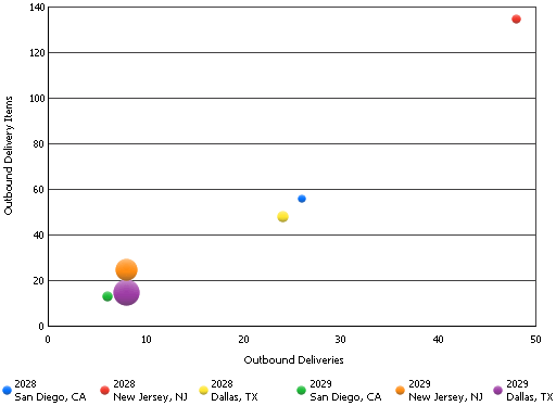
Notice that the largest bubble in the graph is the one for the 2029 Dallas, TX; this shows that the average delivery time was the largest for the Dallas, TX shipping point during the year 2029. Its placement along the X-axis informs you that the Dallas, TX shipping point for 2029 had fewer than 10 outbound deliveries. The bubble's vertical position along the Y-axis emphasizes that the Dallas, TX shipping point for 2029 shipped fewer than 20 outbound items for all outbound deliveries. This analysis suggests that further analysis needs to be done to determine why shipping times were so long for this shipping point in 2029, since the number of outbound deliveries and delivery items were both relatively small.
Using Bubble Charts Effectively
- At least one attribute and three metrics must be present on a grid report to be able to create a Bubble chart. However, to create an effective Bubble chart, it is best to avoid more than three metrics on the grid report. If the grid contains more than three metrics on the grid, the graph may not be useful because Bubble charts are designed to plot two values (two metrics) at a time. The size of each bubble represents the third metric.
- For detailed information about the specific options for Bubble charts in MicroStrategy, see the MicroStrategy Developer help.