MicroStrategy ONE
Pie Chart
A Pie chart is a style of graph in which data values such as percentages are represented as proportionally-sized slices of a pie.
Pie Chart Graph Types
You can create several different types of Pie charts in MicroStrategy, including the following:
- Pie
- Ring
- Multiple Proportional Pie
- Multiple Proportional Ring
Pie Chart Example
In the following exploded Pie chart example, each slice of the graph represents a different region, for example, the Northeast or Mid-Atlantic. The size of each pie slice is determined by the values of the Revenue metric. For example, the Southeast region had $2.2 million in revenue, compared to over $8.5 million in the Northeast. The Northeast slice has been moved away from the pie slightly to draw attention to it.
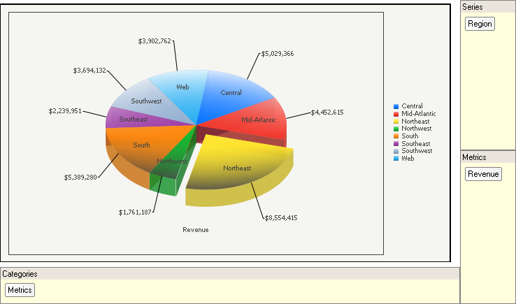
On the graph report, notice that the Region attribute is included in the series for the graph, and the Revenue metric is included in the categories for the graph. This causes the elements of the Region attribute, the regions themselves, to appear as slices in the Pie chart. Each region is assigned its own color to distinguish it from the other regions.
However, if you move the attribute to the categories and the metric to the series on the graph report, multiple Pie charts are created for each region. If you then view the report as a graph, each Pie chart is not divided into slices, which makes it more difficult for you to compare values. Keep this in mind when you are designing your own graph.
Pie: Multiple Proportional Pies Example
The graph below is an example of a Pie chart displayed as multiple pies. Each pie is formatted identically to the single graph in the previous example. In this graph, each pie represents the total revenue for a quarter, divided among several geographic regions. The pies are of different sizes depending on the total amount of revenue for that quarter. For example, the pie for 2026 Q4 is visibly larger than the pie for 2026 Q1, because the total revenue for Q4 was nearly $1,000,000 greater than the total revenue for Q1.
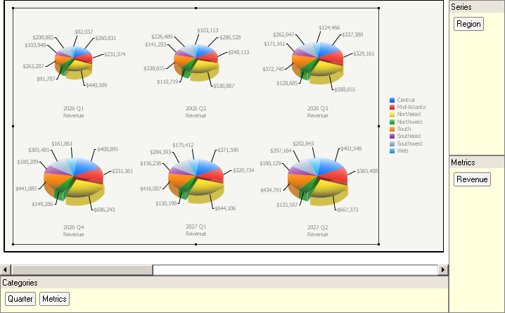
Notice that in the grid report above, the Quarter attribute is in the categories, on the left of the metrics. This causes the graph to display one Pie chart for each available value of Quarter. The way a graph appears depends heavily on whether the attributes and metrics are in the series or the categories of the graph report.
Using Pie Charts Effectively
- The Pie chart is a flexible graph format because you can create one from a number of attributes, metrics, and other report objects. Its minimum requirements are that one attribute and one metric be present on the report grid. However, as explained in Moving Objects on a Graph Report, the location of these objects on your graph report determines whether and how the grid report can be generated as a pie graph.
- When you create a Pie chart, move the attributes and metrics of your report between the series and categories until a useful and easy-to-follow graph is displayed. The location of the attributes and metrics on the grid directly affects whether one Pie chart with different slices is displayed or whether multiple pies are displayed. Review the Pie chart examples above for an example of this.
- For detailed information about the specific options for Pie charts in MicroStrategy, see the MicroStrategy Developer help.