MicroStrategy ONE
Polar Chart
A Polar chart is a graph drawn with circular, polar coordinates. As shown in the example that follows, data points often fall within a certain distance of the middle of the circular graph and another axis.
Polar Chart Graph Types
You can create the following types of Polar charts in MicroStrategy:
- Coordinate Chart
- Dual-axis Coordinate Chart
Polar: Coordinate Chart Graph Example
The Polar: Coordinate Chart graph shown below provides data about the unit cost versus the unit profit for various items.
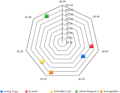
In this graph, the vertical line cutting through the Polar chart is the Y-axis, which represents the unit profit made for each item. The X-axis is represented via the seven-sided polygon. A range of values is listed in order, starting from the top, and moving clockwise around the shape. These values represent the unit cost for each item.
To determine the unit profit for each item, notice how high or low a marker resides based on the Y-axis. For example, notice in the graph above that Lethal Weapon 4 had over $14.00 in profit, as shown by the data marker to the left of the vertical Y-axis. Another item, Everest, had between $12.00 and $14.00 in profit, as shown by the location of the marker along the Y axis.
To determine the unit cost for each item, line the item's data marker up with a location along the perimeter of the graph. For example, if the data marker is at the bottom of the graph, you know that the item had between $1.20 and $1.60 unit cost because those are the data values along the bottom of the graph. Notice in the graph above the Armageddon item's data marker can be lined up near the $1.60 label along the outside of the graph. The Everest item has a much lower unit cost, as shown by how close its marker is to the $.80 label on the graph.
Using Polar Charts Effectively
- While a Polar chart is a flexible graph format because you can create one from a number of report objects, its minimum requirements are that one attribute and two metrics be present on the report grid. However, as explained in Moving Objects on a Graph Report, the location of these objects on your grid report determines whether and how the grid report can be generated as a Polar chart.
- When you design a Polar chart, try to include both the attribute and metric in the grid report's columns. This ensures that each attribute element is represented with a single marker on the Polar chart. To create the example Polar chart above, the Item attribute and the metrics Unit Cost and Unit Profit were all placed in the grid's columns. Therefore, each item is represented by its own marker on the graph.
- For detailed information about the specific options for Polar charts in MicroStrategy, see the MicroStrategy Developer help.