Strategy One
Curate the Responsive and Default Views by Hiding Specific Containers in Free-Form Layout
You can hide visualization containers to provide a more responsive experience on small devices such as mobile phones and tablets, as well as display only certain objects in large non-responsive default views for desktops and large tablets in landscape mode.
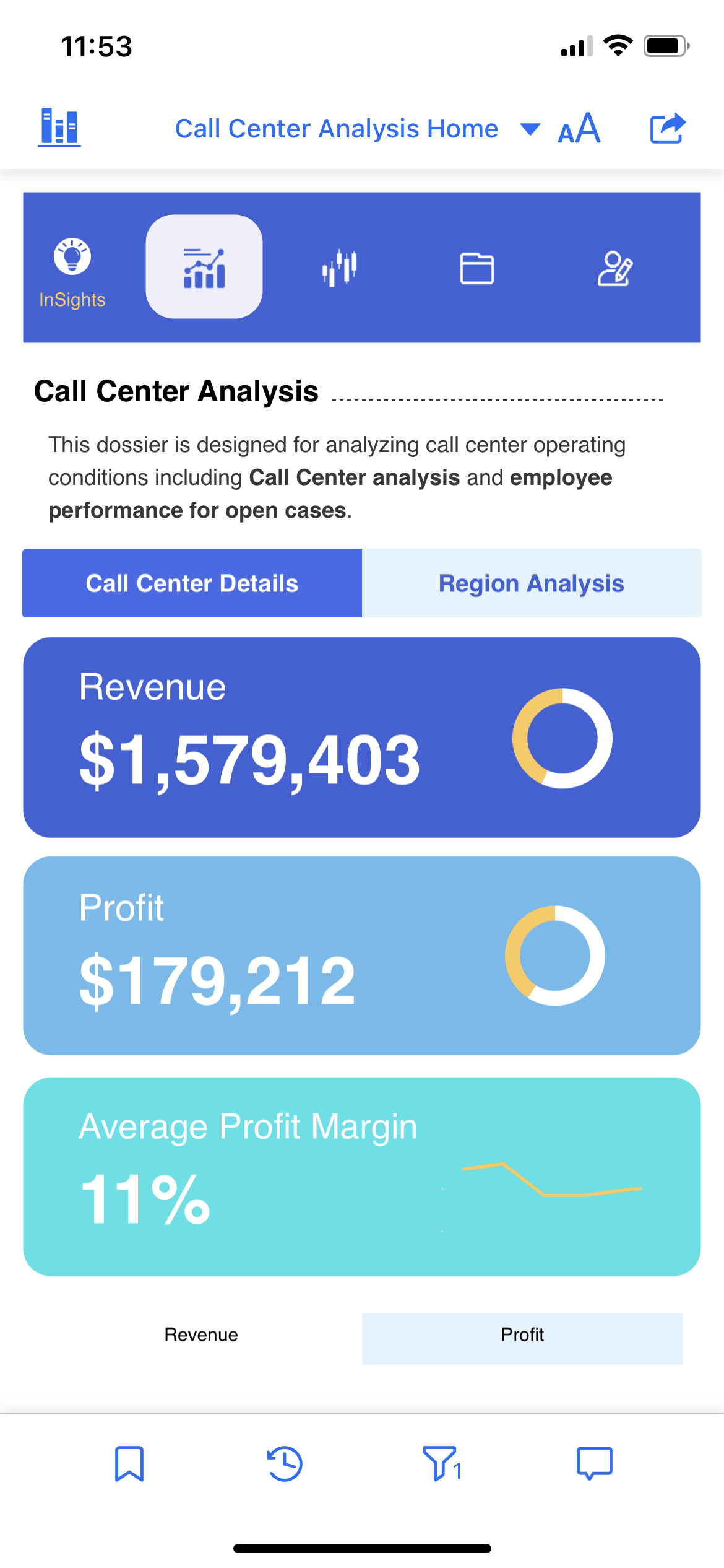
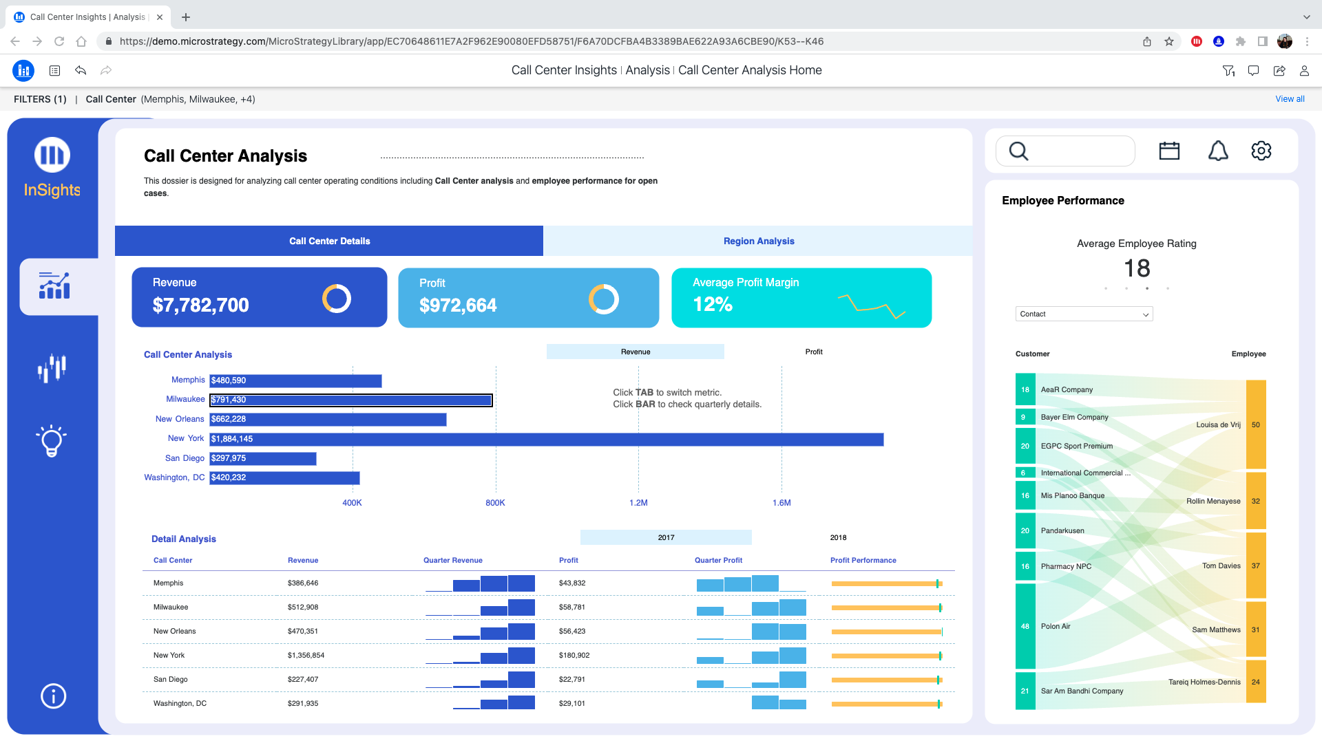
For example, there is a details grid and a background image in a responsive view on a mobile phone. However, users don’t need to see these containers. You can easily hide the elements, so users with small screens have a clean, intuitive view with no unnecessary background images or visualizations that create excessive scrolling.
Some things to keep in mind:
-
For Apple devices:
-
iPad landscape mode runs dashboards in a non-responsive view.
-
iPad portrait mode runs dashboards in a non-responsive view if the device dimension is no less than 768 points in width. Otherwise, the dashboard runs in responsive mode, such as with an iPad mini or 9.7'' iPad. Details about device dimensions can be found in the Foundations > Layout > Specifications section of Apple's Human Interface Guidelines here.
-
All iPhones run dashboards in a responsive view, regardless of whether users are in portrait or landscape view.
-
- For Android devices:
-
Android tablets follow the 768 breakpoint. dashboards run in a responsive view if the device dimension is less than 768 points.
-
All Android phones run dashboards in a responsive view, regardless of whether users are in portrait or landscape view.
For more information about responsive views, see Best practices for creating a responsive free-form dashboard.
Hide Containers in a Responsive View
- Open a dashboard in free-form layout.
- Identify the containers you want to hide in a responsive view for small screens.
-
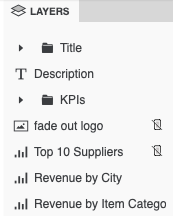
In the Layers panel, right-click the container and choose Hide on Responsive View.
Notice the icons to indicate which containers are hidden in a responsive view.
-
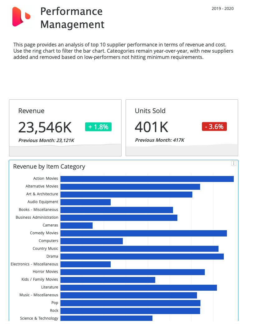
Use the Responsive Preview
 to see how the small screen view looks.
-
To re-display the hidden containers in a responsive view, right-click the container in the Layers panel and choose Show on Responsive View.
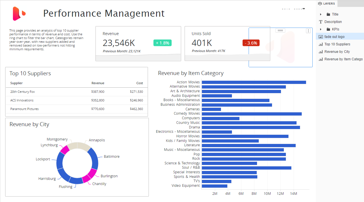
Original non-responsive view:
Responsive preview:
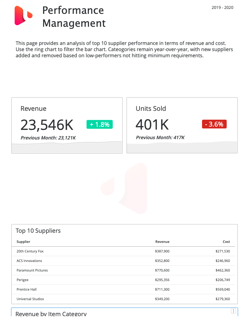
You want to hide the image and grid from a responsive view for small screens to eliminate any necessary scrolling.
Hide Containers in a Default View
There may be instances where you want to display only specific objects in a default, non-responsive view for large screens. This is where Hide on Default View comes in handy. Hide on Default View has two great use cases.
-
Curate the responsive view for small screens so only specific objects display and are then hidden in a default, non-responsive view for large screens. This could include creating different navigation bars for small mobile devices, versus desktops or large tablets in landscape mode. Here are two examples:
-
Great to use while authoring to help adjust and format overlapping containers. Remember to re-show on the canvas before you save unless you want the objects to remain hidden in a default, non-responsive large screen.
Hide Dashboard Elements While Exporting to Excel
Starting in Strategy One (November 2025), you can hide text boxes, selectors, HTML containers, images and shapes before exporting a Dashboard to Excel.
1. Open a dashboard.
2. In the Layer panel, right-click the text box, selector, HTML container, image or shape you want to hide, and choose Hide on Excel Export.
To select multiple items, hold Shift and click each item you want to select.
3. Once the text box, selector, HTML container, image or shape is hidden, an icon appears next to the hidden item.


