Strategy One
Lock Page Size
Starting in Strategy One (January 2026), dashboard authors can define the default consumption view for users.
Starting in Strategy One (December 2025), you can enable a preview feature to display a
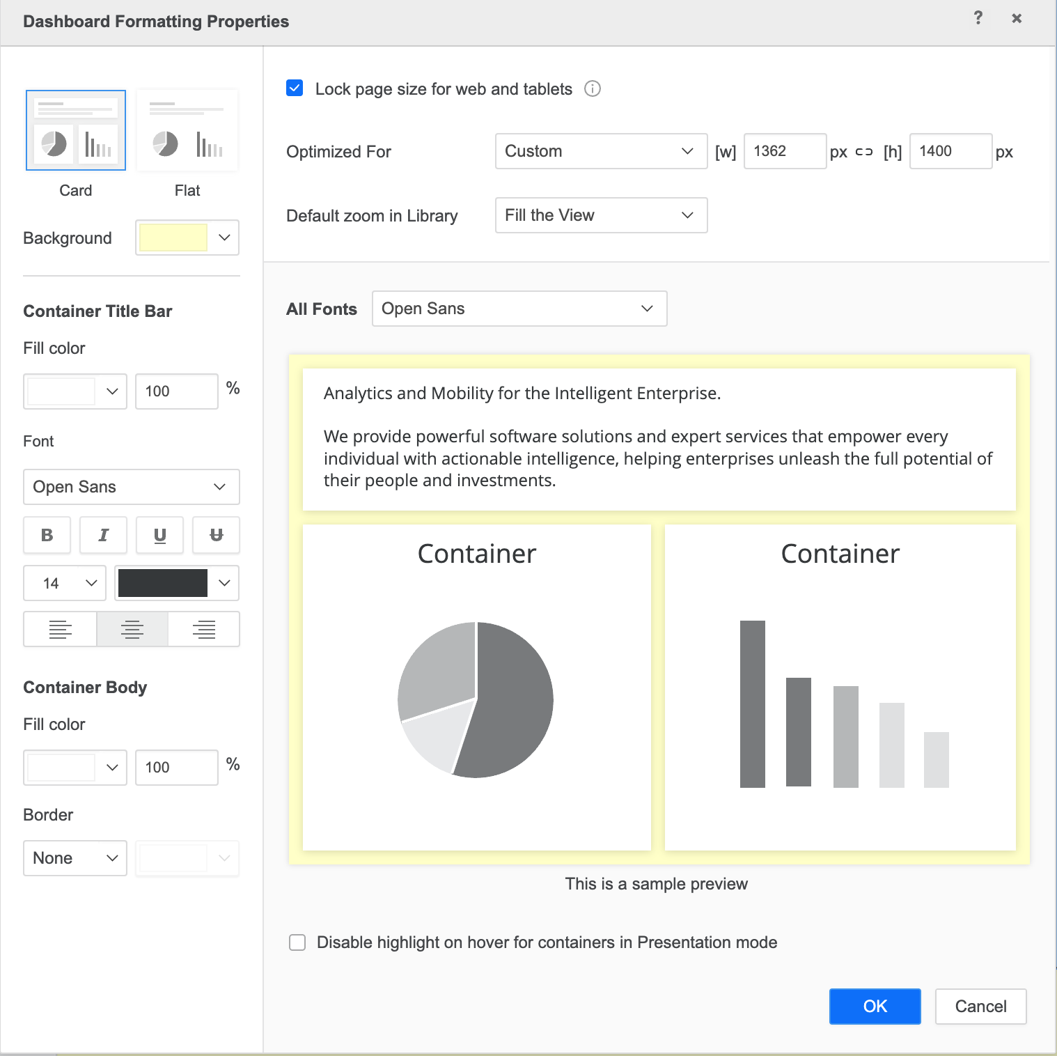
MicroStrategy ONE (June 2024) introduces a new dashboard formatting setting to lock a dashboard's page size. You can set predefined or custom ratios so the dashboard size updates responsively as you change your browser size. The length vs width ratio does not change for each component on the canvas.
Starting in Strategy One (May 2025), this feature is supported in the Library iOS app.
Dashboard Level Lock Page Size Setting
- Open a dashboard you want to modify.
- From the Format menu, select Dashboard Formatting. The Dashboard Formatting Properties dialog opens.
-
Select the check box next to Lock page size for web and tablets.
-
In Optimized for, choose a predefined size in the drop-down or edit the width and height for custom sizing.
-
Starting in Strategy One (January 2026), in Consumption view, choose a default behavior when the dashboard opens in consumption mode. If you are using a version prior to Strategy One (January 2026), this field is named Default zoom in Library.
Dashboard users in consumption mode can update the view setting to their preference.
-
Optionally, click the link icon between [w] and [h] so when a width or height is updated, the other is updated proportionally.
Recommended Canvas Size for Tablets
In addition to the default canvas size in the Optimized For drop-down, view the following dashboard for the latest iPad and Andriod tablet models.
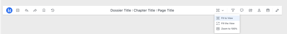
View Mode
-
Open a dashboard in consumption mode.
-
Expand the view drop-down and choose a view option:
-
Fill the View: This view fills the entire screen. The longer side of the dashboard that is cut off by the view will display a scroll bar.
-
Fit to View: This view fits all dashboard contents in the view.
-
Zoom to 100%: The page content will zoom as the browser zooms.
-
If you export to PDF, the export will use the defined setting. If you use Workstation offline mode or a separated visualization and show data, the author chosen paper size is applied.
Limitations
-
For some SVG and custom visualizations, lasso selection and tool tips will not work on Library or with Android touch.
-
Drop-down list selectors may adjust depending on zoom in or out.
-
When the canvas scales up on mobile devices, it may appear blurry. To prevent this, set the page size based on a larger iPad model, which allows the design to scale down cleanly and maintain visual clarity on smaller screens.