MicroStrategy ONE
Displaying or hiding fractional grid lines
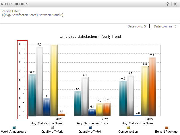
When data is displayed on a report as a graph, by default, the scale of values on an axis and the interval labels displayed for the axis are automatically determined based on the data for the report. If the range of values for an axis is relatively small, this can cause the graph report to include fractional values for the interval labels displayed on the graph's axis. If the number formatting for the axis labels uses a numeric format that does not display fractional, decimal values, this can cause graphs that appear to be displaying duplicate values, as shown in the graph below.
One way to improve the formatting of this type of graph is to modify the numeric formatting of the axis so that it displays these fractional values.
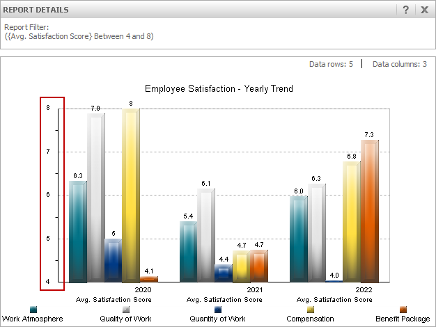
Another option is to hide the interval labels and grid lines for these fractional values. This displays a graph with only integer values along the axis, as shown in the graph below.
The steps below show you how to display or hide fractional interval labels and grid lines.
To display or hide fractional grid lines
-
Open a report in Graph View.
-
From the Graph menu, select Grids and Scales. The Preferences dialog box is displayed with the Axes category selected.
-
With the Axes category expanded, select the axis that includes the duplicated interval labels. The Grids and Scales options are displayed.
-
Select the check box Disable fractional grid lines. This hides any fractional interval labels and grid lines on the graph.
You cannot define whether to display or hide fractional grid lines if you use manual graph formatting such as defining the intervals displayed on an axis or defining the scale of a graph. If the Disable fractional grid lines option is greyed out and not accessible, you may have to clear other formatting options such as Use Manual Grid or Use Manual Setting Maximum Value and Minimum Value.
-
Click OK to update the graph and close the Preferences dialog box.