Strategy ONE
Toolbar Options
You can access document features such as inserting a Grid/Graph or formatting a text field using the toolbar options in the Document Editor. The Document Editor has multiple toolbars you can use to access different document features. Toolbars are mostly divided by workflow—the Insert toolbar, for example, lists the different controls you can insert in the document. You display the toolbar you want to use by clicking on the toolbar's name at the top of the Document Editor. One toolbar is displayed at a time.
Refer to the following sections when searching for specific document features:
- To share and customize the presentation of your document, see Home Toolbar.
- To display or hide panes in the Document Editor, see Tools Toolbar.
- To insert text fields, images, Grid/Graphs, and other controls into a document, see Insert Toolbar.
- To define how values in a Grid/Graph are displayed or apply thresholds to a Grid/Graph or other control, see Data Toolbar.
- To format the display of a Grid/Graph in Grid view, see Grid Toolbar.
- To format the display of a Grid/Graph in Graph view, see Graph Toolbar.
- To format text, numbers, and the colors used in a control, see Format Toolbar.
- To reposition and reorder controls, see Toolbar Options.
The toolbars available may vary depending on your user privileges and the current display mode of the document (Design, Editable, or Presentation).
The table below describes features that are included in every toolbar.
|
Name |
Icon |
Description |
|
Save |
|
Saves your document. |
|
Undo |
|
The last action you made in the document is undone. This option is available in Design and Editable Modes. |
|
Redo |
|
The last action that was undone is redone. This option is available in Design and Editable Modes. |
|
Apply |
|
Applies the undo/redo changes you have made to the document. After clicking this icon, your changes cannot be undone or redone. |
| Presentation Mode |

|
Displays the document in Presentation Mode, a high-level view where you can view the document as a finalized product. Presentation Mode displays all document results. |
|
Design |
|
Displays the document in Design Mode, a high-level view where you can insert and format controls in the document. Design Mode does not display document results and so provides better performance than Editable Mode. |
| Editable |

|
Displays the document in Editable Mode, a detail-level view where you can insert and format controls in the document. Editable Mode displays all document results. |
| Grid |

|
View the report as a grid. |
|
Graph |
|
View the report as a graph. |
| Grid and Graph |

|
View the report as a grid and the graph. |


Home Toolbar
You can share and customize the presentation of your document with the options listed in the Home toolbar. The Home toolbar is available in all modes.
|
Name |
Icon |
Description |
| Grid |
|
View the report as a grid. |
|
Graph |
|
View the report as a graph. |
| Grid and Graph |
|
View the report as a grid and the graph. |
|
Add to History List |
|
Adds the document to your History List, which is a folder where you can save report and document results. Document results in the History List do not include the latest data unless you periodically save the document to your History List or create a subscription. |
|
Create Personal View |
|
Saves a custom view of the document, useful for giving users personalized views of the same document. Personal views save all actions made since opening the document, including sorting, pivoting, and filtering. |
|
Share |
|
Shares your document in an email, as a link, or as an embeddable HTML iFrame. You can also define which users or groups can see and edit the document. |
|
|
|
Exports the document to PDF for printing. |
|
Send Now |
|
Emails the document to stored email addresses. Email addresses are stored in your project's preferences. |
|
Schedule Delivery to History List |
|
Creates a subscription for the document that sends document results to the History List on a specific schedule. |
|
Export |
|
Exports your document to Excel, PDF, HTML, or Flash. Use the drop-down list to select the appropriate export format. |
|
|
|
Exports the document to PDF. |
|
Full Screen Mode |
|
Expands the layout area to fill the entire screen. This option is available in Express, Interactive, Editable, and Flash Modes. |


Tools Toolbar
You can display or hide panels in the Document Editor with the options listed in the Tools toolbar. This toolbar is available in Design and Editable Modes.
|
Name |
Icon |
Description |
| Grid |
|
View the report as a grid. |
|
Graph |
|
View the report as a graph. |
| Grid and Graph |
|
View the report as a grid and the graph. |
| New |

|
Create a new report. |
|
Create Document |
|
Create a new document. |
| Create Dossier |

|
Create a new dossier. |
|
Report Objects |
|
Displays or hides the objects on your report. |
|
All Objects |
|
Displays or hides the All Objects panel. This option is available in Design and Editable Modes. |
|
Notes |
|
Displays or hides the Notes panel. For information on using the Notes panel, see Notes panel. |
|
Related Reports |
|
Displays or hides the Related Reports panel. For information on using the Related Report panel, see Related Reports panel. |
|
Page-by-Axis |
|
Displays or hides the Page-By pane, which displays the attributes the information is grouped by. |
| View Filter |

|
Displays or hides the View Filter pane, which displays the filters on your report. |
|
Report Details |
|
Displays or hides the Report Details pane, which displays information, such as filter and prompt details, about the report. |
| Show pivot buttons |

|
Displays or hides grid formatting capabilities. These buttons appears on existing objects in your report and allow you to move an object to a column/row, move the object left/right, add a page-by filter, or remove the object from the grid. |
|
Show sort button |
|
Displays or hides the sort button, which sorts a column from A-Z or Z-A. |
| Graph Zones |

|
Displays or hides the objects on the x and y axis of a graph. |
|
Report Options |
|
Change general report options, such as drilling capabilities, report formatting, and determining who can view your report. |


Insert Toolbar
You can insert text fields, images, lines, panel stacks, and other controls in a document with the options listed in the Insert toolbar. Select a control from the Insert toolbar or menu, then click an area in the document to place the control.
This toolbar is available in Design and Editable Modes.
|
Name |
Icon |
Description |
|
Design |
|
Displays the document in Design Mode, a high-level view where you can insert and format controls in the document. Design Mode does not display document results and so provides better performance than Editable Mode. |
| Editable |
|
Displays the document in Editable Mode, a detail-level view where you can insert and format controls in the document. Editable Mode displays all document results. |
|
Select Controls |
|
Allows you to select controls instead of inserting them. |
|
Lock Control |
|
Allows you to insert a control that cannot be resized or moved. Select this icon before placing the control you want to insert. |
|
Text |
|
Inserts a rectangular field where you can type and format text. |
|
Image |
|
Inserts an image into the document. The image must be stored in a location that is accessible by the Intelligence Server, the designers of the document, and the document's end-users. For guidelines on using accessible images, see Ensuring access to images. |
|
Line |
|
Inserts a line into the document. |
|
Rectangle or Rounded rectangle |
|
Inserts a rectangle into the document. Use the drop-down list to select the type of rectangle. |
|
Report |
|
Adds any report in your project as a Grid/Graph to the document. If the report is not already a dataset for the document, the report is added as a dataset as well. A Grid/Graph acts as a standard MicroStrategy report and displays data in Grid, Graph, or Grid and Graph view. To format and manipulate the data in a Grid/Graph, see Displaying Reports in Documents: Grid/Graphs. |
|
Grid |
|
Inserts a Grid placeholder that displays as a grid. A Grid placeholder is an empty Grid, without a dataset to populate the Grid with data. For more information, see Adding an empty report. |
|
Graph |
|
Inserts a graph as a placeholder. Use the drop-down list to select the graph style. Whichever graph type you select appears without a dataset to populate it with data. For more information, see Adding an empty report. |
|
Panel Stack |
|
Inserts a panel stack. A panel is an object in a dashboard used to group related data. Panel stacks contain one or more panels, where only one panel is displayed within the panel stack at a time. When you add a panel stack to a document, one panel is automatically added to the panel stack. |
|
Filter Panel |
|
Inserts a special panel stack, where all panels in the stack must display selectors. |
|
Table Control (Mobile) |
|
Inserts a form you can use to prompt users for information in a document displayed on a mobile device. You can add multiple text fields for users to fill out and group the text fields by category. |
|
HTML Container |
|
Inserts an empty HTML container, which is used to display Flash and AJAX content in the document. The content displays as though it is in an HTML browser within the document. This allows a document to display Flash information when the document itself is not in Flash Mode. See Displaying real-time web and other HTML content: HTML containers. |
|
Selectors |
|
Inserts a selector, which allows a user to flip through the panels in a panel stack or display different attribute elements or metrics in a Grid/Graph. Use the drop-down list to choose the type of selector. Selectors are interactive in Interactive, Flash, and Editable Modes. |
|
Buttons |
|
Inserts a button, which is a clickable field that redirects the user to a report, document, or outside link. Use the drop-down list to select the button type. For steps to link to a report, dashboard, or URL from a button, see Linking from a button. |
|
Widgets |
|
Inserts a widget, which is a highly visual, Flash-based display of the results of a dataset. Widgets are often interactive. Use the drop-down list to choose the type of widget you want to use. |
|
Layout |
|
Inserts a layout, which is like adding a document within your document. Layouts can have different primary datasets and document settings. |
|
Document |
|
Inserts a previously-saved document as an additional layout to your document. |


Data Toolbar
You can conditionally format your data or control the display of values in a Grid/Graph with the options listed in the Data toolbar. This toolbar is available in Design and Editable Modes.
|
Name |
Icon |
Description |
| Grid |
|
View the report as a grid. |
|
Graph |
|
View the report as a graph. |
| Grid and Graph |
|
View the report as a grid and the graph. |
| Add View Filter Conditions |
|
Defines conditions for a view filter to exclude data from a grid or graph. For background information on view filters and steps to filter data, see Using view filters on Grid/Graphs. |
|
Sort |
|
Defines sorting rules for the selected control. |
| Drill |

|
Define drilling options. |
| Filter on Selections |

|
Filter on a specific section. Select a section of your report and click the icon to filter the section. |
|
Hide Nulls/Zeros |
|
Displays or hides null or zero values in a grid. For steps, see Determining how null and zero metric values are displayed. |
| Refresh |

|
Refresh your report. |
| Swap Rows and Columns |
|
Switches the data displayed in the rows with the data in the columns of a selected grid. |
| Insert New Metric |
|
Creates a new metric to add to a grid or dataset. |
|
Rename/Edit Objects |
|
Renames or edits objects. |
| Edit Attribute Forms |

|
Define your attribute forms as either DESC, ID, or both. |
|
Toggle Attribute Forms |
|
Displays or hides all attribute forms for an attribute in a Grid/Graph. Available if the attribute has multiple attribute forms that can be displayed. |
|
Show Totals |
|
Displays subtotals and grand totals on a Grid/Graph. |
|
Edit Totals |
|
Opens the Totals Editor, where you can define the subtotals and grand totals used on a Grid/Graph, such as Sum, Average, and Count. You can define how and where subtotals are displayed. |
|
Quick Thresholds |
|
Applies a predefined threshold to a metric in a grid. Use the drop-down list to select the threshold type. For background information on thresholds, including instructions and examples, see Formatting conditional data in documents |
|
Toggle Thresholds |
|
Displays or hides the thresholds in a grid. Available if a threshold has been defined on the grid. For background information on thresholds, see Formatting conditional data in documents. |
|
Visual Conditional Formatting |
|
Opens the Visual Conditional Formatting Editor, where you can create a simple threshold based on a single metric. For steps to create a simple threshold, see Creating a conditional format or threshold based on a single metric. |
|
Advanced Conditional Formatting |
|
Opens the Advanced Conditional Formatting Editor, where you can create thresholds which can be based on multiple metrics and have more complex expressions than a simple threshold. For steps to create an advanced threshold, see Creating a conditional format or threshold based on multiple metrics or attributes. |


Grid Toolbar
You can format the display of a Grid/Graph in Grid view with features listed in the Grid toolbar. The options available may vary depending on the display mode used to view the document. This toolbar is available in Design and Editable Modes.
|
Name |
Icon |
Description |
| Grid |
|
View the report as a grid. |
|
Graph |
|
View the report as a graph. |
| Grid and Graph |
|
View the report as a grid and the graph. |
|
Autostyles |
|
Applies a predefined autostyle to a selected grid. Use the drop-down list to select the autostyle. For background information and instructions on how to create and save an autostyle, see Formatting using predefined formats (Autostyles). |
|
Banding |
|
Displays alternating rows of data in a Grid/Graph with alternating background colors to make rows easier to read. |
|
Outline |
|
Organizes the attributes in a Grid/Graph in a hierarchical display. |
|
Merge Column Headers |
|
Combines columns that are next to each other and have the same header into a single column. |
|
Merge Row Headers |
|
Combines rows that are next to each other and have the same header into a single column. |
|
Lock Row Headers |
|
Always displays row headers to the left of the selected grid when a user scrolls horizontally in the grid. |
|
Lock Column Headers |
|
Always displays column headers at the top of the selected grid when a user scrolls vertically in the grid. |
|
Auto Fit to Contents |
|
Expands or shrinks the width of each column in a grid to fit the text in the column. |
|
Auto Fit to Window |
|
Expands the width of columns in a grid to fit the window. This option does not reduce the size of columns if the window is not wide enough to fit all text in them. |


Graph Toolbar
You can format the display of a Grid/Graph in graph view with the options listed in the Graph toolbar. The options available may vary depending on the display mode used to view the document. This toolbar is available in Design and Editable Modes.
|
Name |
Icon |
Description |
| Grid |
|
View the report as a grid. |
| Graph |
|
View the report as a graph. |
| Grid and Graph |
|
View the report as a grid and the graph. |
|
Graph Type |
|
Defines the graph type of a Grid/Graph in Graph view, such as Vertical Bar or Horizontal Bar. The graph type defines the shape used to represent data values. Use the drop-down list to select the graph type. |
|
Graph Subtype |
|
Defines the graph subtype of a Grid/Graph in Graph view, such as Clustered or Absolute. The graph subtype formats the axes and display of categories and series. Use the drop-down list to select the graph subtype. |
|
Legend |
|
Displays or hides the legend for a Grid/Graph in Graph view. |
|
Data Values |
|
Displays or hides data values near data markers for a Grid/Graph in Graph view. |
|
Series by Row |
|
Displays objects on the Grid/Graph's rows as the series of the graph. |
|
Series by Column |
|
Displays objects on the Grid/Graph's columns as the series of the graph. |
|
Auto Arrange |
|
Any formatting changes you have applied are undone and the graph reverts to its default formatting. This icon is available if the document was created based off of a graph report with the Manual Layout option enabled. The Manual Layout option is located under Graph Preferences for a report in MicroStrategy Developer. |
|
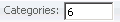
Categories |
|
Sets a maximum for the number of categories in a graph based on the value typed into the Categories field. The limit must be applied with the Apply icon before the graph is updated. The default value is 6. |
|
Series |
|
Sets a maximum for the number of series in a graph based on the value typed into the Series field. The limit must be applied with the Apply icon before the graph is updated. The default value is 5. |
|
Apply |
|
Applies the limits defined in the Categories and Series fields to the graph. |


Format Toolbar
You can access common styling options from the Format toolbar. Many of these features are not available outside of Editable Mode. This toolbar is available in Design and Editable Modes.
|
Name |
Icon |
Description |
| Grid |
|
View the report as a grid. |
| Graph |
|
View the report as a graph. |
| Grid and Graph |
|
View the report as a grid and the graph. |
|
The name of the object you want to format |
|
The object you want to format. Use the drop-down menu to select the correct object. If additional drop-down lists appear, you may select objects, shapes, and text within the initial object. You can then select the appropriate options to format the object, as described below. |
|
Font |
|
Defines the font of the selected text. Use the drop-down menu to change the font. |
|
Font Size |
|
Defines the font size of the selected text. Use the drop-down menu to change the font size. |
|
Bold |
|
Bolds the selected text. |
|
Italic |
|
Italicizes the selected text. |
|
Underline |
|
Underlines the selected text. |
|
Left |
|
Left-aligns the selected text. |
|
Center |
|
Center-aligns the selected text. |
|
Right |
|
Right-aligns the selected text. |
|
Justify |
|
Justifies the selected text so that each line of text occupies the same width. |
|
Currency Style |
|
Displays the selected number with a US dollar sign in front and two decimal places. |
|
Percent Style |
|
Displays the selected number as a percentage, with no decimal places. |
|
Comma Style |
|
Displays the selected number with a comma every three digits and no decimal places. |
|
Increase Decimal |
|
Increases the number of digits that display after the decimal point. |
|
Decrease Decimal |
|
Decreases the number of digits that display after the decimal point. |
|
Fill Color |
|
Sets the background color of the control. Use the drop-down list to select from a color palette, define a new color, or create a gradient. |
|
Line Color |
|
Sets the color of a line or border. Use the drop-down list to select from a color palette or define a new color. |
|
Text Color |
|
Sets the color of text. Use the drop-down list to select from a color palette or define a new color. |
|
Borders |
|
Defines the borders that display around a control. Use the drop-down list to select the borders that display. |
|
Border Style |
|
Defines the line style of the selected border. Use the drop-down list to select the line style. |
| Advanced Grid Formatting |
|
Set advanced font, number, alignment, color, and line formatting on a grid. |
| Advanced Graph Formatting |

|
Set advanced font, number, alignment, color, and line formatting on a graph. |