Strategy ONE
Create a Single Visualization
Use Auto Dashboard to generate a single visualization to answer a specific question or supply information about a topic. You can type your own request or, if you’re not sure how to start analyzing your data, use Auto Dashboard’s list of analysis suggestions. A request can include specific instructions on what type of visualization to generate and what data to use, or it can be a simple query such as "display regional income".
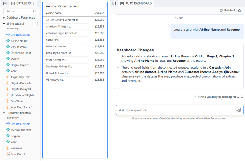
Beginning in Strategy One (March 2026), if a dataset cannot support a requested analysis, Auto Dashboard displays an informational message indicating that the user should review the data. For example, the Airline Revenue Grid visualization shown below uses objects from unlinked and unrelated datasets. The Revenue value cannot be calculated.
Create a Visualization Using Auto Dashboard
- In Library, create a new dashboard or edit an existing dashboard.
- To edit an existing dashboard, right-click the dashboard and select Edit.
The dashboard must contain at least one dataset.
-
If the Auto Dashboard icon
 is not displayed in the sidebar, as shown below, enable Auto Dashboard.
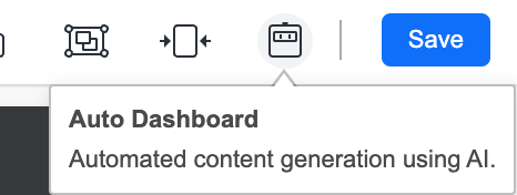
-
If the Auto Dashboard panel is not displayed, click the Auto Dashboard icon
in the sidebar.
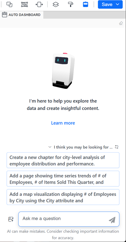
The Auto Dashboard panel displays a list of AI-generated content suggestions. The suggestions depend on the attributes and metrics in the dashboard's dataset.
-
Beginning in Strategy One (January 2026), you can display the Auto Dashboard panel as a floating window, providing more space for the dashboard canvas. Click the Switch to Floating Panel icon
 in the panel's toolbar.
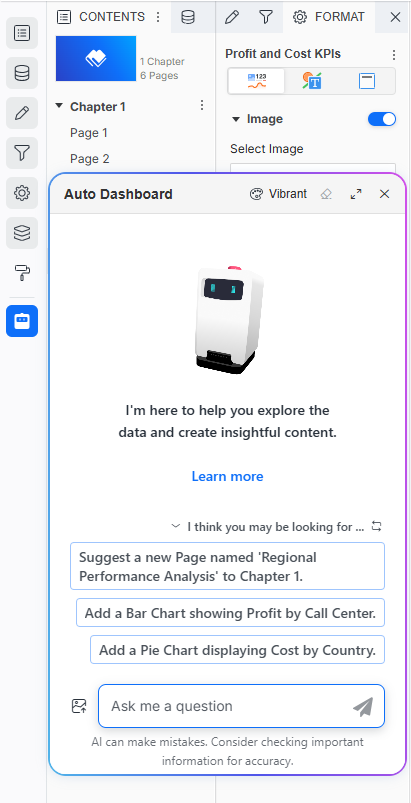 Click here for steps to work with the floating Auto Dashboard panel.
-
You can drag the floating panel to a different location on the dashboard and resize it.
-
To minimize the panel to an icon at the bottom of the sidebar, click Close X. To restore it, click the icon
 .
.
-
To return the panel to the side panel, click the Switch to Side Panel icon
 in the panel's toolbar.
-
-
Create your visualization using either method:
-
Use AI-generated suggestions:
-
Select one of the visualization suggestions from the list.
-
If none of the suggestions meets your needs, click Regenerate Suggestions
 to view alternative options.
-
-
Type a custom request using the steps below:
-
In the question box, type a business question or visualization request.
-
Select dataset objects from the suggestions list that displays as you type. This improves answer accuracy by avoiding ambiguity, especially when multiple objects share a similar name.
-
Click Submit
 or press Enter.
Your visualization is added to the current dashboard page, and the Dashboard panel lists the changes.
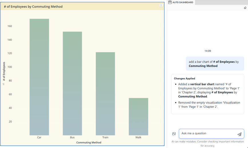
The example below is the response to "add a bar chart of # of Employees by Commuting Method". The bolded text is the dataset objects selected from the suggestions list.
-
-
-
If the visualization does not quite meet your needs, you can refine it by selecting the visualization and providing follow-up instructions to Auto Dashboard. Beginning in Strategy One (October 2025), Auto Dashboard understands historical context such as "Change this to a bar chart" and "Change the color of it to yellow". Supported interactions include:
-
Change the visualization type.
-
Add, remove, or replace an object in the visualization.
-
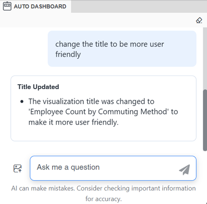
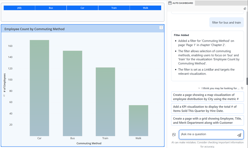
Change the visualization title, as shown in the example below, which asks to make the title more user friendly. The title is updated to "Employee Count by Commuting Method".
-
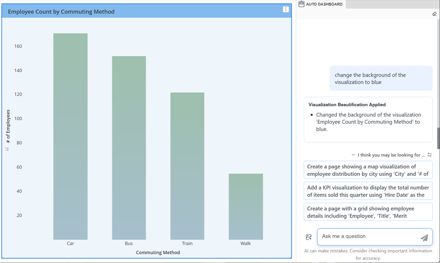
Change the background color of the visualization, as shown in the example below.
-
-
Add a filter for the visualization, as shown in the example below, which created a filter for Commuting Method.
-
-
You can Undo
 the latest action taken by Auto Dashboard.
 - Edit content generated by Auto Dashboard directly in the layout, as you would any other content.
- You can do this manually or by using Auto Dashboard. For example, Auto Dashboard can replace objects in a visualization, change the visualization type, rename objects including pages, delete visualizations or filters, and duplicate a page. Beginning in Strategy One (October 2025), Auto Dashboard understands historical context such as "Change this to a bar chart" and "Change the color of it to yellow". For instructions to edit a visualization, see Enhance a Visualization With Auto Dashboard.
- To remove the visualization from the dashboard, click the context menu
 for the visualization and select Delete.
 - To generate another visualization using Auto Dashboard, select another suggestion or enter a new query in the Auto Dashboard panel. If the suggestions are not listed, you can view them by expanding the I Think You May Be Looking For section. You can also:
- To start a new chat without using previous responses as context, clear the conversation history. Clearing history lets you remove previous inputs so the analysis starts without bias from past sessions. Session history, especially in data-heavy dashboards, can increase load times or make Auto slower. In the Auto Dashboard panel, click Clear History
 and click Yes.
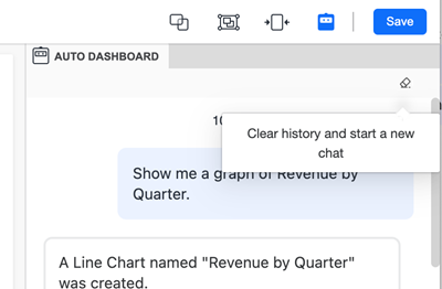
Save the Dashboard
-
Do one of the following:
-
To save the dashboard and continue editing, click Save and select Save.
-
To save the dashboard, exit editing, and view the dashboard, click Save and select Save and View.
-