Strategy ONE
Enhance a Visualization With Auto Dashboard
Strategy One (August 2025) introduces a preview feature, Auto Dashboard 2.0, which has been enhanced to improve responses and the design process. Beginning in Strategy One (September 2025), Auto Dashboard 2.0 is available out-of-the-box.
For more information on the enhancements, see Auto Dashboard 2.0 Enhancements.
Transform your visualizations with AI assistance. Auto Dashboard provides powerful editing capabilities for both manually-created and AI-generated visualizations. Use it to refine, enhance, or completely transform existing visuals to better meet your analytical needs without starting over.
When to Use Visualization Editing
-
Refine visualizations that almost meet your needs but require adjustments
-
Add context to existing charts by incorporating related metrics or dimensions
-
Change visualization types when a different format would better represent your data
-
Apply advanced formatting to improve readability and visual appeal
-
Add analytical elements like trend lines, forecasts, or comparisons
Examples of Powerful Edits
-
Transform a basic revenue bar chart into a comparative analysis with profit margins.
-
Convert a dense data table into an executive-friendly visual summary.
-
Add conditional formatting to highlight exceptions or outliers.
-
Incorporate forecasting elements based on historical trends.
-
Split a complex visualization into multiple, focused charts for clarity.
Beginning in Strategy One (November 2025), you can also:
-
Use free-form layout to organize and overlap the containers that contain your dashboard objects. You can independently position, size, and layer containers on a page. For background information on free-form layout, see Use Free-Form Layout.
-
Filter data at the chapter level by adding, removing, and setting chapter filters.
-
Apply a shadow effect on object containers.
-
Create bar charts with rounded corners.
Auto Dashboard's editing capabilities help you iterate quickly on your visualizations, allowing you to focus on insights rather than technical implementation details.
Edit a Visualization with Auto Dashboard
- In Library, create a new dashboard or edit an existing dashboard.
- To edit an existing dashboard, right-click the dashboard and select Edit.
The dashboard must contain at least one dataset.
-
If the Auto Dashboard icon
 is not displayed in the sidebar, as shown below, enable Auto Dashboard.
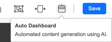
-
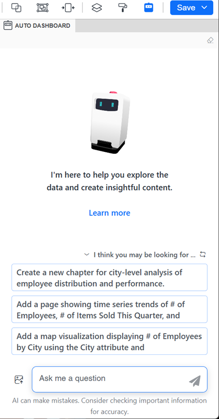
If the Auto Dashboard panel is not displayed, click the Auto Dashboard icon
in the sidebar.
The Auto Dashboard panel displays a list of AI-generated content suggestions. The suggestions depend on the attributes and metrics in the dashboard's dataset.
-
Beginning in Strategy One (January 2026), you can display the Auto Dashboard panel as a floating window, providing more space for the dashboard canvas. Click the Switch to Floating Panel icon
 in the panel's toolbar.
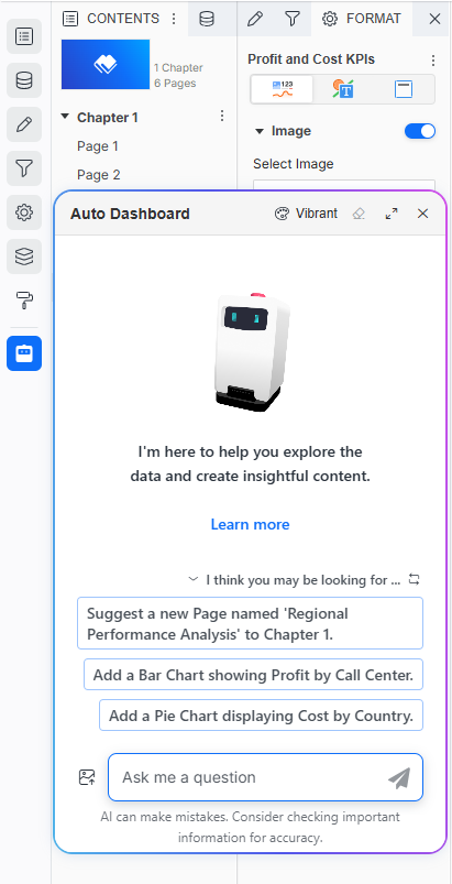 Click here for steps to work with the floating Auto Dashboard panel.
-
You can drag the floating panel to a different location on the dashboard and resize it.
-
To minimize the panel to an icon at the bottom of the sidebar, click Close X. To restore it, click the icon
 .
.
-
To return the panel to the side panel, click the Switch to Side Panel icon
 in the panel's toolbar.
-
-
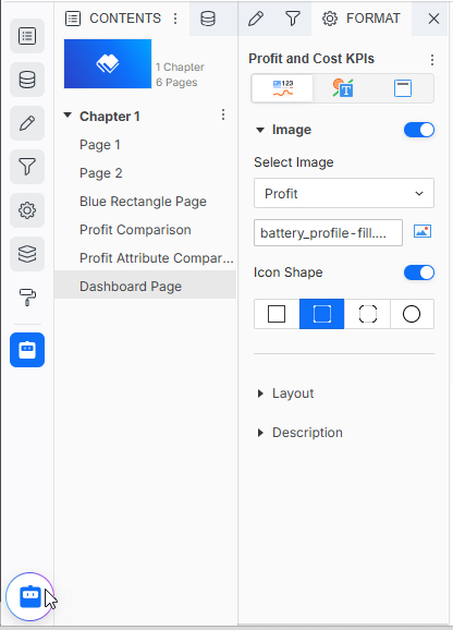
Click the visualization to edit.
-
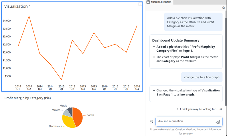
In the Auto Dashboard panel, type natural language instructions describing the modification to make. Beginning in Strategy One (October 2025), Auto Dashboard understands historical context such as "Change this to a bar chart" and "Change the color of it to yellow".
For example, the user typed "Change this to a line graph". Auto Dashboard completes the task and notes its changes in the panel.
Other examples include:
-
Change this bar chart to a line graph
-
Add a comparison to last year's data
-
Show only the top 5 performers and combine the rest as "Other"
-
Apply color coding based on performance thresholds
-
-
Continue to interact with Auto Dashboard until your visualization is complete.
-
You can edit a different visualization by selecting it in the dashboard page.
Save the Dashboard
-
-
Do one of the following:
-
To save the dashboard and continue editing, click Save and select Save.
-
To save the dashboard, exit editing, and view the dashboard, click Save and select Save and View.
-