MicroStrategy ONE
Formatting the Axes on a Graph
The axes of a graph help to label and give context to the data displayed on a graph. Depending on the graph style you have selected, different axes are used to display the data as a graph:
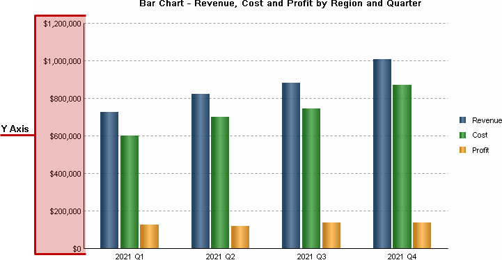
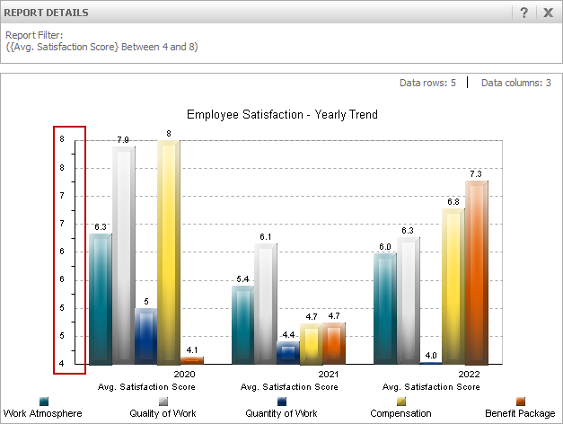
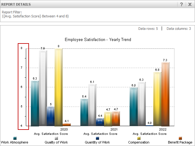
- Y Axis (or Y1 Axis for dual-axis graphs) is a primary numeric axis for graphs of all styles, except Pie, for which the Grids and Scales options is grayed out. It plots the values from the rows and columns in your data sheet. By default, the value labels on the Y axis are drawn on the left side of a vertical graph or the bottom of a horizontal graph. The Y axis is highlighted in the simple graph shown below.
- Y2 Axis is an axis for dual-axis graphs, for example, Area, Bar, Bubble, Column, Line, and Scatter. Histogram, Pie, Pareto, and 3D Scatter graphs do not have a Y2 Axis. When a dual-axis graph is selected, the series are automatically divided in half, with half of them assigned to one axis and the other half to the second axis. The two axes can be drawn up or out from the same base line or physically split into two separate sections on the graph. By default, the numeric labels for the Y2 axis are displayed on the right side of a vertical graph or the top of a horizontal graph. For an example of a dual-axis graph, see Bar.
- X Axis is for Bubble, Histogram, and Scatter graphs. These graphs include two numeric axes: a Y axis that is drawn on the left side of the graph and an X axis that is drawn on the bottom of the graph frame. By default, the value labels for X Axis are displayed across the bottom of the graph.
-
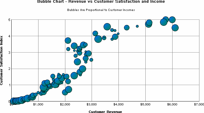
Z Axis is for Bubble and 3D Scatter graphs. For Bubble graphs, this axis is different from other graph axes in that there is no line that shows the range of values. Instead, the Z axis determines the size of the bubble, as shown in the image below.
- Category Axis is for Area, Column, Line, Stock, Gauge, and Surface graphs. The Category Axis defines the groups of items that are being charted.
- For all graph types except Bubble, Histogram, and Scatter, the labels for Category Axis are taken from the values defined in the first row of your data sheet.
- For Area, Column, Gauge, Box Plot, Pareto, and Line graphs, the Category Axis labels are drawn immediately below the graph frame.
- For Bar graphs, the Category Axis labels are drawn immediately to the left of the graph frame.
-
For Surface graphs, the Category Axis labels are drawn on the lower right side of the 3D cube.
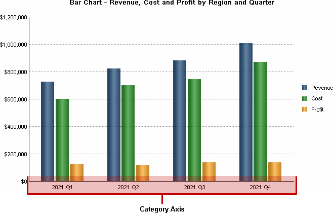
Along with the Y Axis, the Category axis is included on all graphs except for Pie graphs. The Category axis is highlighted in the simple graph shown below.
- Series Axis is for 3D Surface graphs only. In two-dimensional graphs, the series or rows of objects being charted are shown in the legend area of the graph. In three-dimensional graphs, these objects are shown on the Series Axis.
To Format the Axes of a Graph in MicroStrategy Developer
- Open a report in Graph View.
- Choose Graph > Grids and Scales.
If the graph is a Pie graph there is no Grids and Scales option, since Pie graphs do not have axes.
- Within the Axes category, you can expand each available axis and select the following formatting options:
- Grids and Scales: You can define the formatting of the grid itself and its scaling. The options that are available depend on the graph type and the axis, some of the formatting options include:
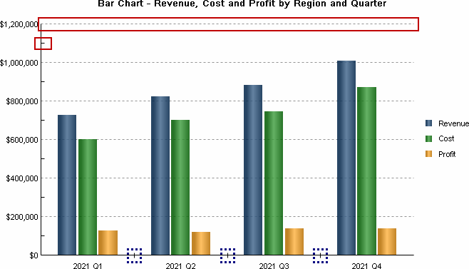
- Displaying or hiding grid lines, which provide lines and marks that denote range intervals on a graph's axis. For example, the graph below displays a major dashed grid line and a mark on the minor grid line for the vertical Y axis (highlighted with solid, red rectangles). Additionally, the horizontal Category axis includes a mark between each category to give some separation to the elements displayed on the graph (highlighted with dashed, blue rectangles).
- Displaying a custom line, which draws a line on the graph at a specific point or value. This can help to highlight a certain point or threshold of values on a graph. For an example graph that uses a custom line, see Pareto Chart.
- Using a logarithmic scale for the graph data. This can improve the display of data that follows a logarithmic trend.
- Defining how to display data on a graph that is not within the range of values defined for the graph's axes. For an example of defining how off-scale values are displayed, see Adjusting the Layout, Size, and Scale of a Graph.
- Defining the scale, or range of values displayed on a graph. While the scale of a graph is automatically determined based on the data for a graph, you can manually define the range of values to improve the look-and-feel of the graph or to show or hide values based on your graphing requirements. For an example of manually defining the scale of a graph, see Adjusting the Layout, Size, and Scale of a Graph.
- Displaying or hiding fractional grid lines, which is described in Displaying or Hiding Fractional Grid Lines.
- Axis Labels: You can define the formatting of the labels that are displayed for the axis. The options that are available depend on the graph type and the axis, some of the formatting options include:
- Defining where the labels for the axis are displayed. For example, you can display labels for a vertical Y axis on the left side, the right side, or both sides of the graph.
- Displaying the values on the axis in reverse order. For example, for graphs that include multiple years of data, you can display the values on the axis in reverse order to list the most recent data first.
- Formatting the numeric values for axes that include numeric data, which is described in Formatting Numeric Values on a Graph.
- Click OK.
Displaying or Hiding Fractional Grid Lines
When data is displayed on a report as a graph, by default, the scale of values on an axis and the interval labels displayed for the axis are automatically determined based on the data for the report. If the range of values for an axis is relatively small, this can cause the graph report to include fractional values for the interval labels displayed on the graph's axis. If the number formatting for the axis labels uses a numeric format that does not display fractional, decimal values, this can cause graphs that appear to be displaying duplicate values, as shown in the graph below.
One way to improve the formatting of this type of graph is to modify the numeric formatting of the axis so that it displays these fractional values. For steps to format these numeric values, see Formatting Numeric Values on a Graph.
Another option is to hide the interval labels and grid lines for these fractional values. This displays a graph with only integer values along the axis, as shown in the graph below.
The steps below show you how to display or hide fractional interval labels and grid lines.
To Display or Hide Fractional Grid Lines
- Open a report in Graph View.
- Choose Graph > Grids and Scales.
- With the Axes category expanded, select the axis that includes the duplicated interval labels. The Grids and Scales options are displayed.
- Select the check box Disable fractional grid lines. This hides any fractional interval labels and grid lines on the graph.
You cannot define whether to display or hide fractional grid lines if you use manual graph formatting such as defining the intervals displayed on an axis or defining the scale of a graph. If the Disable fractional grid lines option is grayed out and not accessible, you may have to clear other formatting options such as Use Manual Grid or Use Manual Setting Maximum Value and Minimum Value.
- Click OK.