MicroStrategy ONE
Bar
Bar graphs, also known as column graphs, are one of the most commonly used graphs because they are easy to use, flexible, and allow you to easily compare a wide range of data values.
Bar Graph Types
You can create many types of Bar graphs in MicroStrategy, including the following:
- Horizontal Bar and Vertical Bar styles:
- Absolute
- Clustered
- Stacked
- Dual-axis Absolute
- Dual-axis Clustered
- Dual-axis Stacked
- Bi-polar Absolute
- Bi-polar Clustered
- Bi-polar Stacked
- Percent
- 3D Bar styles:
- Riser
- Floating
MicroStrategy also includes Budgeting graph types that provide special Bar graph formatting of the values on a graph:
- Horizontal Lipstick and Vertical Lipstick, see Lipstick and Overlapping Bar Graphs.
- Horizontal Overlapping Bars and Vertical Overlapping Bars, see Lipstick and Overlapping Bar Graphs.
Vertical Bar: Dual-Axis Clustered Graph Example
One type of Bar graph you can create in MicroStrategy is a Vertical Bar: Dual-Axis Clustered graph. This traditional vertical Bar graph generally plots data within individual categories, with each bar representing a different measurement.
For example, the graph below allows you to analyze the revenue and profit generated by different suppliers, as well as the number of units each sold. The X-axis is divided by supplier (ACS Innovations, for example), the Y1-axis on the left represents the number of units sold, and the Y2-axis on the right represents dollar amounts.
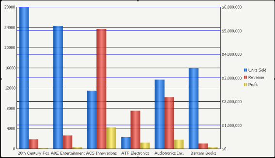
Notice that 20th Century Fox sold the most units, as represented by the tallest blue (the leftmost column for each category) column on the graph. The suppliers' smaller red (the middle column for each category) and yellow (the right-most column for each category) columns represent revenue and profit respectively. You can determine how much revenue and profit ACS Innovations generated by identifying the top of each column and comparing it against the dollar amounts on the right.
In the grid report, notice that the Units Sold metric is the first object on the grid's columns. This is important because the Units Sold metric's placement on the grid determines that the Y1-axis on the left side of the graph will represent the number of units sold.
Revenue and profit are measured in the same way, in that both are calculated by currency. Therefore, it is convenient for these metrics to reside to the right of the Units Sold metric in the columns. This way, a Y-2 axis on the right side of the graph can measure both Revenue and Profit along the same axis.
As shown in the graph above, you can allow some graph types to have two numeric axes (Y1 and Y2). This allows you to chart some of the series on one axis and some of the series on another axis. This is most helpful when the series use different value formatting. For example, the Units Sold data is displayed as a general count while Revenue and Profit data are displayed in a currency format.
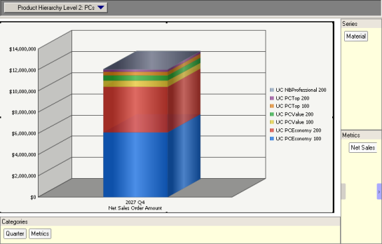
Vertical Bar: Stacked Graph Example
Another type of Bar graph you can create in MicroStrategy is a Vertical Bar: Stacked graph. This vertical Bar graph plots data within one column, with individual sections of the column representing a different measurement.
For example, the graph below provides information about the amount of net sales generated for each material (in this case, servers) in 2027 Q4. On the grid report, notice that the Material attribute is placed within the series and Product Hierarchy Level 2 attribute is placed within the Page-by field; having this attribute in the page-by field allows you to switch between different graph data for each specific material. For instance, since PCs is selected in the Page-by field, the graph below reveals net sales data about the different PCs purchased by customers in Q4 2027.
Lipstick and Overlapping Bar Graphs
MicroStrategy includes the Lipstick and Overlapping Bar graph types to provide special formatting of values on a graph. These Budgeting graph types are provided to compare two sets of data that are closely related. The most common use is to compare actual data, such as revenue, and the targets that were set prior. Another common use is to compare the same actual data versus a forecast for the same data that was created using statistical analysis.
These Budgeting graph types help to compare two sets of data (the first two metrics on the graph) that are closely related in the following ways:
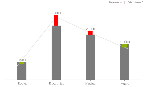
- Lipstick Bar graph: A Lipstick Bar graph combines what are traditionally two separate bars on a graph into a single bar with distinctive formatting, as shown in the image below.
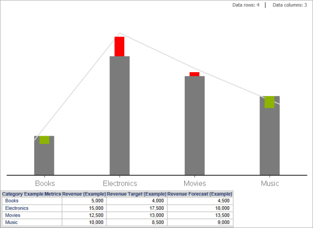
By default, the data for the first metric is displayed as a standard bar on the graph with gray formatting, while the data for the second metric is displayed in one of the following ways:
- If the second metric is less than the first metric, the second thinner bar is displayed as a green bar that starts at the value of the second metric and stops at the value for the first metric. For example, in the Lipstick Bar graph shown above, when the target revenue value is lower than the actual value for revenue, as seen with books and music, this shows that results are beating expected targets. A green bar is shown to display the difference.
- If the second metric is greater than the first metric, the second thinner bar is displayed as a red bar that starts at the value of the first metric and stops at the value for the second metric. For example, in the Lipstick Bar graph shown above, when the target revenue value is higher than the actual value for revenue, as seen with electronics and movies, this shows that results are not meeting expected targets. A red bar is shown to display the difference.
- If no data exists for the first metric, or its values are null, then no bar is displayed for the first metric. Instead, a bar is only displayed for the value of the second metric. By default, these bars for the second metric are displayed with a lighter gray color than the bars displayed when the first metric has a valid value.
- Overlapping Bar graph: An Overlapping Bar graph displays two separate bars on a graph with an overlap of the bars to easily compare the values, as shown in the image below.
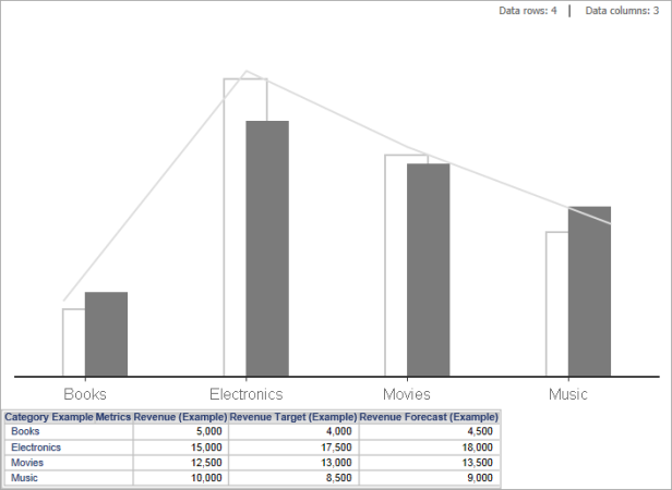
By default, the bars are displayed with contrasting colors and formatting, which makes it easier to quickly compare the data.
Since Overlapping Bar graphs use a slight overlap to compare two metric values, you can use this graph type for a wider range of analysis as compared to a Lipstick Bar graph. The Lipstick Bar graph formatting implies a direct relation of expected versus recorded values between the data being compared. With an Overlapping Bar graph you can also compare values such as the price of an item versus the cost of an item.
While the first two metrics on a Lipstick or Overlapping Bar graph are used to display and format the bars of the graph, additional metrics can also be included. Any additional metrics are displayed as simple line graphs, which can be used to display trends or highlight minimum and maximum values. In the example reports shown above, the revenue forecast is displayed as a line on the Lipstick and Overlapping Bar graphs.
The steps below show you how to create a Lipstick or Overlapping Bar graph.
Create a report with at least one attribute and two metrics. Additional metrics are displayed as lines on the graph.
To Create a Lipstick or Overlapping Bar Graph
- In MicroStrategy Web, navigate to and click on the report to be displayed as a Lipstick or Overlapping Bar graph.
- From the toolbar, click the Graph icon.
- Choose Format > Graph.
- On the General tab, from the Graph Type drop-down list, select Budgeting.
- From the Graph Sub-type drop-down list, select one of the following:
- Vertical Lipstick: A Lipstick Bar graph in which the bars of the graph are displayed vertically.
- Horizontal Lipstick: A Lipstick Bar graph in which the bars of the graph are displayed horizontally.
- Vertical Overlapping Bars: An Overlapping Bar graph in which the bars of the graph are displayed vertically.
- Horizontal Overlapping Bars: An Overlapping Bar graph in which the bars of the graph are displayed horizontally.
- In the Max Bar Size area, you can define the size of the bars using the Type drop-down list.
By default, Automatic is selected, which means that the size of the bars is determined automatically, based on the data for the graph. If you select Manual, you can type a value to define the size of the bars. The maximum value of 1 displays the bars so that the bars of adjacent categories on the graph appear to be touching.
- You can perform additional formatting for the graph, such as:
- For Lipstick Bar graphs, you can display the value of the difference between the two values being compared:
- On the Format tab, from the drop-down list at the top, select Increment/Decrement Value.
- From the Format area, select the Show check box. This displays the value of the difference between the two values being compared, as shown in the graph below.
- Perform any other graph formatting required for the graph report, and then save your changes. Once your changes are saved using MicroStrategy Web, you can view or modify this graph in MicroStrategy Web.
Using Bar Graphs Effectively
- The Bar graph is a flexible graph format since you can create one from any number of attributes, metrics, and other report objects. Its minimum requirements are that one attribute and one metric be present on the report grid. However, as explained in Moving Objects on a Graph Report, the location of these objects on your graph report determines whether and how the grid report can be generated as a Bar graph.
- When you are using a Vertical Bar: Dual-Axis Clustered graph (see Vertical Bar: Dual-Axis Clustered Graph Example), or other graphs similar to it, think about the order in which your metrics appear on the grid report. The order of the metrics in the series for the graph report determines which metrics are represented by the Y-1 and Y-2 axes. For example, in the Vertical Bar: Dual-Axis Clustered graph above, the order of the metrics in the series determines what the Y-1 and Y-2 axes represent.
- As shown in the graph in Vertical Bar: Dual-Axis Clustered Graph Example, you can allow some graph types to have two numeric axes (Y1 and Y2). This allows you to chart some of the series on one axis and some of the series on another axis. This is most helpful when the series use different value formatting. For example, the Units Sold data is displayed as a general count format, while Revenue and Profit data are displayed in a currency format.
- Placing an attribute in the page-by field can not only enhance the look and feel of your graph, it is often an essential step in the graph design process. For example, recall the Vertical Bar: Stacked graph example above. If you move the Product Hierarchy Level 2 attribute off the page-by field onto the grid, the graph presents an excessive number of columns, making it difficult to focus on specific data.
- Apply a gradient to the bars in your graph to make them stand out from the other sections of the graph. For example, the graph above has a gradient applied to its series. To apply gradients and other effects, right-click your graph's series and access the Preferences dialog box. For these steps, see Manually Formatting Graph Series and Objects.
- If you are comparing two sets of data that are closely related, such as actual and target data, or actual and forecast data, consider using a Lipstick or Overlapping Bar graph. These Budgeting graph types are described in Lipstick and Overlapping Bar Graphs.
- For detailed information about the specific options for Bar graphs in MicroStrategy, see the MicroStrategy Developer help. (From within MicroStrategy Developer, press F1.)