MicroStrategy ONE
Formatting a Graph Using Colors, Shading, and Effects
You can change the colors and overall look and feel of specific objects, such as series, on your graph. For example, you can format individual bars in your Bar graph or pie slices in your Pie chart using thresholds, as described in Displaying Thresholds on Graph Reports. The graph legend or axes can be formatted as well.
You can format a graph report by adjusting colors, and applying a variety of graphical effects, including gradients, transparency, patterns, pictures, textures, and bevel effects. You can also apply a set of color and shading schemes to all the objects on a graph report.
Formatting Colors, Shading, and Effects in MicroStrategy Developer
You can change the colors, shading, and other effects on your graph report in a number of ways. For example, you can do the following:
- Select a color/shading scheme from the Color Styles drop-down menu on the Graph toolbar. When you select a color/shading scheme for a graph report, the colors of the graph are changed, and shading and other effects are applied as well. For these steps, follow the procedure To Change the Colors, Shading, and Other Effects on a Graph Report in MicroStrategy Developer below.
- Select from several color palettes in the Color Palette drop-down menu on the Graph toolbar. When you select a color palette for a graph report, the colors of the graph are changed, but shading and other effects are not applied. For these steps, follow the procedure To Change Only the Colors of a Graph Report in MicroStrategy Developer below.
- Manually format the color of individual objects and apply effects such as gradients to them. For example, you can adjust the color of and apply a texture to the bars of a Bar graph. For more information, see Manually Formatting Graph Series and Objects.
- Define metric-specific graph colors that are used when a metric is displayed as a series in a graph. Metric-specific graph colors override any colors defined by the color palettes and color styles selected for the graph, as well as any manual color formatting selected for the series of the graph. For steps to define metric-specific graph colors, see Defining a Graph Color for Metrics in MicroStrategy Developer.
- Define graph colors for individual graph elements such as bars in your Bar graph or pie slices in your Pie chart using thresholds, as described in Displaying Thresholds on Graph Reports.
The procedure below provides steps to change the colors, but not the shading and other effects, on your graph report.
To Change Only the Colors of a Graph Report in MicroStrategy Developer
- View a report in Graph or Grid Graph View. Choose View > Graph View or Grid Graph View.
- On the Graph toolbar, click the arrow next to the Color Palettes
icon.
If the Graph toolbar is not displayed, from the View menu, select Toolbars, then Graph.
- Select a color palette to apply its color scheme to the graph report.
The steps below show you how to change colors, shading, and other effects on your graph report.
To Change the Colors, Shading, and Other Effects on a Graph Report in MicroStrategy Developer
- View a report in Graph or Grid Graph View. Choose View > Graph View or Grid Graph View.
- On the Graph toolbar, click the arrow next to the Color Styles
icon.
If the Graph toolbar is not displayed, choose View > Toolbars > Graph.
- Select a color/shading scheme to apply to the graph report.
Defining a Graph Color for Metrics in MicroStrategy Developer
You can define the color used for a metric when it is displayed as a series in a graph. The graph color that you define for a metric overrides any default color schemes for the graph report. This lets you maintain any metric-specific color schemes that are utilized throughout a MicroStrategy project. For example, you can define a Profit metric to always display in green on graph reports.
To allow colors for metrics to be inherited in graph reports, you must take the following actions:
- Define the colors to use for a metric when it is displayed as a series in a graph. You can define this color formatting for the metric itself, or for the metric on a specific graph report:
- You can define the graph color for a metric, and this color is then used as the default graph color for the metric in all graph reports. Steps on how to complete this configuration are described in To Define the Default Graph Color for a Metric in MicroStrategy Developer.
- You can define the graph color for a metric on a specific graph report. This overrides any default metric graph color options. Steps on how to complete this configuration are described in To Define the Graph Color for a Metric in a Graph Report.
- Enable the graph report to inherit a metric's graph color. Steps on how to complete this configuration are described in To Enable or Disable a Graph Report to Inherit a Metric's Graph Color in MicroStrategy Developer.
To Define the Default Graph Color for a Metric in MicroStrategy Developer
- Using MicroStrategy Developer, log in to a project.
You must log in with an account that has privileges to modify metrics.
- Browse to a metric, right-click the metric, and then select Edit.
- Choose Tools > Formatting > Headers.
- From the Chart tab, in the Series Color drop-down list, select one of the following options:
- <default>: Allows the color for the metric to be defined on the graph report. For steps on how to define the graph color for a metric in a graph report, see To Define the Graph Color for a Metric in a Graph Report.
- Solid: Displays a single color for the metric when the metric is displayed as a series in a graph report. You can select the color from the Fill color drop-down list.
- Gradient: Displays a blend of two colors in a gradual color change for the metric when the metric is displayed as a series in a graph report. You can select the two colors for the gradient from the Color 1 and Color 2 drop-down lists, and select the angle for the gradient.
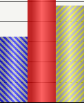
- Pattern: Applies a pattern to the object's background. Patterns can help to distinguish between the risers of different series in a graph without having to rely solely on color. For example, the three bar risers shown below can be distinguished by color as well as by the pattern that they use.

- From Graph: Allows the color for the metric to be defined on the graph report. When defining the default graph color for the metric at the metric level, this From Graph option is the same as using the <default> option. For steps on how to define the graph color for a metric in a graph report, see To Define the Graph Color for a Metric in a Graph Report below.
- Click OK.
- Click Save and Close.
You can repeat these steps for any metrics that require a specific graph color. Each metric should use a color that can be easily distinguished from the colors used for other metrics. This ensures that graph report results are easy to decipher based on color.
To Define the Graph Color for a Metric in a Graph Report
- Using MicroStrategy Developer, log in to a project and navigate to a graph report.
- Right-click the graph report and select Run.
- Choose View > Grid View.
- In the report results, right-click the metric, point to Formatting, and select Metric Name Headers. The Metric Name is the name of the metric.
- From the Chart tab, in the Series Color drop-down list, select one of the following options:
- <default>: Displays the default graph color that was defined for the metric using the Metric Editor. For steps on how to define the graph color for a metric using the Metric Editor, see To Define the Default Graph Color for a Metric in MicroStrategy Developer.
- Solid: Displays a single color for the metric when the metric is displayed as a series in a graph report. You can select the color from the Fill color drop-down list.
- Gradient: Displays a blend of two colors in a gradual color change for the metric when the metric is displayed as a series in a graph report. You can select the two colors for the gradient from the Color 1 and Color 2 drop-down lists, and select the angle for the gradient.
- Pattern: Applies a pattern to the object's background. Patterns can help to distinguish between the risers of different series in a graph without having to rely solely on color. For example, the three bar risers shown below can be distinguished by color as well as by the pattern that they use.
- From Graph: Displays the color defined by the graph's default color scheme. Manually selecting this option overrides any default metric graph color options defined using the Metric Editor.
- Click OK.
- Choose View > Graph View to display the report results as a graph.
You can repeat these steps for any metrics on the report that require a specific graph color. Each metric should use a color that can be easily distinguished from the colors used for other metrics. This ensures that graph report results are easy to decipher based on color.
To Enable or Disable a Graph Report to Inherit a Metric's Graph Color in MicroStrategy Developer
Inheriting metric graph color is enabled by default. The steps below show you how to ensure that metric graph colors are inherited, as well as how to disable this formatting.
- Using MicroStrategy Developer, log in to a project and navigate to a graph report.
- Right-click the graph report and select Run.
- Choose Graph > Preferences.
- By default, all metric-specific graph colors are inherited. To disable this inheritance and apply the graph color scheme to all metrics, in the Other area, clear the Apply metric formatting when available check box.
- Click OK.
Formatting the Y-Axis: Graph Series in MicroStrategy Web
The procedure below describes how to format a graph in MicroStrategy Web using the Format: Graph dialog box, because this dialog box contains all formatting options for a graph. As an alternative, you can quickly format a graph by right-clicking the graph component and selecting a formatting option. You can also format the graph using the Formatting toolbar, which is available from the View menu.
You must have the necessary Web Professional privileges to format graph series.
To Format the Series of a Graph in MicroStrategy Web
- Run a report and display it in either Graph View or Grid and Graph View.
- Choose Home > Graph.
- Right-click the graph and select Format.
- If DHTML is disabled, click Go.
- Select the Format tab.
- If DHTML is disabled, select the Format link.
- From the left-most drop-down list at the top, select Series Shapes. From the next drop-down list, select the specific series to format. In a bar graph, you can select Bar Riser for [name of attribute/metric combination]. For example, this may be displayed as Bar Riser for Electronics Revenue.
In MicroStrategy Developer, you can choose to format a metric displayed as a series in a graph, to always display as a specific color. For example, you can define a Profit metric to always display in green on graph reports. This formatting overrides the formatting options you can select in the Series Colors options. For steps to assign a specific color to a metric, see Defining a Graph Color for Metrics in MicroStrategy Developer.
- If DHTML is disabled: From the drop-down list, under Series Shapes, select the specific series to format. In a bar graph, you can select Bar Riser for [name of attribute/metric combination]. For example, this may be displayed as Bar Riser for Electronics Revenue. Click the check mark.
- To apply a background color, from the Fill Color drop-down list, select the background color for the graph series.
- You can apply any of the following effects to the shape of the series:
If DHTML is disabled, you cannot create custom colors. You also cannot apply gradients, transparency effects, or bevel effects.
- Apply a color gradient, which is a combination of two colors. To do so, in the Fill area click the arrow on the right side of the color selector, and then click Gradients. In the Gradients dialog box that opens, select the two colors to use for the gradient. Select a shading style to determine the direction in which the two colors are blended together.
- Adjust the transparency of the series color using the Fill Transparency scroll bar. Click and drag the scrolling bar until you reach the desired transparency. As you scroll, the percentage of transparency is displayed. When you set the transparency to a low percentage, the colors of the object appear brighter. When you set the transparency to a high percentage, the colors of the object appear more faded.
- In the Line/Border area, you can define various formatting for the border line of the series. For example, from the Color drop-down list, specify a color for the border lines.
By default, all series in a graph share the same border formatting, which means that changing the border formatting for one series applies to all series for the graph. To define unique border formatting for each series in a graph, you must first select the general graph preferences option Allow different borders per series using MicroStrategy Developer. Once this option is selected and the changes are saved using MicroStrategy Developer, unique border formats for each series in a graph can then be applied and saved from either MicroStrategy Web or Developer.
- If you are formatting a graph that contains lines, such as a Line, Area, Polar, or Radar graph, you can specify whether the lines in the graph are straight or curved. In many cases, curved lines provide a cleaner look and feel. To apply curved lines, on the General tab select the Use curved lines check box.
-
If the graph report includes series markers, from the left-most drop-down list at the top of the Format tab, select Series Markers. You can define various formatting for the series markers. For example, from the Effects drop-down list, select a bevel effect, such as Chiseled Edge or Sphere.
The Donut and Sphere effects are applied to all circular graphs (such as a Pie graph), polygonal graphs (such as a Radar graph), and rectangular graphs (such as a bar graph). The Smooth and Chiseled Edge effects are not applied to any circular types of graphs.
- Click Apply to update the graph's appearance or click OK to update the graph and close the dialog box.
Applying Gradient Colors to a Graph in MicroStrategy Web
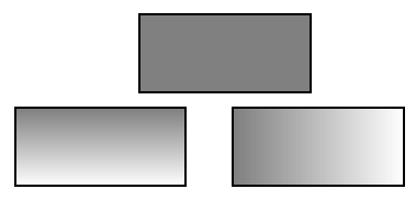
Gradient colors blend two colors to create a gradual color change in the background of a graph or a control in a Report Services document. (For an introduction to controls in documents, see the Report Services Document Creation Guide.)
In the example shown below, the rectangles on the bottom use gradient colors, while the rectangle on the top uses a single, solid color.
You can select the two colors, as well as the direction of the blending. The direction is called the gradient shading style, and several variants are available within each shading style (for example, Horizontal centered is one variant of the Horizontal shading style). The available shading styles are:
- Horizontal
- Vertical
- Diagonal Up
- Diagonal Down
- From Corner
- From Center
- Custom
The Horizontal and Vertical shading styles contain Horizontal centered and Vertical centered variants. These variants, shown below, are three-way or mirror gradients.
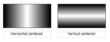
These types of gradients blend the colors from the middle of the graph series out to the edges. One color is applied in the center of the graph series and the other to the edges of the graph series, then the two are blended. The two halves are identical, as though a mirror was placed along the center. You can choose to blend the colors horizontally or vertically, as shown in the rectangles above, by specifying the gradient shading style and variant.
The procedure below describes how to format a graph in MicroStrategy Web using the Format: Graph dialog box, because this dialog box contains all formatting options for a graph. As an alternative, you can quickly format a graph by right-clicking the graph component and selecting a formatting option. You can also format the graph using the Formatting toolbar, which is available from the View menu.
To Apply Gradient Colors to the Series of a Graph in MicroStrategy Web
- Run a report, and display it in either Graph View or Grid and Graph View.
- Right-click the graph to modify, select Fill, and then Gradients. The Gradients dialog box opens.
- Select the two colors to use for the gradient from the Color 1 and Color 2 drop-down lists.
- From the Shading Styles area, select a shading style in which to display the gradient. The shading style determines the direction in which the two colors are blended together.
- If you select Custom from the Shading Styles area, you can specify the following:
- Transition Type: Determine the direction in which the gradient colors transition.
- Angle: Determine the angle at which the gradient colors are blended.
- X Offset: Determine the horizontal position of the point at which the gradient colors are blended.
- Y Offset: Determine the vertical position of the point at which the gradient colors are blended.
- Select a graph variant on the right.
- Click OK.
Displaying Thresholds on Graph Reports
Thresholds are a standard MicroStrategy analysis feature that allow conditional formatting for metric values. This conditional formatting is called a threshold, because when a given value in your data reaches a certain point, or threshold, the conditional formatting is applied (see Understanding How Formatting Impacts Report Display). This conditional formatting is displayed on grid reports by default, but it can also be displayed on graph reports.
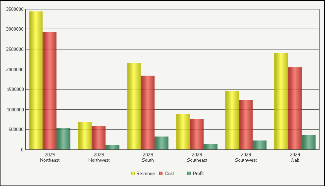
Enabling the display of thresholds on a graph report allows the conditional formatting to be applied to the series of a graph report, thus highlighting data of particular importance on the graph. The graph report shown below uses thresholds to highlight when employee satisfaction is above seven or below three for a given survey field.

In the report shown above, gradients are used to highlight each threshold on the Avg. Satisfaction Score metric. These two thresholds help to distinguish when employee satisfaction is considerably high or low.
Any background effect can be used to display a threshold. This includes a solid color, a pattern, a gradient, and any other available background effects. If your thresholds that are displayed on a grid report only include formatting such as symbols and text formatting, you can add background formatting to the threshold so that the background formatting can be displayed when the report is displayed as a graph.
If a threshold does not include any background formatting, the threshold formatting cannot be displayed on a graph report.
If a threshold includes background formatting as well as other types of formatting, only the background formatting can be displayed on the graph report.
Not all graph types can display thresholds. For example, Area graphs combine all data into a single area object. Since the data is all visually connected into the same area object, thresholds cannot be displayed for specific data points. However, many graph types display a separate series or data marker for each data point, and thus can display thresholds.
The following graph types can display thresholds directly on the series of the graph:
- Bar
- Boxplot
- Bubble chart
- Funnel
- Histogram
- Pareto chart
- Pie chart
- Stock
The following graph types can display thresholds on the data markers that highlight specific data points on the series of the graph:
- Gauge
- Line
- Polar chart
- Radar line chart
- Scatter plot and three-dimensional scatter plot
For example, the graph report shown below is the same report used in the previous example. However, while the previous example used a Bar graph style, the report shown below uses a Line graph style.

Rather than highlighting the entire line of the Line graph, the threshold formatting is displayed only on the data markers.
You have created a graph report, which also includes thresholds on the data.
The thresholds that you plan to display on the graph report include some type of background effect such as a solid color, a gradient, or a pattern. Background formats are the only threshold formatting that can be displayed on graph reports.
To Enable the Display of Thresholds on a Graph Report
- Using MicroStrategy Web, log in to a project and navigate to a graph report that includes thresholds.
- Run the report and display it in Graph View.
- Choose Data > Advanced Thresholds Editor.
-
From the list of thresholds, select a threshold. On the toolbar, click Enable threshold on Graph (
 ). Repeat this step for any thresholds that are to be displayed on the graph.
If a threshold does not include any background formatting, it cannot be displayed on a graph report and the Enable threshold on Graph option is not available.
If you have a threshold that should be displayed on a graph, you can add a background effect to the threshold. You can then enable the background formatting of this threshold to be displayed on the graph report. This background effect is also displayed on the report when it is displayed as a grid.
- Once you have enabled the required thresholds to be displayed on the graph report, click OK.
- Click OK.
- Review the graph report. The thresholds should be displayed for applicable data on the graph report.
If you are using one of the graph types that support thresholds, and you do not see thresholds on the graph report, use the steps provided below to display the thresholds:
- Choose Format > Graph.
- Click General and clear the Apply rounded effects to all series check box.
This removes the automatic beveling effects used for the series and data markers of the graph report, but it also allows the display of thresholds for certain graph types. You can still apply and create your own custom bevel effects for the graph report, as described in Manually Formatting Graph Series and Objects.
- Click OK. The thresholds should now be displayed on the graph report.