MicroStrategy ONE
Moving Objects on a Graph Report
A graph report's layout depends on the location of report objects on the grid of the report. For example, a grid report with its metrics in the rows and attributes in the columns produces a different graph than a grid report with the same metrics in the columns and attributes in the rows.
Graph reports consist of categories and series. A summary of these elements of graphing is provided in the table below.
|
Graphing Term |
Definition/How it appears in reports |
||||||||||||
|
Categories |
|
||||||||||||
|
Series |
|
Consider the following example. The Bar graph shown below displays revenue, cost, and profit by region and quarter.
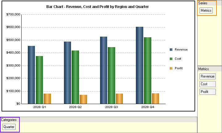
This graph report, named Bar Chart - Revenue, Cost and Profit by Region and Quarter, is available in the MicroStrategy Tutorial project.
Notice in the graph report shown above that the attribute Quarter is included in the categories, while the metrics Revenue, Cost, and Profit are included in the series. This displays a cluster of three bars for the Revenue, Cost, and Profit metrics. Each cluster represents the metric values for a particular quarter. This view of data displays how revenue, cost, and profit affect each other for a given quarter.
You can change the focus of the graph report simply by changing the series and categories. For example, the same graph report is used to display the graph below.
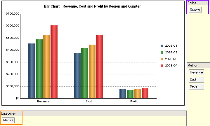
Notice that the only change that has been made is that the Quarter attribute is now a part of the series, while the metrics Revenue, Cost, and Profit are part of the categories. Each cluster of bars now represents a single metric over time. This view of data displays how revenue, profit, and cost have increased or decreased over four quarters.
As shown in the previous examples, how you situate report objects such as attributes and metrics on a grid directly affects how data is displayed on your graph, which in turn can change the analytical focus of the graph. It is helpful to keep this in mind as you design reports you intend to display as graphs.
To display or hide the series and categories drop zones in MicroStrategy Developer, click Show Drop Zones in the toolbar.
It is also important to remember that each graph type has its own data requirements, and changing the location of objects for one graph type can have a vastly different effect than it does for another graph type. For information on the requirements for each graph style, see Minimum Object Requirements for Each Graph Style.