MicroStrategy ONE
Visualizations in dashboards
A visualization is a visual representation of the data in a dashboard, such as a grid or graph. Visualizations provide multiple ways to display and interact with the data from the dashboard's dataset. Each visualization is displayed on a separate tab in the dashboard. You can click the tab of a visualization to display it.
The different types of visualizations available for analyses are:
-
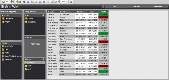
Grid visualization: You can display data in an interactive grid, allowing users to pivot, sort, move, drill, filter, and perform additional manipulations on data displayed in the grid.
-
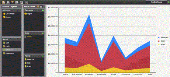
Graph visualization: You can display the data in a graphical format and choose between a variety of different graphs, such as an area graph, line graph, or pie chart.
-
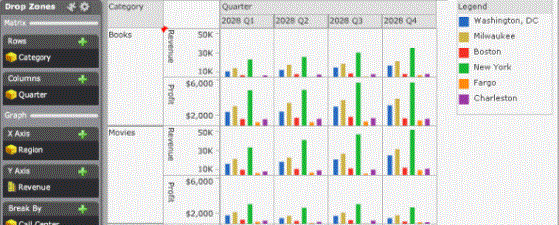
Graph Matrix visualization: You can display the data in a chart containing one graph for every combination of the data that you specify, allowing users to examine the data for each combination individually.
-
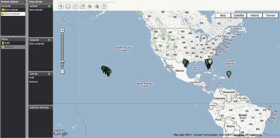
Google Map visualization: You can display the data as geographical locations on a map, then change the color, size, and display of markers based on the value of a metric, to allow users to quickly grasp relationships between different locations.
-
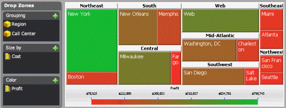
Heat Map visualization: You can display the data as a combination of colored rectangles. Each rectangle represents an attribute element, and is colored and sized according to the value of metrics in the visualization, allowing users to quickly grasp the state and impact of a large number of variables at one time.
For instructions to work with visualizations in MicroStrategy Web, see the MicroStrategy Web Help or the Document and Dashboard Analysis Guide.
