Strategy ONE
Enable and Apply Metric Thresholds
Use the Metric Threshold API to enable the threshold editor option on the context menu of drop zones for metrics on the Editor panel. The Threshold Editor lets you apply thresholds to metrics used by your custom visualization. The following steps describe how to use APIs to make the threshold editor option visible. Make the following changes on the Code Editor panel.
The Custom Visualization Tool is replacing Visualization Builder in the MicroStrategy 2021 release. Visualization Builder can still be used in the 2019 and 2020 releases, but is no longer supported in version 2021 and up.
- In the Custom Visualization tool, open the visualization you want to customize.
-
Enable the Thresholds context menu option.
By default, the Thresholds option is not shown in the context menu of drop zones for metrics. To make this option visible, you call addThresholdMenuItem() anywhere in plot().
Copythis.addThresholdMenuItem(); -
Once it is enabled, you can open the Threshold Editor from the context menu for metrics.
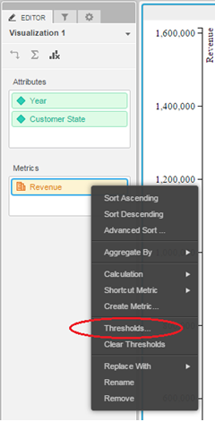
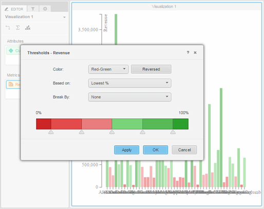
On the Threshold Editor, you can set the color code, apply the threshold algorithm, and choose the attribute you want to break by.
-
Only basic thresholds are available to the custom visualizations. If you previously applied any advanced thresholds to the grid, they will not be available.
-
To obtain the threshold color applied to each metric value, you send an additional parameter, called hasThreshold, when you request data using DataInterface.getRawData(format, params).
For data in a tree format, use:
Copyvar rawData = this.dataInterface.getRawData(mstrmojo.models.template.DataInterface.ENUM_RAW_DATA_FORMAT.TREE, {hasThreshold: true});For data in a row format, use:
Copyvar rawData = this.dataInterface.getRawData(mstrmojo.models.template.DataInterface. ENUM_RAW_DATA_FORMAT.ROWS_ADV, {hasThreshold: true});The returned JSON looks similar to the following:
Copy{"headers":[{"name":"2007 Q1"}],"values":[{"v":"$1,682,656","rv":1682656,"threshold":{"fillColor":"#cc2525","n":""}}]}The value in the threshold editor object can be used to style the visualization:
Copydata.push({name: unescapeString(tempName), value: value.rv, color: value.threshold && value.threshold.fillColor});
chart.selectAll(".bar").data(data).enter().append("rect").style("fill", function (d) {return d.color;});Let's review the code...- fillColor is the color code where this value falls in the threshold. For example, if you are using red for values in the lower 50% and green for values in the higher 50%, a metric value that is lower than the median value will have fillColor equal to “#ff0000”.
-
n is reserved for future use . It will be used for the image URL or the replaced text.
-
If you are using the custom visualization in presentation mode in a document instead of a dashboard, open styleCatalog.xml (located under WEB-INF\xml in the plug-in) and make sure that reportXMLStyle is set as VisualizationServerJsonDataStyle. Previously, it was set to VisualizationDataStyle. If you create or save your custom visualization using the Custom Visualization Tool, the change is made automatically in WEB-INF\xml\styleCatalog.xml:
Copy<ActualParameter name="reportXMLStyle" type="1" value="VisualizationServerJsonDataStyle" />