Strategy One
Get Started with Documents
A document displays your organization's data in a format that is similar to a PowerPoint presentation, where several grid and graph reports can be viewed at the same time, along with images and text. High-quality, Pixel Perfect™ documents allow you to display your business data in a user-friendly way that is suitable for presentation to management for boardroom-quality material. Examples of documents include scorecards and dashboards, managed metrics documents, production and operational documents, and more.
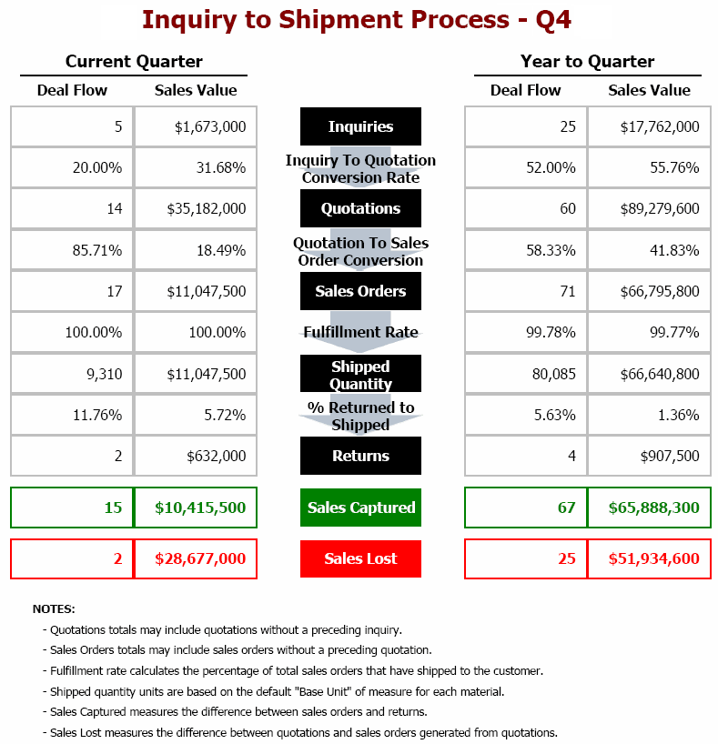
The sample managed metrics document shown below is the Inquiry-to-Shipment Process document. This document helps you analyze sales deals and sales amounts for different stages of the inquiry-to-shipment process. The document presents a visual representation of the sales and distribution process to help you understand how each stage relates to the others. It also includes a number of metrics that measure overall performance for captured and lost sales.
Executives can use this document to gain an understanding of overall sales activity, from generating inquiries to delivering goods to customers. They can also use the data to analyze key performance indicators that measure the performance of the sales organization.
Dashboard-Style Documents
You can also analyze a dashboard-style document, which provides interactive features that let you change how the document's data is viewed. This type of document is commonly used to assess company or personal performance, to take a quick status check of the company, or to monitor personal work or work group contributions to overall goals of the business. Dashboard-style documents summarize key business indicators by presenting them in visually intuitive, easy-to-read, interactive documents. Since it is usually only one page long, a dashboard-style document makes it easy to view the whole document at one time and see all the information. A dashboard-style document allows interactivity, so each analyst can change how they see the data, within the limits of what the document allows.
The following dashboard-style document presents several common qualities:
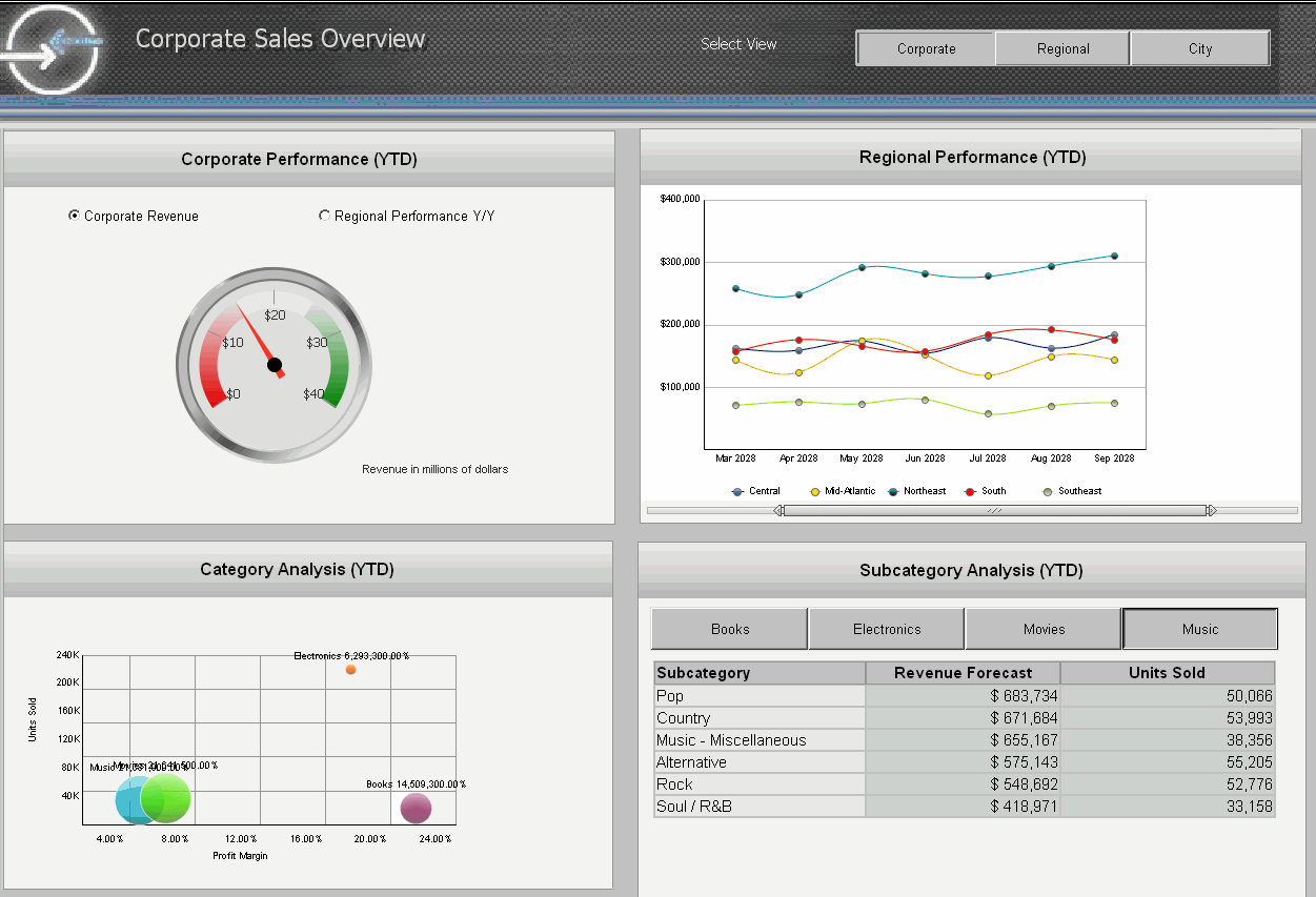
Common dashboard characteristics in the example shown above include:
- The gauge, which shows corporate revenue at a glance.
- The two graphs, which display regional and product performance in an easy-to-understand format.
- The buttons at the top right (Corporate, Regional, and City), which allow a user to view different areas of the business, providing a quick status check across the company.
Analysis at a Glance: Gauge Widget and Radio Button Selector
The image below is an example of a gauge graph that is used at the top of the document to highlight corporate revenue and regional performance.
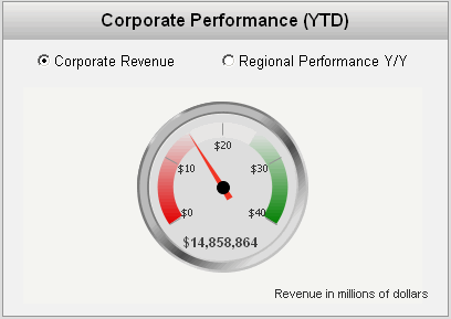
Objects such as gauge graphs, funnel graphs, gauge widgets, thermometer widgets, and cylinder widgets can provide a quick view of important KPIs. These graphs and widgets are good for analyzing data at a quick glance. For a complete list of widgets that can be used in documents, see Introduction to Providing Analysis and Interactivity: Widgets
If you select the Regional Performance radio button, the gauge changes to display regional performance data. The radio button is a selector, which allows you to change the data that you are viewing. A selector can be displayed as a button bar, a drop-down list, radio buttons, and so on, as described in Interacting with a Document: Selectors.
Analyzing Ranges of Time: Graph Report and Slider Selector
You can use the slider along the bottom of the Regional Performance graph to change the length of time displayed and specific range of time covered in the graph's data.
The document initially displays regional performance for August 2005 to February 2006. You can move the slider to change the range of time, for example, to display March to May 2008. You can extend the length of time displayed by dragging the right end of the slider to lengthen or shorten the slider. The graph now shows performance for March to September 2008, as shown below.
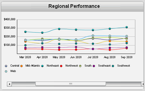
This example uses a Grid/Graph displayed as a graph report and a slider-style selector. Selectors can be displayed as button bars, drop-down lists, radio buttons, and so on, as described in Interacting with a Document: Selectors.
Analyzing Specific Attributes, Elements, or Metrics: Grid and Button Bar Selector
In the document sample above, the buttons in the Subcategory Analysis grid can be used to change the product category displayed.
The document initially displays data for the Music category. Click the Books button to show data for that product category instead, as shown below.
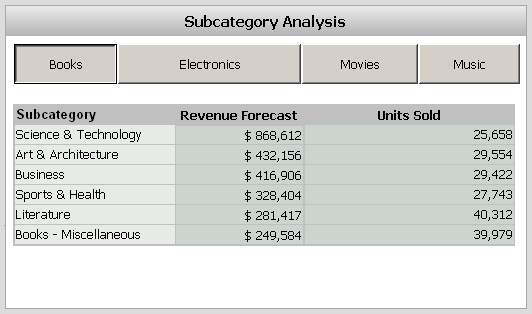
This example uses a Grid/Graph displayed as a grid report and a button bar selector. A selector can be displayed as a button bar, a drop-down list, radio buttons, and so on, as described in Interacting with a Document: Selectors.
Analyzing Across the Company: Panels and Button Bar Selector
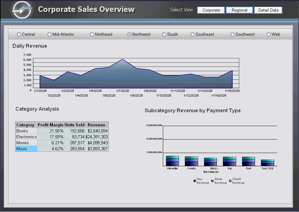
Another example of a button bar in this example is the button bar at the top right of the document. You can use the buttons to switch views, displaying a different set of grids and graphs which show a different set of data.
When you click the Regional button at the top of the document, a different panel, displaying a different set of grids and graphs is displayed, as shown below:
Related Topics
Interacting with a Document: Selectors
Using a Grid or Graph as a Selector
Drilling Into Related Data on Grids and Graphs
How Drilling and Selectors Work Together
Linking to Other Documents and Reports
