Strategy ONE
Customize the Login Screen for Android
Library Mobile SDK for Android allows users to easily customize the Login screen using a JSON file, instead of writing custom code. We provide three sample JSON configuration files that you can customize on your own.
Changes that you make in the SDK take precedence over changes you make using the Application Appearance editor in Workstation. Customizations that you apply on the Library Screen using the SDK will not be affected. For more information, see Modify the Library Logo and Color Theme.
Enable Login screen customization
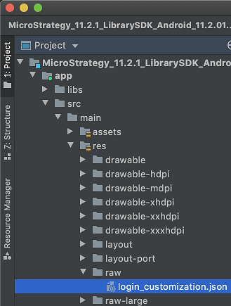
- Create a file named login_customization.json, if it is does not already exist, in <sdk_project_folder>/MicroStrategyLibraryMobile/app/src/main/res/raw.
-
The sample configuration JSON files are located in <sdk_project_folder>/MicroStrategyLibraryMobile/app/src/main/res/raw.Try out the different backgrounds by replacing the content of login_customization.json with one the sample files.
- Customize the login_customization.json file using the settings defined in Data types, Background settings, and Customize UI elements sections.
The root of login_customization.json is a dictionary that hold configuration key-value pairs. You can add your configuration to the root dictionary of the JSON file to achieve the customization you want.
{
  "loginScreenStyle": 1,
  "loginIcon": {
    "iconFont": {
      "font": "mobile_dossier_android.ttf",
      "fontString": "\uea2b",
      "fontColor": "#ffffff"
    }
  },
  "serverLabel": {
    "display": true,
    "font": {
      "size": 16,
      "color": "#ffffff"
    }
  },
  "changeLibrary": {
    "display": true,
    "font": {
      "size": 16,
      "color": "#ffffff"
    }
  },
  "background": "bk",
  "themeColor": "#ffffff",
  "defaultTextColor": "#ffffff",
  "maxWidthOfLoginElements": 400,
  "stayLoggedIn": {
    "stayLoggedInByDefault": true
  },
  "loginButtons": [
    {
      "authType": 1,
      "textFont": {
        "color": "#50a7e8"
      },
      "iconFont": {
        "fontColor": "#ffffff"
      },
      "backgroundColor": "#ffffff"
    },
    {
      "authType": 2,
      "textFont": {
        "color": "#50a7e8"
      },
      "iconFont": {
        "fontColor": "#ffffff"
      },
      "backgroundColor": "#ffffff"
    },
    {
      "authType": 4,
      "textFont": {
        "color": "#50a7e8"
      },
      "iconFont": {
        "fontColor": "#ffffff"
      },
      "backgroundColor": "#ffffff"
    },
    {
      "authType": 5,
      "textFont": {
        "color": "#50a7e8"
      },
      "iconFont": {
        "fontColor": "#ffffff"
      },
      "backgroundColor": "#ffffff"
    }
  ]
}
Data types
Since the configuration settings are stored in a JSON file, values such as strings, numbers, arrays, and dictionaries can be stored directly. However, some other types of values are stored by combinations of basic JSON data types, which this section covers in more detail.
Images
Images are represented by name, without a file extension or directory name. Store images in the project drawable resource folder located at <project_folder>/app/src/main/res/drawable*. Relative paths and URLs are not supported. See the Background image section for an example.
Colors
Colors are stored as a case-insensitive hexadecimal string that begins with #. The hexadecimal value can be 6-digit RGB or 8-digit ARGB color code.
The following hexadecimal strings are valid color codes:
- #ff6800
- #BA333333
Fonts
You can use two types of fonts:
- System fonts using an Android font family name, such as sans-serif or monospace.
- Custom fonts stored in <project_folder>/app/src/main/res/assets. Use the font filename with an extension, such as mobile_dossier_android.tff.
Relative paths and URLs are not supported.
Fonts are stored as a dictionary with the following properties:
|
Key |
Type |
Default Value |
Description |
|---|---|---|---|
| name | string | null | Name of the font available from the Android system or the project assets folder, with the file extension included. |
| color | string | null |
The font color as a hexadecimal string. |
| size | Number | 0 | Font size in DP units. Only effective when the value is greater than zero. |
Here is an example of font customization:
"font1": {
  "name": "sans-serif",
  "color": "#00FF00",
  "size": 14
},
"font2": {
  "name": "myfont.ttf",
  "color": "#ff0000",
  "size": 8
}
Icon fonts
Icon fonts are similar to regular fonts and are stored as a dictionary with the following properties:
|
Key |
Type |
Default Value |
Description |
|---|---|---|---|
| font | string | null | Name of the font available from the Android system or the project assets folder, with the file extension included. |
| fontString | string | null |
The actual string for an icon. This is normally a Unicode character represented as a hex string with a prefix of \u. |
| fontSize | number | 0 | Font size in DP units. Only effective when the value is greater than zero. |
Here is an example of icon font customization:
"myIcon": {
  "font": "myiconfont.ttf",
  "fontString": "\u8e0a",
  "fontColor": "#abcdef",
  "fontSize": 32
}
Background settings
The section details the background settings. This includes the Login screen style, background image, and background color.
Login screen style
You can set a custom background image or color using three different styles. The style of the background is specified by loginScreenStyle.
|
Key |
Type |
Default Value |
Description |
|---|---|---|---|
| loginScreenStyle | number | 0 | Use a value of 0, 1, or 2 to define the Login screen style. |
The values that represent the three different screen styles are detailed below.
|
Name |
Value |
Description |
|---|---|---|
| BASIC | 0 | This is the default style. The login dialog is shown as a white card and the background is applied beneath the card. Note that on an Android phone, the card view fills up the entire screen and the background is not shown. |
|
CUSTOM1 |
1 |
The login dialog fills up the content view and the login dialog is set against the background. Use this style if you want to specify a full screen background. |
| CUSTOM2 | 2 | Similar to CUSTOM1, in that the login dialog fills up the content view. However, the background is only applied to the upper part of the dialog and the lower part contains a blank background. |
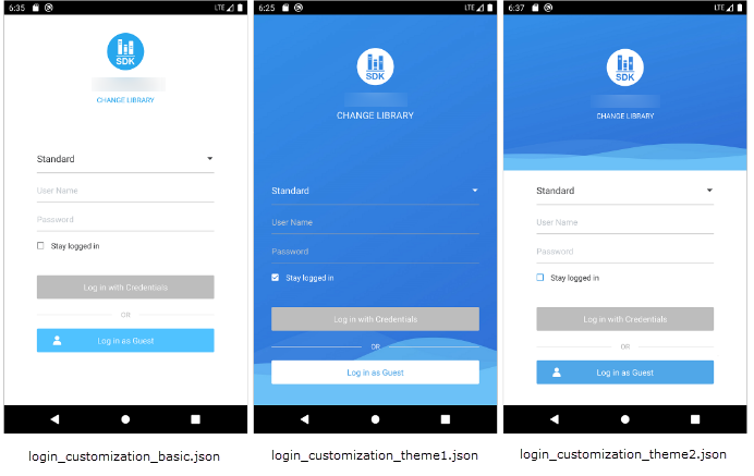
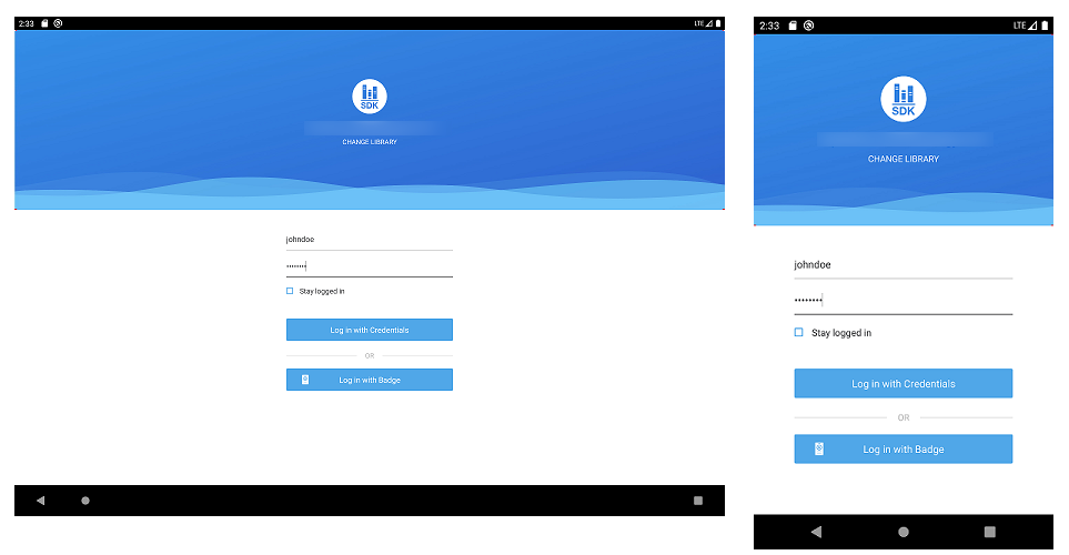
The three Login screen styles appear as follows:
-
The basic default screen, represented by a value of 0.
-
The Login screen represented by a value of 1.
-
The Login screen represented by a value of 2.
Background image
In addition to choosing background styles, you can specify which background image or color to use. If you want to use the drawable folders located in <project_folder>/app/src/main/res/, you must set the background item with the name of the drawable resource in the project.
|
Key |
Type |
Default Value |
Description |
|---|---|---|---|
| background | string | null | The background image. |
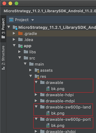
Since the screen sizes vary among different devices, you may want to set multiple screen-specific background images for your app. You can achieve this by adding alternate images to multiple drawable folders with different width and orientation qualifiers.
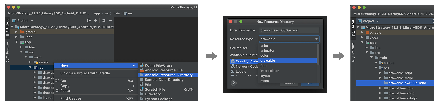
Let's say you want to add background images for an Android phone, a tablet in portrait mode, and a tablet in landscape mode. You have already prepared three .png images and sized them properly. You specify the resource image name as bk, without a file extension.
"background": "bk",Rename each .png file to bk.png and copy it to the corresponding drawable folder under <project_folder>/app/src/main/res/. Use the drawable-sw600p-land folder for tablet landscape mode, drawable-sw600p-port for table portrait mode, and drawable for phones and other sizes.
See Use the smallest width qualifier on the Android Developers site for more information about using resources for different screen sizes.
Background color
Alternatively, you can use a solid color as a background. Instead of setting background, use backgroundColor.
|
Key |
Type |
Default Value |
Description |
|---|---|---|---|
| backgroundColor | string | null | The background color in hexadecimal format. |
The following example uses a red background color:
"backgroundColor": "#FF0000",Customize UI elements
Customization of the login dialog consists of general settings such as theme color or element width, and customization for individual UI elements.
Theme color
You can specify a theme color that covers, but is not limited to the following UI elements:
- Background color of login buttons
- Tint color of the login icon
- Text color of the change library label
- Tint color of the Stay logged in checkbox
This is a general color setting that can be overwritten by specific settings for individual UI elements.
|
Key |
Type |
Default Value |
Description |
|---|---|---|---|
| themeColor | string | null | The theme color used by the login dialog. Do not use hexadecimal color codes that include transparency. |
Default text color
You can specify a default text color that covers, but is not limited to the following UI elements:
- Text color of text fields
- Text color of the server label
|
Key |
Type |
Default Value |
Description |
|---|---|---|---|
| defaultTextColor | string | null | The default text color for the login dialog. |
Width of Login buttons and fields
You can specify the width of login buttons and fields.
|
Key |
Type |
Default Value |
Description |
|---|---|---|---|
| maxWidthOfLoginElements | number | 0 | Specifies the width of login buttons and fields. The width of these elements are constrained by the outer container. |
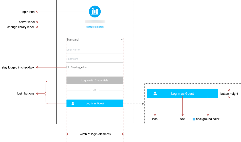
Login icon
loginIcon is a dictionary of key-value pairs storing properties of the login icon.
The login icon can also be customized using dossier_login_icon.xml. dossier_login_icon.xml has a higher priority than the loginIcon setting in login_customization.json. To use the JSON setting, you must remove the customized dosser_login_icon.xml from your project.
|
Key |
Type |
Default Value |
Description |
|---|---|---|---|
| loginIcon | dictionary | null | The login icon. |
loginIcon contains the following properties:
|
Properties |
Type |
Default Value |
Description |
|---|---|---|---|
| display | boolean | true | Determines whether the element is displayed or hidden. |
|
iconFont |
dictionary |
null |
Specifies an icon from icon fonts. The size property is overwritten by iconSize. |
|
iconImage |
string |
null |
Specifies an icon using a resource image. |
| iconSize | number | 0 | If this value is greater than 0, specify the size of either iconFont (in DPs) or iconImage (in SPs). |
Here is an example of login icon customization:
"loginIcon": {
  "display": true,
  "iconFont": {
    "font": "myiconfont.ttf",
    "fontString": "\u8e0a",
    "fontColor": "#abcdef"
  },
  "iconSize": 18
},
Server label
serverLabel is a dictionary of key-value pairs storing the properties of the server label.
|
Key |
Type |
Default Value |
Description |
|---|---|---|---|
| serverLabel | dictionary | null | The server label. |
serverLabel contains the following properties:
|
Properties |
Type |
Default Value |
Description |
|---|---|---|---|
| display | boolean | true | Determines whether the element should be displayed or hidden. |
|
font |
dictionary |
null |
Determines the font for the label, including size and color. |
Here is an example of server label customization:
"serverLabel": {
  "display": true,
  "font": {
    "name": "sans-serif",
    "color": "#00FF00",
    "size": 14
  }
}
Change Library button
changeLibrary is a dictionary of key-value pairs storing properties of theChange Library button.
|
Key |
Type |
Default Value |
Description |
|---|---|---|---|
| changeLibrary | dictionary | null | The Change Library button. |
changeLibrary contains the following properties:
|
Properties |
Type |
Default Value |
Description |
|---|---|---|---|
| display | boolean | true | Determines whether the element should be displayed or hidden. |
|
text |
string |
null |
Custom text for the label. |
| font | dictionary | null | Specifies the font for the label, including size and color. |
Here is an example of Change Library label customization:
"changeLibrary": {
  "display": true,
  "text": "Change Server",
  "font": {
    "name": "sans-serif",
    "color": "#00FF00",
    "size": 14
  }
}
Stay Logged In checkbox
stayLoggedIn is a dictionary of key-value pairs storing properties of the Stay logged in checkbox.
|
Key |
Type |
Default Value |
Description |
|---|---|---|---|
| stayLoggedIn | dictionary | null | The Stay logged In checkbox |
stayLoggedIn contains the following properties:
|
Properties |
Type |
Default Value |
Description |
|---|---|---|---|
| display | boolean | true | Determines whether the element is displayed or hidden. |
|
stayLoggedInByDefault |
boolean |
false |
Specifies whether the Stay logged in option is enabled by default. |
| text | string | null |
Custom text for the label. |
|
font |
dictionary |
null |
Specifies the font for the label, including size and color. |
Here is an example of the Stay logged in checkbox customization:
"stayLoggedIn": {
  "display": true,
  "stayLoggedInByDefault": true,
  "text": "Remember Me",
  "font": {
    "name": "sans-serif",
    "color": "#00FF00",
    "size": 14
  }
}
Customization of individual login buttons
loginButtons is an array containing the customization of individual login buttons.
|
Key |
Type |
Default Value |
Description |
|---|---|---|---|
| loginButtons | array | null | Customizes individual login buttons. |
Each element of loginButtons is a dictionary of key-value pairs storing the properties of a login button.
|
Key |
Type |
Default Value |
Description |
|---|---|---|---|
| authType | number | 0 | Specifies which button you want to customize. |
|
text |
string |
null |
Custom text for the button. |
| textFont | dictionary | null | Specifies the font for the button text, including size and color. |
|
iconFont |
dictionary |
null |
When the login button contains an icon, this property customizes the icon from icon fonts. |
| backgroundColor | string | null | Specifies the color of the button background. |
|
buttonHeight |
number |
0 |
Specifies the height of the button in DPs. |
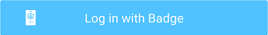
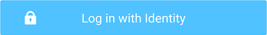
The following enumerate values for authType represent different types of login buttons:
|
Value |
Login Button |
Default UI |
|---|---|---|
| 0 | Badge Log In button |
|
|
1 |
Standard Log In button |
|
|
2 |
Trusted Log In button |

|
|
4 |
SAML Log In button |
|
| 5 | Guest Log In button |

|

"loginButtons": [
  {
    "authType": 1,
    "text": "My Login",
    "textFont": {
      "name": "sans-serif",
      "color": "#50a7e8",
      "size": 14
    },
    "iconFont": {
      "font": "myiconfont.ttf",
      "fontString": "\u8e0a",
      "fontColor": "#ffffff"
    },
    "backgroundColor": "#ffffff",
    "buttonHeight": 50
  },
  {
    "authType": 2,
    "textFont": {
      "color": "#50a7e8"
    },
    "iconFont": {
      "fontColor": "#ffffff"
    },
    "backgroundColor": "#ffffff"
  },
  {
    "authType": 4,
    "textFont": {
      "color": "#50a7e8"
    },
    "iconFont": {
      "fontColor": "#ffffff"
    },
    "backgroundColor": "#ffffff"
  },
  {
    "authType": 5,
    "textFont": {
      "color": "#50a7e8"
    },
    "iconFont": {
      "fontColor": "#ffffff"
    },
    "backgroundColor": "#ffffff"
  }
],