Strategy ONE
Customize the Appearance of Forecast Line Charts
Make your forecasts visually engaging by customizing the appearance of your Forecast Line Chart. Adjust colors, fonts, and labels to match your preferences and create a chart that's not only insightful, but looks great!
By default, the forecasted area of the line chart uses the first color from the chosen color palette. However, you can customize the color, data labels, markers, and divider line using the Format panel.
Customize Forecast Lines, Confidence Bands, Dividing Lines, and Forecast Line Markers
-
In the Format panel, click Text and Form
 .
. -
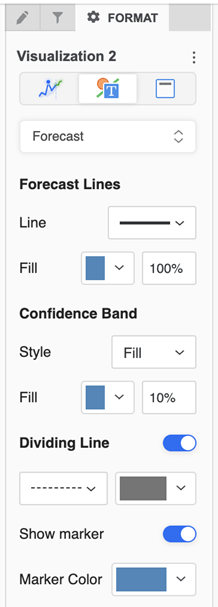
Select Forecast from the drop down.
-
Select options to format the Forecast Lines, Confidence Band, Dividing Line, as well as enable and color markers on the forecast line.
Customize Line Color and Style
-
In the Format panel, click Text and Form
. -
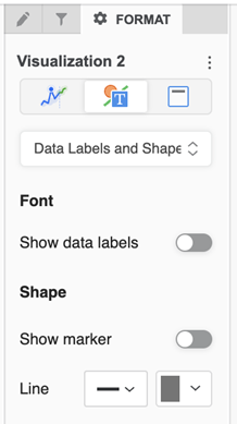
Select Data Labels and Shapes from the drop down.
-
Under Shape, select a Line style and color.
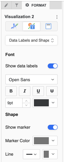
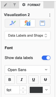
Customize Data Labels
-
In the Format panel, click Visualization Options
 .
. -
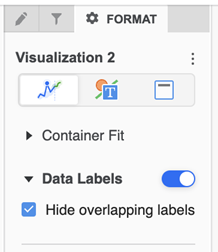
Enable Data Labels to view them.
-
By default, only the labels that don’t overlap are visible. Deselect Hide overlapping labels to enable all data labels.
-
In the Format panel, click Text and Form
-
Under Font, use the text formatting options to change data label font and color options.
Customize Line Markers
-
In the Format panel, click Text and Form
-
Select Data Labels and Shapes from the drop down.
-
Under Shape, enable Show marker to enable all markers on a line.
-
If markers are enabled, select the Marker Color.